Blog Archives

Bed Count (version 1)

BedCount1ematted

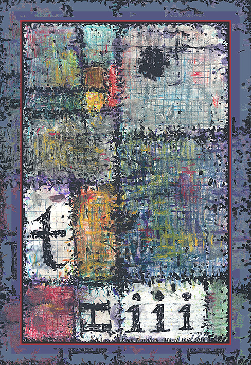
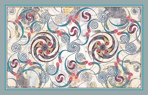
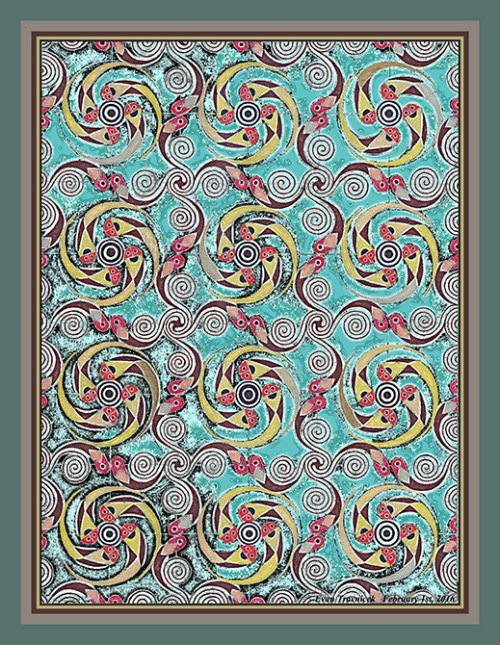
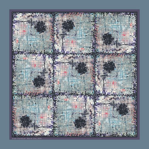
They look like wrinkles in the sheets of a bed. They look like nine square beds fit closely together for storage, creating a plane of mattresses and sheets; like fields of farms below an airplane as you travel overhead. Of course I hadn’t thought of this perception while I was drawing the original piece on collaged paper, which is derived from After the Crash J1 for which I posted previous to this one.

I selected this area of that drawing and repeated it eight more times, thus creating nine cells for which you see here. I turned each cell however so that each adjacent cell is not identically positioned, thus rendering a random—what looks to be—coded image.

It looks like the black cloudy spots in each cell could be nuclei for biological cells, and the surrounding speckles on the borders of each cell are the membranes. There are skin cells in the human body called cuboidal cells. I liken these abstractions to them.

Having made two comparisons already—cells and beds—I note to you that skin cells on the epidermis of your body are rubbed off each night on the sheets of your bed. The colorful impressions of your dreams are added to the folds of your soft sleepfulness as well. But you turn every once in a while to reposition your body in a more comfortable position while you sleep, like the Andy Warhol film called Sleep.

In my healthcare statistics class, I calculated simple formulas for hypothetical bed counts in hospitals. That’s part of the reason why I titled this piece bed count. When a hospital is a maximum capacity, all the beds are used leaving no more beds for new arrivals. That’s why an exact bed count is so important for healthcare workers to know working in a hospital. If there are less patients than there are beds, they can be calculated in ratios.

I don’t know if you can see the salt crystals mingled with the blue areas, but there is indeed salt that I used on the original drawing. I did this to create clouding and bleeding effects. I also used rubbing alcohol, which I splashed on the nervously applied random dots speckling the borders and the spots. You can see the bleeding effect in some of these areas creating an off purple color.

Leave a comment

March 21, 2016 · 7:20 pm

Tri-Iteration (version 1)

TriIteration1ematted

Is it time for some therapy for non-physical beings bound and whipped by the addictive pleasures of the flesh? Well, whatever. Apparently, art therapy is the thing critics and journalists like belittling and criticizing as of late. I sort of don’t blame them due to all the coloring books for adults that even Wal-Mart now sells. If I were more paranoid, I’d say that centralized PR firms caught on to my doodling after observing me from all the surveillance cameras around every corner for the last few years.

I would work on larger more extensive art projects, but, for whatever reason, I’ve been condemned to doodle on scraps of paper glued together into collages. I’m becoming cooler and cooler with that as the world’s years hammer away at my trembling heart. It’s cool; I needed to develop some courage. I hope I’ve gained a thread of it from a badge of courage awarded from heaven.

Anyway, I titled this piece Tri-Iteration because of the repeated lower-case i’s in the lower part of this abstract illustration. An iteration is a repeated utterance. This drawing is basically the foundation drawing for my Wrecked Tangles (After the Crash) J series. Besides the i’s, included in this picture is a t and an H. I suppose you political hacks could find a hidden connection there between the letters I incorporated herein, and current events.

Maybe my unconscious mind was trying to tell me and everyone else something. I wasn’t consciously trying to intend a message. In fact, this drawing was an attempt on my part to escape my over-thinking, analytical mind. Hence, “art therapy.” It allows me to rest my left brain, and enter the playful, experimental, careless regions of my right brain. Having been credentialed as a Registered Health Information Technician lately, I have been trained to think more scientifically, quantitatively, and rationally. I’m glad the artist self within me hasn’t been completely gutted by this world.

What I note to you about this drawing with pens, pastels, diluted acrylic, and collaged pieces of paper is that I used two new agents as transformative properties in it. I used salt and rubbing alcohol to help weather and distort the colors of dust and magic marker. In previous Wrecked Tangles drawings, I had struggled to make the wrecked parts of the angles and lines mimic nature’s and time’s characteristic features of entropy, weathering, stress, and crumbling.

I first made the frame around this piece solid colors with no interference, but then I decided it needed some pocks and perforations to give it a distressed look. So I copied a selection of the pocks, points, and perforations inside the image and stretched them over to the frame. I was satisfied with that result. It can be changed to solid if you want that format. I can also make the image as a print without any pseudo-matting so that you can get it framed yourself if you so desire.


Buy Now Button

2 Comments

March 17, 2016 · 6:13 am

Oriole Radiation (version 10)

OrioleRadiation10ematted

In this piece, I’m looking for shapes that arise from combining two or more individual works together into one piece. Interesting, unexpected results arise from my playful experimentations. It reminds me of community billboards on college campuses outside. There are so many pieces of paper stapled on top of layers of previously posted pieces of paper, and they all have different degrees of erosion and decomposition having been exposed to the weather.

I used New Morals, the piece I recently posted, and Interleukin, the piece that began my ball-point pen Micro-Chimerisms project back in 2008 in this amalgamation. This work looks like it’s been aggressively dealt with by someone or some force that was ruthless enough to scrape over it leaving it in the state that you see now. Perhaps the person who ran roughshod over it was interrupted by another person or force and was left laying in the condition you see here.

Anyway, the force that left it—be it nature or human—I imagine left it as a mess with an intriguing design; unintended, of course. Though I ultimately made this image, I still sometimes like imagining stories behind what created them in order to generate more amusement, excitement and wonder. Maybe a combination of weather and a manual laborer worked there impersonal energies upon this picture plane. One could almost imagine that this is a bird’s eye view of a worksite where piles of dirt rest waiting for laborers to shovel them into wheel barrows and make deliveries to other areas. Meanwhile, stages of snow, rain, and wind visit the site every so often, and leave it slightly more tattered than before.

I titled this piece Oriole Radiation because it looks like something is emitting or radiating from the yellow lips near the lower left of the picture plane. An oriole is a colorful bird found in the Midwest and Northeastern states of the US. I thought it was fitting because they are song birds who sing in the Spring, thus radiating sweet chirps and warbles. Oriole is similar to the word “oral.” I was going to use the word oral, but then I decided to word associate it with oriole. Maybe the message here is a beautiful cry for help.


Buy Now Button

Leave a comment

March 7, 2016 · 5:54 am

Annulus (version 1)

Annulus1ematted

The quadruple pinwheeling pisciforms compose the background forces of this eidolon. They seem so dominant and bold with their colors that they are fighting with the cool light blue foreground design. Intentional or not, it is what it is, and, overall, it works together in an orderly structure. I did leave clues of the squared off graph sketch I made in preparation for the original drawing, which is Happy Zephyrs.

I titled this piece Annulus to signify the light blue shape right in the middle of the picture plane, which looks like a waistline with a belt around it. Annulus is an Arabian word for ring. I learned of that while reviewing the structures of the heart and the aortic arch connecting to the heart.

Inversions, flips, reversals, hue warping, and combining two individual drawings into one piece is what this one’s about. The blue foreground design comes from a piece I did several months ago called Growing Independents. Obviously there’s a political message in that title. Perhaps this one’s alternate title could be Merging Independents to signify the growing awareness that partisan politics, in the traditional sense, are just empty marketing jingoisms.

It takes active oppositional forces for change to start significantly altering superstructures of state. The cool blue design in the foreground can be seen as a relief to the growing heat and tension arising in the background… for now. Its icy and fragile structure will soon give way to the full blown revolution of the zephyrs and proletariats blowing like empty potato chips bags in the background.

Certain patterns must accumulate certain amounts of energy by accomplishing enumerable repetitions, much like the running legs of a jogger, or the curls of a weight lifter. In art, exhaustive oceans of intricate design can come together to make greater coherent wholes, and the transmute into different structures frequently. I captured a certain state here.

An interesting aspect to digital, in contrast to traditional art, is that it never decomposes, deteriorates, or entropies. A piece of art online forever remains the same. I wondered to myself how deterioration, or corruption, could happen to art in the cyber-world. Viruses can corrupt files I thought, and I’ve seen examples art mapped from computer viruses that artists have created before, but these aren’t caused by the forces of time; they’re caused by human factors.

I still wonder how time can deteriorate art seen online. I suppose a computer can become so old that it might distort an image, but it wouldn’t be the internet itself that deteriorates the image. Again, I come the idea that perhaps, if the internet were to be accessible to us indefinitely from now on, the art found on it would never get old, fade, scratch, or decompose. Perhaps it is only the sensory modulators—natural or digital—that corrupt and entropy over time and not that which is perceived. Perhaps we and everything around us is contained in compressed learning experiences that are really artificial in the greater scheme of things, and timelessness exists past the barriers of our physically indoctrinated perceptions.

Leave a comment

March 6, 2016 · 7:02 am

New Morals (version 3)

NewMorals3ematted

The media used for this piece is nothing new to art. Collages and assemblages have been used by artists since the early twentieth century. There may even be instances before the 20th century as well where craftspeople used readymade printed on paper and objects to construct images or sculptures. The shifting paradigms around art in the 20th century, however, allowed for collages and assemblages to be conceived for acceptance to wider appeal.

Moreover, the techniques I used to give this piece it’s weathered and scraped look is nothing new to art. In fact, the distressed technique in the kitsch and decorative arts have been well established for a number of years now. So I don’t necessarily feel that original in this way with regard to this piece.

I suppose one thing that comes to mind is the reversal of the text so that it semi-illegibly hints at something a little more original, but even that technique is well-worn by many artists. I do, however, enjoy the subliminal, creative, and suggestive aspects of mixing words and letters up. This technique, of course, originates from William S. Burroughs, an author from, again, the 20th century.

In my review of assemblages and collages, the artists I can think of right now who were the originators of them are Robert Rauschenberg, Kurt Schwitters, Max Ernst, and many other Dadaists and surrealists. I suppose my fascination with these art forms is found in their recyclable qualities, and their suggestions to re-use found objects & periodicals for irrational reasons. I’m repelled and drawn to these modern day kitsch, arts & crafts, scrap-booking art-forms simultaneously.

I’m repelled by scrap-book art because it’s so common now-a-days, but I’m attracted to it because it dovetails with my life-long efforts to create mosaic and mosaic-like art. From my Wrecked Tangles series, on back to my first serious oil painting I did in high-school called Memory (which was based on a Byzantine mosaic my teacher showed me from a Smithsonian magazine) my art, to a large degree, experiments with particles and pieces joined together to form greater wholes, or gestalts. I suppose on a more basic level, I’m dealing with primary syzygies, such as matter and space, light and dark, male and female, etc.

I’m just developing my own ideas using the available ideas I’ve learned from previous artists and giving them my own energy, my own style, my own perception. I sometimes feel glad to explain what I’m doing with my art by blogging about it, and other times, I feel irritated because I can’t think of anything to say. I usually surprise myself, however, when I start typing about the first thing or two that comes to my mind when I prepare for posting a piece online.

I titled this piece New Morals as a para-association from the flipped and reversed text in the picture. Specifically, the word “world,” which can be seen in the upper right corner of the picture, looks like it could almost begin to spell the word “moral,” as it has the first three letters m-o-r in it (the letter “w” flipped is “m”). The coy look of a woman’s eyes and lips can be seen blending with the off-white of the paper of the various pages with text I glued on to the original media.

Perhaps what this crafty title could be suggesting is the new morals that shall be developed in the 21st century cyber-age. I recommend reading Jacques Derrida’s philosophy about writing and language. He indicates the mercurial and contradictory nature of words and writing in his philosophy of deconstructionism. Words and writing are intended to put into stone that which is rapidly processing and quickly flowing through our minds in streams of consciousness. Words, letters, and writing are really like small windows through which one can look to see only part of a landscape. Furthermore, that landscape is always in a state of change, no matter how slow.

Leave a comment

February 28, 2016 · 6:21 am

Megalopolis Untitled Number Nine (version 28)

MegalopolisUntitledNumberNine28ematted

I made this image back in 2011 when I was working on my first Wrecked Tangles project, titled Wrecked Tangles (encircled). For new viewers, Wrecked Tangles (encircled) is a play on words. It’s a more difficult way of saying “rectangles and circles.” That is the basic theme of this project. I finished the (encircled) project over three years ago, but I wanted to repost a highlight from that project.

In all of my Wrecked Tangles projects, I catalog each series alphabetically, and each piece either numerically or alphanumerically. This helps me to organize and give some order to such massive projects. While they are mostly created digitally, their foundation media is traditional, as I scan in mixed media drawings as bases.

This image you see here is from the Wrecked Tangles (encircled) S series. I titled it Megalopolis Untitled Number Nine (version 28). I chose such a long title for semi-nonsensical reasons. It does, however, look like you are looking straight down at a cityscape from an airplane perhaps as a bombardier. Why would you be a bombardier? you may ask me. You wouldn’t. I’m just giving you an idea here.

I actually auctioned this piece off as a print at an auction here in Albuquerque to provide assistance to the victims in Japan after the tsunami hit their Nation in March, 2011. I was glad to be able to help in some small way. The fact that this graphic has a big red circle in the lower left corner of the picture plane is fitting for Japan, as the Japanese flag has a red circle in the center of it symbolizing the Rising Sun.

A dream I’d had recently suggesting I have a bigger fan base in Japan than I do in the US prompted me to repost this image again. So, if my dream has any substance to it on this plane, thank you to my friends in and from Japan. May this image be a message of courage and strength as you rebuild your life from previous catastrophes, man-made and natural. The circle of red can be a place in which you store your tools and energy for whenever you need.

Leave a comment

February 26, 2016 · 8:15 am

Binarydom (version 9)

IdiosyncraticCouple9ematted

I went through three different names for this picture before I settled on Binarydom. First, I thought Binary Idiom because there are two commensurate pinwheels on either side of the image. I didn’t like that though because I couldn’t settle on whether if there were two idioms or just one divided in itself. Echoes of Hegel’s Unhappy Consciousness can be associated here.

Then I thought of Idiosyncratic Couple as a title, which actually sounds about right to me right now. The central theme that I’m developing here however is one of basic blocks and forces of universe building; or, world creating. The title Idiosyncratic Couple doesn’t completely work as a description for me yet here because the shapes, forms, and movements aren’t evolved to the point of human intelligence and relationships. I am sure many analysts will have fun with my interpretations so far.

I progressed therefore to the idea of calling it Manichaea. Manichaeism was actually an ancient religion founded by an Iranian prophet named Mani in ancient Persia. It’s basic narrative is that we live in a dualistic cosmology of good and evil, light and dark, and so on, resembling the Chinese Ying Yang principle. I gazed into my image and just didn’t see that blatant opposition in it however because the colors on the left and the right of the image are the same—there is no oppositional emphasis. Rather, it seems like more of a harmonious synthesis.

What you may imagine looking at here is two quadrilateral (square) molecules linked up together by ionic bonding. I know that there is no such thing as a square shaped molecule, but I like imagining it as thus in my development of generating imaginary universes. Most molecules usually are hexagonal and pentagonal in structure when studied in diagrams.

I henceforth concluded in titling this piece Binarydom. It’s a kingdom of two molecular worlds bound together in harmony as they travel over the nascent inchoate urges towards clearer definition observed in the background. I drew this drawing with gel and ball-point pens first on blank white paper. I already had some pasted together paper media for future projects, which I scanned into the computer to use for this project.

I made a template of Binarydom with just the white surrounding, excluding the colors and forms, and combined that with the background of pasted together paper media. I feel I merged it all together with a certain degree of success by my standards. I altered the coloring for some of the pisciforms so that their bodies are now a cerulean blue, instead of silver. I originally made their bodies with a silver gel pen. The silver didn’t show up as well as I liked, so I adjusted them to a blue hue.

Leave a comment

February 5, 2016 · 8:19 am

Happy Zephyrs (version 4)

HappyZephyrs4ematted

This is the latest drawing I recently finished. It’s titled Happy Zephyrs. The image you see here is based on the original drawing. The original drawing was done on paper with felt-tip and gel pens. I used different metallic gold gel pens for the tails of the pisciforms you see repeating regularly throughout the picture plane. 

For some reason, I’ve been fascinated with metallic gold pens. I think it’s because in formal art, using things such as gel pens (perhaps even especially metallic gold pens) is considered low value, scrap-book, hobby, not serious type art. In this, I see a challenge. Therefore, I’m drawn (all fun intended). 

I decided that Happy Zephyrs, the original drawing as converted into digital imagery after scanning, was asking me to make a background for it. It was a subtle beckoning, but I heeded. I tweaked a few of the filters and adjustments in my editing program, and thus produced variations of what you see here. I feel particularly satiated with achieving an oxidized copper effect. This gives me the weathered, stressed, aged look that I often seek. 

I know many artists have experimented with and explored techniques of aging, weathering, stressing, ad hoc, and imperfect expressions already, so this really isn’t anything original on my part. I do feel, however, that this approach is something that has immeasurable depth and possibilities to it. In a sense, I feel like I let nature flow through me sometimes when I make art; like I’m letting the forces of nature with a few of its tools work the various terrains and mediums of earth. 

Electronic art is just another dimension to this process for me. The vortex, the force, the warp adjusting, the attenuation, the pattern recognition and hybridization are all within me. I am a doorway through which ideas come tumbling out and find security within the various mediums I record them in for present or future purposes. Even the ideas I supposedly complete in final works still have possibilities for future morphoses into new ideas. 

The word zephyr means a light wind or west wind. It comes from the Greek word Zephyrus, which was identified by the ancient Greeks as a god of the western wind. In my making of this drawing, I hadn’t delved too deeply in researching the myth behind Zephyrus. Perhaps it’s something you may embark upon if you feel so intrigued to do so. I just thought the pisciforms in this particular drawing looked like windsocks with happy faces, so I made the connection: Happy Zephyrs.

1 Comment

February 1, 2016 · 9:59 am

Storms of Dark Matter (version 5)

StormOfDarkMatter5ematted

It looks like leaves, feathers, and zephyrs swirling and undulating around nebulae up in the sky as a person from a different time on earth gazes upwards. Of course such perceptions are imagined as bold. This because of the lack of city lights in that time. Who knows what year it is? Who cares? When one is lost in the beauty, mystery, and awesomeness of this unfathomable universe or the next, one loses meaningless needs to measure and compare.

Well, I still like having my rational mind about me, and even sharpening it for a better understanding of my surroundings, things, and people. It’s just nice to take flights of fancy into incredible reveries so that I can capture a few of their elements in drawings and writings.

I just finished a new drawing I call Happy Zephyrs. While this is not that drawing—and I haven’t posted it on my Art of eVan blog yet—it does have elements of Happy Zephyrs embedded in it. There’s no hidden text in this piece, so don’t concern yourself with sublime communications. I titled it Storm of Dark Matter.

This electronic illustration makes me think of peering up into space. Or, perhaps—I imagine—I am in space, traveling around in it on the outskirts of galactic clusters, penetrating the folds of dark matter (whatever that is) and taking snap-shots of what I see. Because, really, astrophysicists don’t even know what dark matter is, but they do know something more permeates our universe because of the amount of stuff measured in it as compared to what we can see.

This piece makes me think of the Hopi Indians, and how they left artistic markings in stones consisting of characters and spiral formations. I imagine the Hopis looked into the night sky often and let themselves unleash with wonder, awe, and imagination. It is indeed energizing to feel the unseen properties and elements of space and time. Rather like waves lapping on a shore of consciousness and audible conch shells in a backwater location.

In my sketching of new ideas, I’ve been exploring trebeculations interconnecting irregularly, and then adding convolutions and spirals to them. So it’s a play on straight and curved lines really, which makes me think of bitmap and vector imagery combined into one level of a fractal snapshot. Like nautilus shells placed in open boxes so that one can put them together as a piece of art and hang them on the wall.

Leave a comment

January 24, 2016 · 6:00 am

Ring Swimmers (version 1)

RingSwimmers1

This piece is derived from Meme Catcher. It’s basically one of the corners of Meme Catcher repeated four times. Can you guess which corner? I like the way the corner looks in Meme Catcher, and I knew it could be used as material for a picture in itself.

All in all, it really is just an attempt at a pretty design. I’ve been to Hobby Lobby a couple times recently, and I really enjoy the wall decor they’ve been selling there lately. They are just fascinating arabesques crafted with metal and wires. I feel this is a piece that could be sold there. I have made it as a print however.

In the future, when I have access to more materials and resources, I’d like to get into making wall reliefs, metal decors, arabesques, and so forth. So I’ve been recording every day a development of ideas on this kind of theme. It really is exciting! I feel that it is an addition to my Micro-Chimerisms idea, as well as my Wrecked Tangles theme.

The ideas I develop are like stylized worlds unto themselves. To explain it in a certain way, each ideological theme is like one artist, say, for example, Van Gogh, and the next theme is, for another example, like Paul Klee. In another way of explaining it, each ideological theme I develop is like the product of a character portrayed in a novel. Since I am one person—the creator, the artist—the thematic worlds I imagine and develop sometimes merge.

This is where new ideas are born—the merging and hybridization of two or more previous ideas. That’s why you often see layers upon layers of imagery in my recent works. The last idea I posted, Cherubesque, was an attempt at this. I’m not satisfied with that picture though. In fact, I think it’s rather mediocre. Nevertheless, Cherubesque has an idea in it I want to develop more. That is the idea of intertwining human bodies. William Blake often depicted this in his works. I’d like to develop works involving many human bodies composing intertwining shapes and forms, such as eight-pointed stars and so on.

Ring Swimmers has binary fish swimming around inside golden rings, joining together symmetrically in the center of the vignette. I say vignette because the center of interest has a highlit quality to it, even though it is indeed defined by the framing borders. I didn’t really think about the symbology of four rings, and eight fish. I invite you to imagine what it means to you. Other than that, I feel it’s a nice calming meditative piece, indicating wealth and security.

Leave a comment

January 14, 2016 · 9:45 am