Synthesized Judgement (original)

Synthesized Judgement (October 22nd, 2025), by Evan Travnicek. Mixed media on paper. Dimensions: 10.5″ x 17.5″

Behind not caring, there are layers of care. The ballerina’s back is faced towards the viewer as she faces an audience in her world. I didn’t consciously plan this piece. It just happened as I successively selected cutouts from magazines that I cut out. It isn’t exactly William S. Burroughs’ cutup technique to poke into the unknown universe for inspiration because I allowed my conscious self to be a main part in the creative process. My muse guided me. 

This piece was me positively smashing through another long creative block. Creatively working through the vicissitudes of life, mean people, and one’s own unseen shadow can be a route to more creativity and growth. It looks like the ballerina is flipping off whoever is to her left as she walks forward. The manufactured flower is completely turned away from the ballerina. I wasn’t thinking about these psychological things when I was making the piece. 

The perspective leading off into an unseen horizon lining the top background of this illustration unifies the divergences in the foreground, thus suggesting peace. I created a major theme of stability because of the dominant horizontal lines composing the image, but inside that stability are imperfections creating dynamic qualities that cause interest for the viewer. 

I feel this is the most successful formal piece I have made since Foothill Neighborhood because I incorporated cutouts, acrylic washes, pen and ink, gauche, watercolor, and oil paint based transfer drawing techniques. This process used to be new to me, so I didn’t feel like I had a handle on it, but with this piece, I feel more confident in how I handled its outcome. 

I titled this piece Synthesized Judgement because I’ve been re-reading The Critique of Pure Reason by Immanuel Kant lately, and he wrote about how our minds synthesize our worlds and the contents of our minds into a synthetic unity so that we understand things in an orderly way better. I took a creative route to illustrate what our minds do with this image because of the cutouts from magazines, the lines defining objects, people, and boundaries, and the colors adding degrees of intensity for character and variation.

One-Time
Monthly
Yearly

Make a one-time donation

Make a monthly donation

Make a yearly donation

Choose an amount

$5.00
$15.00
$100.00
$5.00
$15.00
$100.00
$5.00
$15.00
$100.00

Or enter a custom amount

$

Your contribution is appreciated.

Your contribution is appreciated.

Your contribution is appreciated.

DonateDonate monthlyDonate yearly
Leave a comment

October 25, 2025 · 8:35 pm

The Tension Between Reality and the Unknown

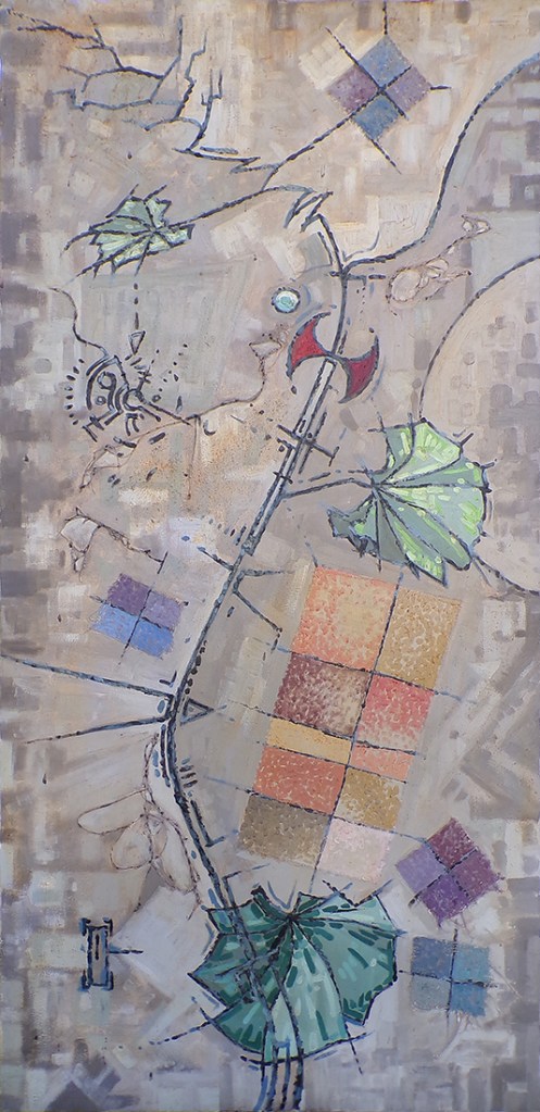
The Tension Between Reality and the Unknown (January 2002), by Evan Travnicek. Mixed media on stretched canvas. Dimensions: 59.75″ x 29″

This painting was created in 2002. I was starting to experiment with mixed media on canvas as I expanded my palette from using only artist’s oil paint. I have continued my mixed media passion to this day. It comes from the do-it-yourself, punk rock, ad hoc spirit of the late 1970s, which was, and still is, in many ways, a symbolic sacrifice of ideal, traditional visions of perfection in order to get out of one’s own way for the purpose of creating in the moment rather than waiting for the perfect moment. 

A passion for the line in art is expressed here. I was experimenting with variations in stylized lines. There is something technological and biological about it. Lines, as seen in nature, are really just surfaces of objects as seen level with the surface, rather than perpendicular to the surface. 

The leaves of the plant I represented in this painting are called mallow, which is a common garden weed found in the midwest. I like their kidney shape. I also like the natural corrugation that fans out from the center of the leaves which creates a kind of rooftop effect for lighted and shaded surfaces on the leaves.

I find one of the most neutral colors one can use for a background to be raw umber mixed with some titanium white. It’s like the middle grey used in traditional photography which reflects about 18% of light that falls on it. The rest of the surface has a gentle absorbing sense about it, including the green colors in the foreground. The nascent forming qualities of the background give a platform on which lines can be defined. 

One-Time
Monthly
Yearly

Make a one-time donation

Make a monthly donation

Make a yearly donation

Choose an amount

$5.00
$15.00
$100.00
$5.00
$15.00
$100.00
$5.00
$15.00
$100.00

Or enter a custom amount

$

Your contribution is appreciated.

Your contribution is appreciated.

Your contribution is appreciated.

DonateDonate monthlyDonate yearly

1 Comment

October 6, 2025 · 8:05 pm

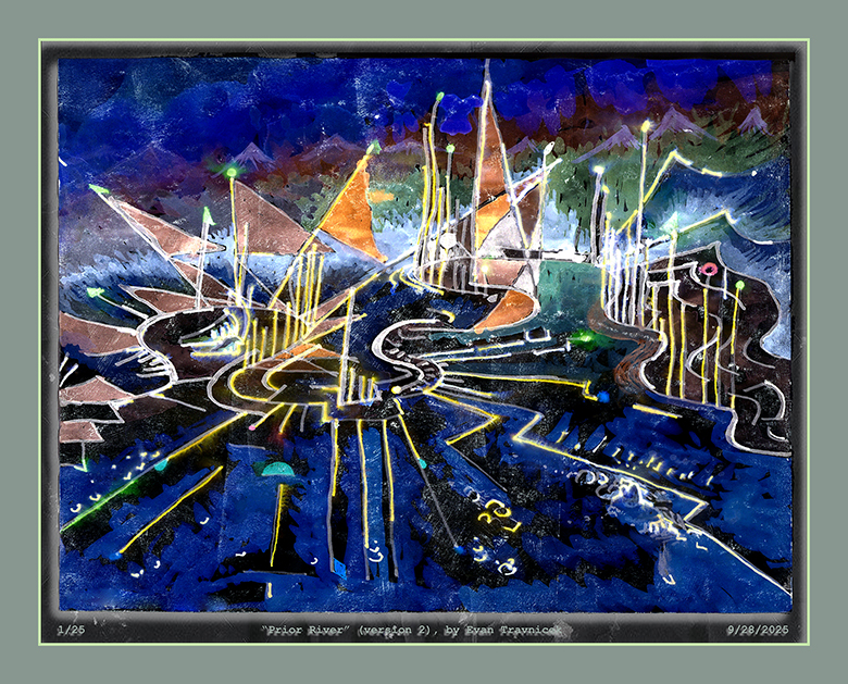
Prior River (original and version 2)

It’s mixed media. I used a reed pen and diluted black Chinese ink from a vitamin supplement bottle converted into an ink well. My foundation is working with oil paint, but my work in recent decades has transitioned into wet and dry mixed media, on and off of digital media doc makers. 

This drawing harkens back to a painting I made in 2002 called The Tension Between Reality and the Unknown. I will post that painting here after posting the versions of this drawing I want to post first. Then I’ll link the painting to its title so you can look at it for ease of viewing. 

I’ll admit that I have been struggling with regulating my time, space, and mind with my smartphone usage and social media. I’ve posted authors, videos, and articles about the targeted map to addiction that social media giants and smartphone makers have made out of the human brain to exploit maximum usage of their apps and devices on my X account to raise awareness about this problem that I believe most people with smartphones struggle with. 

My art is about relationships and connections. The internet and social media are about relationships and connections, too, but in a much different way. The colors, shapes, and lines are what represent relationships in my art. Maximum time, and data output from their users are what represent relationships for social media giants. I’m not anti-smart phone or anti-social media however. I am pro strategizing ways to maximize my own creative powers so I can be more active in working on my vision rather than passively scrolling through other peoples’ lives. 

I realize that the still images made by a relatively unknown artist are like muted forms on digital wallpaper of cyberspace living rooms, but I don’t care. I realize typing something like that out doesn’t particularly help me promote myself as a confident and ambitious character out of a romance novel. Fuck that shit. I’d rather just be raw & real as I continue to fight and struggle on my path of positive passion.

Prior River has connections to a main theme in my dreams. I sometimes dream about walking down to a river from a gradually descending series of river banks. I realized that this theme has connections to my childhood memories of traveling down Dellyne Avenue NW, and Taylor Ranch Drive to go to Albuquerque. The Rio Grande is at the base of descending down the bank on which Taylor Ranch Drive is paved. This part of the city was still rather undeveloped back in the 1980s, so it really was part of the outskirts. 

I suppose Prior River is symbolic of making connections to a river of life from the past that’s still there. It connects me to how creative I used to be and still am. 

Leave a comment

September 29, 2025 · 3:32 am

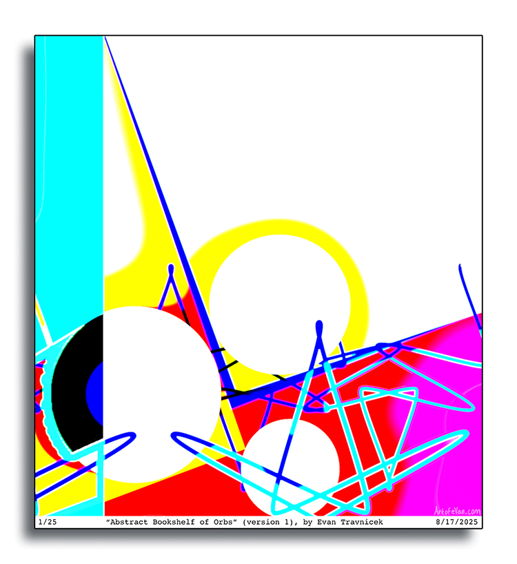
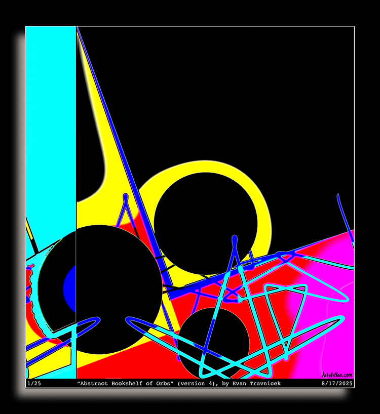
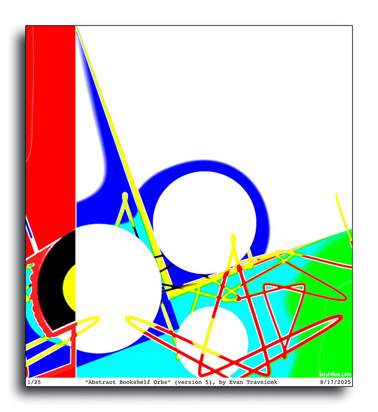
Abstract Bookshelf of Orbs (versions 1,2,4, & 5)

These pieces are purely abstract and completely digital with no input from traditional media. I’m playing with depth in an almost totally abstract sense because of how the objects are placed in seeming progressions of foreground to background, thus making sense in a three dimensional way while eliminating all lighting, curvature, and shadow. I read somewhere that the more abstract the art of a culture or society is, the more totalitarian it is because abstractions in any field abstract from the natural or manmade world and reduce the forms, shapes, colors, and objects to basics and bold colors. I suppose there may be some truth to that, but the point of this blog is to, by and large, escape politics, economics, and government. I just find myself fascinated by abstract art. There is so much more that can be done with it.

I was thinking of Hans Hoffman’s ideas about tensions between objects, or painted areas, on a picture plane in this series. I was particularly intrigued by how the three circular shapes don’t overlap each other and have space between each other, but they still convey a sense of foreground and background. The circle in the middle of the picture plane is almost like the center of attention while it still is sensed as a background object. It could be the planes surrounding the circles that help to give the sense of depth. The weight of the image tends towards the lower left hand side of the picture because of all the spaces being filled with different colors and shapes.

One-Time
Monthly
Yearly

Make a one-time donation

Make a monthly donation

Make a yearly donation

Choose an amount

$5.00
$15.00
$100.00
$5.00
$15.00
$100.00
$5.00
$15.00
$100.00

Or enter a custom amount

$

Your contribution is appreciated.

Your contribution is appreciated.

Your contribution is appreciated.

DonateDonate monthlyDonate yearly
Leave a comment

September 3, 2025 · 8:26 pm

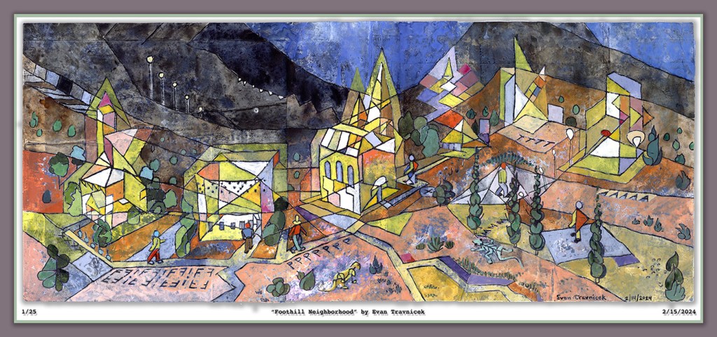
Foothill Neighborhood

Original mixed media watercolor on homemade paper collage surface

24” x 10”

This image is digitally mounted

Gradients and progressions stand out in particular to me currently. The illusory creation of space using delineated gradients and progressions will never cease to repel and fascinate me in cycles of disgust and redemption. I get disgusted by the limitations of two dimensions to work with in attempting to suggest dimensions past the third. But I then get fascinated by the possibility of successfully visually communicating dimensions past the third utilizing only the surface of a two dimensional plane. 

The simultaneity is already accomplished on a two dimensional surface because you don’t see the eventful sequences of times I built up the image you’re looking at. You just see it all at once. This instantaneous production reflected in your mind is a doorway to other dimensions. 

This mixed media watercolor painting is painted on glued together pieces of paper, pages from magazines, and printouts. Before drawing the linear composition, in which I filled in the spaces with watercolors, I washed the surface with a diluted primer paint so that the images and text from the collaged surface would show through to the eye, hence subtly emphasizing the notion of layers built up through sessions of work and time. I used variations of the color yellow to fill the spaces of the buildings because yellow is a bright, warm, outstanding color to use against a more neutral background. 

I intentionally made a progression from light to dark with the lines dividing the landscape from foreground to background, and then the sky. The sky is an evening or early morning dark blue. I wanted to convey the idea of a staff or lines on a sheet of musical notes. The staff is the hilly lines of the landscape and the notes are the buildings and the characters walking around on the paths. Hence my joy of capturing the illusion of space with abstracted lines, shapes, and colors. 

Evan Travnicek

Leave a comment

June 25, 2024 · 4:51 am

W.E.F.U. Ough Ough (original)

Recently, I’ve been thinking a lot about the illusory nature of art. Also the broad application of art as used by the human species. I’ll be impressionistic with my notation here. I notice things in different fields of study, activity, history, and observation and I connect them together. This is one of my strengths—ideation—as defined by Gallup’s Talent Assessment Test. Being an artist helps me see relationships and connect disparate parts as I highlight and explain the connections.

The Ancient Chinese philosopher of war, Sun Tzu, noted in one of his passages of wisdom “appear weak when you are strong, and appear strong when you are weak.” So, right here, I see the connection between war and art. The connection is that art mimes, imitates, and even mocks reality, and war capitalizes on the mistakes opponents make in assessing the rapidly changing contours of reality. 

The Op Art movement from the 20th century manipulated illusions of perspective and played with tricks of visual perception that created illusions of movement and tension. This movement stemmed from Modern Art in general whose revolution was born in the 19th century with masters like Van Gogh, Gauguin, and Cezanne. More specifically, Op Art seems to have at least been inspired by Hans Hoffman and his ideas about intervals of tension between shapes and colors as they “stacked” upon each other on a two dimensional surface. 

Collectively, we have taken illusion to an entirely new universe called the cyber domain, which adds a dimension that both destroys and accelerates creativity. The amount of diversion found in the galaxies of clickbait and casino modeled slot machine social media destroys creativity in my opinion. But this is all due to the predation on the weaknesses of human passions and lack of discipline training. Luckily, with the artist who has a tenacious vision, these time consuming, life wasting passions are cast aside for self transfixing creative endeavors. 

In my piece that I present to you presently in your handheld or home computer world, I suggest nascently what I described in the previous paragraphs. I’m creating tension for the eye between the red and green colors used for the left and right sides of the picture. I also employ illusions and distortions of perspective with the roughly drawn circuit like lines encompassing and networking the shapes. The shapes look like electrical tops spinning remotely by wi-fi controllers on a split tabletop. I intentionally added the misprints, smudges, and ink debris to the surface to give it a slightly uncalibrated early 20th century printmaking machine character. 

The media used are colored pencil, Schneider pens, ballpoint pens, oil transfer printing, gauche, and water discolored with old bits of India ink and charcoal. The title, W.E.F.U. Ough Ough, seems to suggest world economic fuck off, off, off (as in, someone coughing). 

Leave a comment

January 14, 2024 · 2:40 am

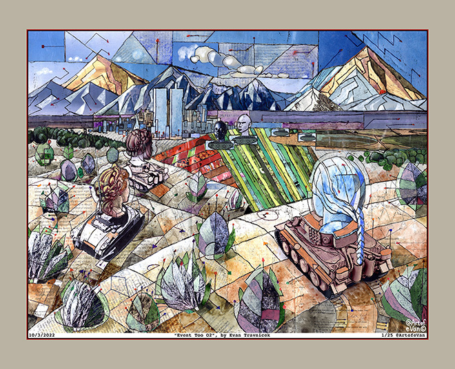
Event Too O2 (original)

Event Too O2 (original)
Image derived from mixed media on paper
Standard print size: 32 x 26 inches
Contact artofevan@hotmail.com for interest

This piece is inspired by the fake news industry, which really took hold after the Telecommunications Act in 1996 signed by Bill Clinton into law. Basically corporate media lobbies secured the First Amendment for themselves and allowed mergers to consolidate corporate media into now just six major corporations. This piece is also inspired by Deleuze and Gauttari’s Anti-Oedipus, which takes an schizophrenic conception of reality based on the basic motive of desire. A third concept I wanted to illustrate here is the concept of approximation as I express it in my collage forms of art. I’m also reminded of that scene from Pulp Fiction where the agent is telling the two main characters what to do to cover up a murder scene. A huge credit goes to Immanuel Kant and what I learned about his philosophy centering on perception, a major philosophy from which contemporary cognitive psychology derives its concepts. 

The concept of approximation is expressed in this piece by my connection of disparate realities gathered together from different magazine sources and cutting out pieces from pages for usage in collage work. I put all the pieces together here in this landscape so that they’re seamless enough to pass as unnoticed (hopefully), but I’m emphasizing the disparate realities in hopes of creating an entertaining and enjoyable work of art for my audience. This associates with William S. Burroughs’ cut up technique, which associates with the media / film industry’s regular profession of editing and recombining clips and scenes so as to tell a story to audiences. It’s like they “make” anachronisms and turn them into linear stories.

I’m definitely inspired by cubist concepts of showing viewers different angles of view simultaneously of objects or scenes here. The grids of contours and lines crossing each other and ending with colored arrows and dots symbolize the often confused, fear-based, misleading directions that media tell people and society to go in. This is why I think of Anti-Oedipus by Deleuze and Gauttari. They discuss schizophrenia in that book as a mass of undifferentiated confusion, like found in nature. They also wrote about the use of things that don’t work, that are purposeless, and that break down in society as serving other purposes. 

I think of French philosopher Baudrillard’s concepts of signs and symbols in society, which frequently have no intrinsic value in themselves, but, because they are associated with societally accepted symbols and avatars of value, they then possess value in themselves, albeit as near holograms or illusions parasitizing from things of real value, potentially distracting audiences from things of real value and redirecting attentions to things of false value. Perhaps the collection and assimilation of many valueless items here in this collage build up into a gestalt of something that possesses value, which work synergistically to create something even greater than the sum of the items.

The title Event Too O2 associates with the historical Event 201, at which the world of western elites gathered together in 2019 to play out and discuss a hypothetical pandemic a year before the real pandemic took place. I feel that the confusion of conflating the pandemic with supposed manmade climate change, along with societal disparities among the different classes that politicians exploit with heart deceiving lies is sufficiently displayed here in this illustration with a kind of surrealistic madness as female heads on tanks (talking heads of the corporate media military industrial complex) battle it out as spectacles on manufactured landscapes for listeners and viewers to to come to conclusions approved of by the ruling classes. 

Leave a comment

October 6, 2022 · 12:17 am

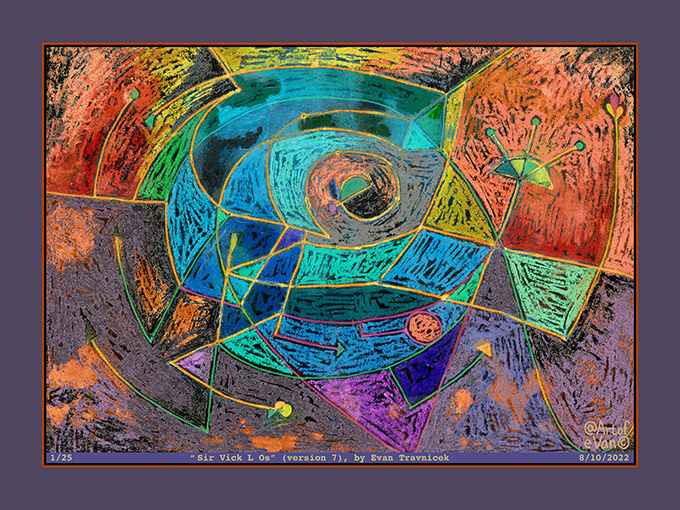
Sir Vick L Os (version 7)

Sir Vick L Os (version 7)
Image derived from mixed/digital media
Standard print size: 32 x 24 inches
Contact artofevan@hotmail.com for interest

I titled this one Sir Vick L Os. I’m sure your inquisitive mind will figure out the Phoenician phake nooz. Geek beyond geek and squeak past squeak. The original drawing is of different colors than this variation. I thought I’d park my attention on this variation and write a li’l randomness about it for a blog.

I recently got some soft oil pastels because I wanted to experiment combining drawings using them with ink pens and washes. So that’s what I did with the original drawing of this piece. The original is drawn on a 7.5 x 10 inch piece of paper. The varied prints of it, manipulated in photoshop, can be of larger sizes. For economic reasons, I like to stick to the standard sizes so I can frame them more expediently.

Leave a comment

August 11, 2022 · 3:02 am

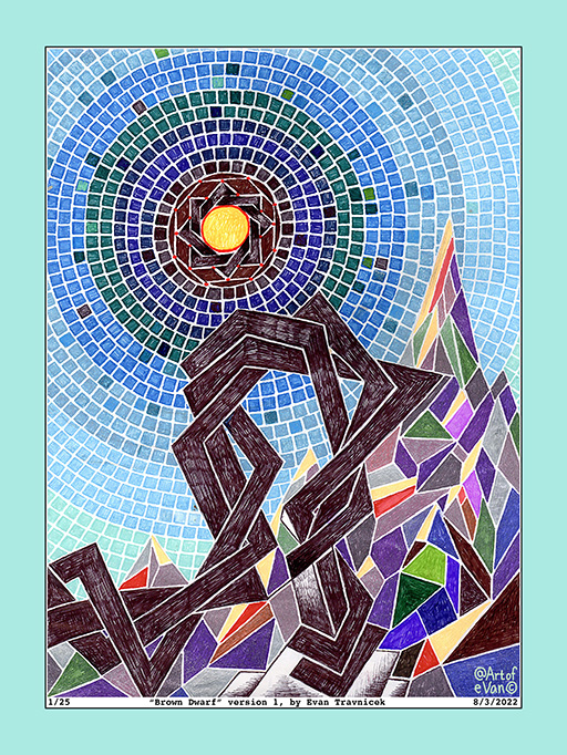
Brown Dwarf (version 1)

Title: Brown Dwarf (version 1)
Media: gel and ballpoint pens on paper
Original drawing: 8 x 11 inches
Print: 24 x 32 inches
Contact: artofevan@hotmail.com

At first, I was thinking of titling this piece Twisted Mountain because of the twisting formation I drew in the foreground. The idea here grew from the Rub el Hizb form I drew at the beginning of this drawing. Rub el Hizb is an Islamic star, it’s an eight pointed star, as opposed to the six pointed star of the Star of David. I just like the shape of it. It reminds me of a mathematical attempt to estimate Pi, the circumference of a circle, and represent it as a finite number.

The overlapping squares make me think of frames, as in picture frames. Frames attempt to capture beauty, or a thing of interest, for an artist and his or her audiences. It’s like the light of this star is being bound by a limiting frame. I drew some parallelogram mosaic pieces surrounding the black frame holding the star bound in its place in the sky.

After making these observations, I decided to title this piece Brown Dwarf. I remembered from an astronomy class at RCC that there are stars called brown dwarfs, which are astronomical bodies that are between planets and stars. So they’re becoming stars. Jupiter is considered a potential star, but both brown dwarf stars and Jupiter are not massive enough to sustain the nuclear fusion that is necessary to turn hydrogen into helium at their cores.

This drawing is composed of ballpoint, and gel pens as media that I used to draw on paper media. It took me a longer time to complete because drawing each mosaic square with these pens was a patient and extensive process. If you are interested in the original drawing, or if you are interested in acquisitioning a high quality, ltd edition print of it, please email me at artofevan@hotmail.com. The print edition of this piece is limited to 25.

Leave a comment

August 4, 2022 · 3:01 am

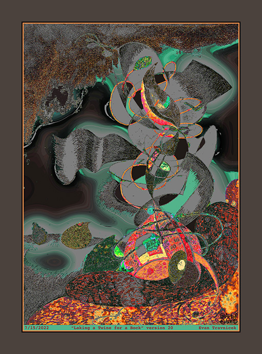
Laking a Twine for a Bock (version 20)

Media: Digital print on paper
Limited edition print of 25
Dimensions: 30 inches by 24 inches
Price framed: $500.00
Price non-framed: $100.00
(Shipping included in price)

I thought I made up the word “bock“, which is included in the title for this piece. But then I searched for the word upon a suspicion that it might be an obscure word not commonly used. Sure enough, it is an actual word. It’s a dark lager beer with a high alcohol content, which is made in the Fall and drunk in the Spring. This just added more interesting character to the story behind the title I used. 

It looks like a murky, smokey phenomenon, for the center of interest in this image, in an underground cavern on an alien moon. The smokey or gray parts look like halos, adding a mysterious spooky quality to them. Like they are the ectoplasm from supernatural activity. 

It’s titled Laking a Twine for a Bock. I changed some letters and words in the expression Paul Klee used “taking a line for a walk” when he summarized what he did when he made art. As I mentioned, this piece looks like its an abstract scape of an underground cavern, so there is what looks like a pool of molten lava in the foreground to me. The pool of molten lava associates with the word in the title “lake.” This image was derived from a physical drawing I made with pens, markers, and paint that had almost nothing to do with this current digital incarnation. That’s why this one is “version 20.” I made 19 prior versions. 

Twine associates with the word “line” and both of these things can be used to wind up in loops or other shapes. The fact that the illustration has a dark theme to it associates with the word “bock”, which means dark beer. I made the drawing neither in the Spring nor the Fall, but I feel it still can be visually consumed for those who have a taste for this form of edification. 

I remember seeing a science fiction novel laying around the house when I was a kid about some kind of intelligent lifeforms that live on the surface of a star. I couldn’t remember the name of that novel, nor who the author was. Neither could my dad when I asked him about it. So I decided to put ye olde SEO to work on Google to see what popped up. After a few rewordings, I found a novel called Dragon’s Egg, by Robert L. Forward. I realized that this is the novel that I remember from childhood because it’s about intelligent creatures the size of sesame seeds who live life at a pace of a million times faster than humans on a neutron star with a gravity of 67 billion times more than Earth. Humorously, the creatures are called “cheela.” Cheelas on Earth are Indian pancakes. 

I mention that novel because it’s always been an inspiration lingering in the back of my head of intelligent lifeforms that don’t necessarily take the humanoid form, but still possess consciously intelligent organizing powers and abilities. That’s what I think of when I look at this artwork. I also think of Paul Klee’s puppets and dolls

In this image, I’m trying to visualize characterized organizing functions of intelligences other than human, which is rather difficult to do because most people have little to no interest in anything nonhuman. So I’m trying to make them human related in the form of art so as to establish connections with the imagination and unconscious mind more than the daily drag of basic survivalism. This segues into Carl Jung‘s idea of the unconscious mind, and Richard Schwartz‘s concept of parts in psychology to me because the parts Schwartz describes composing the human psyche are sometimes “mute” or they don’t communicate by words, but they are still there.

Opening up this doorway leads to shamanism I’ve found, which starts with Jung’s concept of the Active Imagination, which actually is a book about the topic that he wrote. Other ideas come to mind, such as The Trickster, as described by Joseph Campbell, and his research into ancient myths. 

Leave a comment

July 15, 2022 · 10:55 pm