Synthesized Judgement (October 22nd, 2025), by Evan Travnicek. Mixed media on paper. Dimensions: 10.5″ x 17.5″
Behind not caring, there are layers of care. The ballerina’s back is faced towards the viewer as she faces an audience in her world. I didn’t consciously plan this piece. It just happened as I successively selected cutouts from magazines that I cut out. It isn’t exactly William S. Burroughs’ cutup technique to poke into the unknown universe for inspiration because I allowed my conscious self to be a main part in the creative process. My muse guided me.
This piece was me positively smashing through another long creative block. Creatively working through the vicissitudes of life, mean people, and one’s own unseen shadow can be a route to more creativity and growth. It looks like the ballerina is flipping off whoever is to her left as she walks forward. The manufactured flower is completely turned away from the ballerina. I wasn’t thinking about these psychological things when I was making the piece.
The perspective leading off into an unseen horizon lining the top background of this illustration unifies the divergences in the foreground, thus suggesting peace. I created a major theme of stability because of the dominant horizontal lines composing the image, but inside that stability are imperfections creating dynamic qualities that cause interest for the viewer.
I feel this is the most successful formal piece I have made since Foothill Neighborhood because I incorporated cutouts, acrylic washes, pen and ink, gauche, watercolor, and oil paint based transfer drawing techniques. This process used to be new to me, so I didn’t feel like I had a handle on it, but with this piece, I feel more confident in how I handled its outcome.
I titled this piece Synthesized Judgement because I’ve been re-reading The Critique of Pure Reason by Immanuel Kant lately, and he wrote about how our minds synthesize our worlds and the contents of our minds into a synthetic unity so that we understand things in an orderly way better. I took a creative route to illustrate what our minds do with this image because of the cutouts from magazines, the lines defining objects, people, and boundaries, and the colors adding degrees of intensity for character and variation.
Original mixed media watercolor on homemade paper collage surface
24” x 10”
This image is digitally mounted
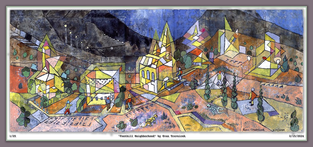
They look like robots walking around in the foothills of a southwestern landscape. The little characters on the paths look like those characters in Oskar Schlemmer’s Triadisches Ballet. This ballet is an inspiration for this piece. That, and, of course, the Bauhaus school of art and design. I have been reading Paul Klee’s volume one book titled The Thinking Eye, which goes into detail about his thought processes and theories behind his abstract art. I’ve learned a lot so far about space, line, shape, and color.
Gradients and progressions stand out in particular to me currently. The illusory creation of space using delineated gradients and progressions will never cease to repel and fascinate me in cycles of disgust and redemption. I get disgusted by the limitations of two dimensions to work with in attempting to suggest dimensions past the third. But I then get fascinated by the possibility of successfully visually communicating dimensions past the third utilizing only the surface of a two dimensional plane.
The simultaneity is already accomplished on a two dimensional surface because you don’t see the eventful sequences of times I built up the image you’re looking at. You just see it all at once. This instantaneous production reflected in your mind is a doorway to other dimensions.
This mixed media watercolor painting is painted on glued together pieces of paper, pages from magazines, and printouts. Before drawing the linear composition, in which I filled in the spaces with watercolors, I washed the surface with a diluted primer paint so that the images and text from the collaged surface would show through to the eye, hence subtly emphasizing the notion of layers built up through sessions of work and time. I used variations of the color yellow to fill the spaces of the buildings because yellow is a bright, warm, outstanding color to use against a more neutral background.
I intentionally made a progression from light to dark with the lines dividing the landscape from foreground to background, and then the sky. The sky is an evening or early morning dark blue. I wanted to convey the idea of a staff or lines on a sheet of musical notes. The staff is the hilly lines of the landscape and the notes are the buildings and the characters walking around on the paths. Hence my joy of capturing the illusion of space with abstracted lines, shapes, and colors.
I feel like there is so much more that can be done with cubism, and optical illusions. It seems like artists of the 20th century—in western worlds at least—allowed themselves to get lazy on creativity, imagination, and innovation. As it always seems to throughout the ages, I think art got institutionalized by elite tastes in the 20th century up to now here in the 21st century.
I use the term “elite tastes” because it’s more accurate than the 19th century term “bourgeois tastes.” The term bourgeois comes from Marxism which negatively frames entrepreneurs, small business owners, and non-elite class libertarians. Most of us alive today have grown up in a world that has been manufactured by Marxist oriented agendas because of an elite, government, corporate, political, ruling class. I say that because of the current, primary, global monetary system that has evolved from the Federal Reserve.
The Federal Reserve was created because of a few destabilizing events that occurred a few years after the beginning of the 20th century, one of which was the Panic of 1907 from which culminated because of an earthquake that occurred in San Francisco in 1906. Deposits were unavailable for weeks while money was needed for an economic boom.
The Federal Reserve was formed in 1913 by bankers, headed by J.P. Morgan, and political authorities in the United States Senate at the time to remedy businesses and shortages and lack of access to money. This is why I say that it was the first major tool of socialism for elites, bankers, politicians, and other titans of the time. It was formed to bail out banks, industries, and commerce. While it helped to stabilize the economy for smaller businesses too, its main purpose was to create an institution—a socialized insurance policy—against failure for elites.
So this has been going on for longer than a hundred years here in America, creating a permanent class of politicians who merely revolve through doors of banking, politicking, war-making, and sausage making. In summary, we have had a class of royalty under “capitalist” monikers, something the founders of the US fought to free itself from British Royal rule.
I wrote the last three paragraphs to set the context in which art in America has developed. Artists have never been narrated as being titans of finance, or savvy businessmen. Artists have always been subordinate to elite, ruling classes, whether if it was being a scribe in ancient Egypt, a court painter in Victorian Europe, or an intelligence-propaganda asset of the political tyranny of the CIA.
It’s especially hard for artists to get a foot in the world today because we aren’t creating anything excessively dopamine stimulating, such as porn (I realize some are); anything convenient and immediately gratifying like a sugar-carb permeated snack; or socially useful like an iPhone, which provides a handheld desktop for an endless amount of entertainment, guidance, media-making and editing, business, or social media apps.
In order for artists in America to really succeed with a self-sustaining, independence supporting income, we have to be connected to and socially pleasing to wealthy collectors, politicians, bankers, gallery owners, most all of whom are left-leaning. I note here a phenomenon of right-leaning politics to be less imaginative, daring, and innovative in the arts. I think that’s because conservatives are naturally rule and law abiding, whereas liberals tend to be more free with breaking rules.
I conclude this blog by saying the cliche that only one percent of artists “make it” with their careers as artists because of this highly selective, socialized, hand-picked world of western art. Most everyone is in debt to the debt making machine of Washington and its magical acts of fiduciary conned-fidence. At its core, money is what really, really matters to most people. And art is a fleeting oddity that passes by one’s scrolling through digital media on a handheld device. It’s hardly even an entertaining pleasure to most people anymore.
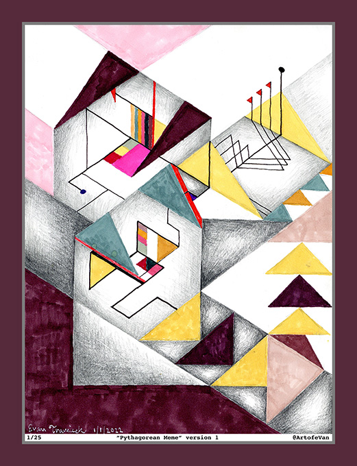
I titled this piece Pythagorean Meme because of its geometric shapes. They look like abstract housing structures on a landscape. The idea echoes the Bauhaus architectural school as well as mortgages for housing and the FDIC. I used the word meme in the title because I didn’t want to use the word dream. Dream is overly used in my opinion, but it still communicates so much about our illusion based world that’s relevant. So I sublimated it with an associated rhyming word.
As you may know, I’ve been fascinated with optical illusion art for the last few years at least. I’ve always loved the Bauhaus artists and philosophies of art. The word bauhaus has meaning to me because it contains the word house in its German form, and housing, home, security, family, mortgaging, financing, etc. are all associated with it. Art is housed by housing, shelter, and environmentally protecting structures. This recent style of art is enabling me to explore more of that and expand upon it with my own vision. Theo Van Doesburg is an inspiration, as well as Oscar Reutersvard.
This domain is finally paid for, so I might as well use it! Here is a painting I completed a few days ago. It’s derived from an image I flipped left to right and then inverted the colors. The model’s skin is therefore blue here. I wanted to create that effect. Since the world adjacent to ours, in this peculiar hyperdimension of fake time, is a sort of an inversion that mocks our world because it doesn’t have to abide by our rules, I gave it a spooky ghostly quality.
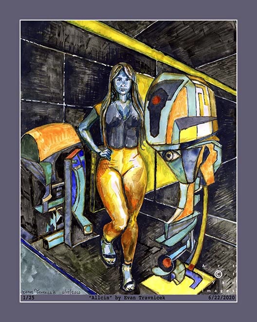
I love drawing models. I encourage other artists to join life drawing classes. So much skill and keenness of perception is gained from hours of practice drawing and painting the human figure. I titled this piece Allicin as allusion to the property found in garlic. Garlic is a smelly spice or herb to eat, but it’s health benefits excel past many other health foods. For example, Allicin is known to significantly reduce hypertension for people with high blood pressure. Allicin is my model for relaxing me. I love her.
Since Instagram is continuing to insist on being a major ____sucker in suppressing me and my art page there, I’m going to post here again like I originally intended. Since Facebook took over Instagram, it has turned from the hottest social media into a basket case bottom dweller. Everyone I show this piece to loves it and says it should sell for thousands in a gallery. Too bad most art galleries are also vampiric ____suckers as well. Thanks for your support, those of you who aren’t fair weather flaky ghosts blown by the wafts of fake social media winds.
I captured this selection of a couple drawings I layered together because it emphasized this concept of letting the forces of nature do their things as I draw and create. Media have minds of their own often times I’ve noticed over the years. It first started with this notion of working with works of art I wasn’t satisfied with and not giving up and loving them anyway. Then it developed into this idea of capitalizing on mistakes as abstract expressionists showed me. Finally I realized I am a part of nature and I act upon and within nature as a natural force myself, so art just became this flow of letting all these forces of nature interact with each other and selecting material that gave me satisfaction. And so I share this satisfaction.
It’s called Pastel Ash because I used pastels to make strikes around the macaroni shape. I digitally amalgamated another drawing I made into this piece. It looks like some weathered trash stuck together you might find by the side of the road. Beside your fallible psychological analysis, I encourage you to find beauty in trash laying around. Maybe you could pick it up and use it for something, like a work of art.
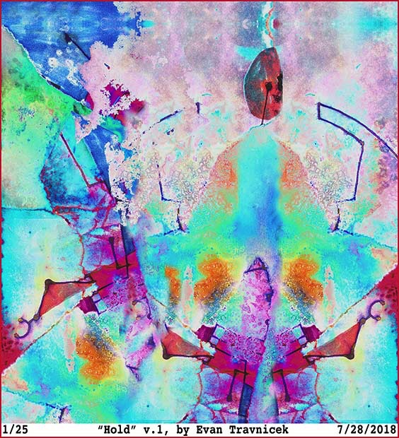
I am going to share this piece here for the first time I’ve shared on WordPress for a long time. I call it Hold. It’s a digital manipulation of a mixed media collage drawing I did a couple years ago. I like the endless multiple meanings found in the word hold. The complete abstract character of it gives it even more liberation with meaning and enables you to create your own story of it for yourself.
It looks like a boat. It looks like a water strider—those bugs I used to see skate around on the surfaces of ditch water after big rainstorms in Nebraska. It also makes me think of the Mahayana and Hinayana, which are boats, or vehicles, figuratively, in Buddhist epistemology. It looks like the boat could be seen as traveling across a large body of water on the surface of a planet. You can see the curved horizon of this planet on the right side of the picture. I like how the boat appears closely to you as the viewer, but the planet appears as if it’s tens of thousands of miles away. It gives it the sense of multiple points of view—an expanded sense of perception—as may be experienced in dreams while observing something.
When a string on a cello or a guitar is plucked, it vibrates back and forth in order to produce the sound it makes. The string actually moves in a circular motion, like a jump rope might. I have noticed that vibrating strings make the shape of a boat or ship between the insertion points. Physicists have taught us that matter is really just non-physical energy at sub-atomic levels. Some theorize that matter is fundamentally made of superstrings as theorized about in superstring theory. Thus all matter is just countless superstrings harmonizing and cacophanizing everywhere.
In Judeo-Christian literature, you can read about Noah’s Ark, and the story about the world flooding due to God’s wrath. I don’t want to try to prove the veracity of this story here, but I do want to make associations and correlations for artistic and intellectual purposes. The bow of a ship is designed to “cut” through water with the least amount of resistance as possible. Thus they have narrow wedged rostrums. The idea of the least amount of resistance is also found in Taoism, as Lao Tzu wrote that water seeks the path of least resistance as it travels down the folds, crevices, and foothills of mountains.
The idea I want to emphasize here is “the least amount of resistance as possible.” This is actually a strategy that applies to people—us—manipulating and managing matter and life in general with the best outcomes in mind. For example, when I enter into a new social situation, I like to scope and gauge things before I start accepting more responsibility, management, and control. It’s my method—one of several—of attempting to create harmony.
Getting more abstract here, I imagine that certain combinations of sounds, melodies, and jingles can act as codes in environments so as to produce certain effects. Codes, perhaps, to open doors or to lock them. Basically, waves of all kinds—physical or non-physical—are patterns, and if they are harmonious with other wave patterns, then I believe they have to potential to create beneficial situations. Beneficial to knowledgeable users of course.
Specifications:
Title: Staggering Stride (version 1)
Source mediums: Water-based ink, alcohol-based marker, pencil, water, and rubbing alcohol on paper, manipulated digitally with Photoshop
Print medium: Hewlett Packard printer ink from Hewlett Packard DesignJet Z2100 printer on Hewlett Packard print paper (Note: print can be made with archival paper and printer if requested)
This digital illustration here is derived from two different drawings I executed on paper a couple of years ago. That was when I was fresh out of school having graduated with a degree in Health Information Technology. It was also after I had just attained my credential as a Registered Health Information Technician. I felt so proud of myself for accomplishing what I felt were these highlights of my life.
I titled this piece The Heart of a Habit. The two drawings I used in layering it together were Topology of Hearts, Hands, and Minds, and Happy Zephyrs. I created this digital amalgamation back in February, 2016. For some reason, I stopped making these mathematically approximated tessellations. You may see some influence of M.C. Escher’s work here. I started becoming more interested in liquid ambiences from applying water to water-based pen work, and rubbing alcohol to professional marker applications.
I’ve been trying to resolve a conflict for a long time with my art, and it keeps on morphing into my fascination with styles of art that are polarized. So, for example, Escher’s work is mathematically refined, and perspicuous, but Kandinsky’s work is the opposite, and, in some cases, is quite amorphic. I truly enjoy both styles of art: Optical illusion art, and abstract art. I’d like to make a bridge between Optical-type art, and purely Abstract art, which, to me, would be the ultimate optical-psychological form of art… at least at this point in time.
A habit is often unquestioned, and, like a heart, is hidden. One can only hear the beat of a heart if one listens closely. I make this comparison of a heart to a habit because, if one observes with curiosity, and without criticism, one often finds that a habit is used to fend off some unwanted circumstance or feeling. The word habit rhymes with the word rabbit, and rabbits run from danger. A rabbit’s heart races rapidly as it flees quickly from danger, such as a predator.
My art can be seen as a habit with which I use to escape the harsh realities of the world. I don’t think it needs to be pathologized however. I think it’s a constructive outlet for all the frustrations I’ve encountered in the medical and business fields. I’ve been making art since I was a baby, so it’s pointless to try to dismiss it as a neurosis. I am glad my art seems to defy George Orwell’s postulation that “all art is propaganda.” My art has become so abstract at this point that I feel it successfully escapes the orbit of politics. I just haven’t imagined a truly satirical, powerful, salient political art idea to illustrate for a few years now.
Specifications:
Title: The Heart of a Habit (version 2)
Source mediums: Water-based ink, on paper, manipulated digitally with filters
Print medium: Hewlett Packard printer ink from Hewlett Packard DesignJet Z2100 printer on Hewlett Packard print paper (Note: print can be made with archival paper and printer if requested)


 I captured this selection of a couple drawings I layered together because it emphasized this concept of letting the forces of nature do their things as I draw and create. Media have minds of their own often times I’ve noticed over the years. It first started with this notion of working with works of art I wasn’t satisfied with and not giving up and loving them anyway. Then it developed into this idea of capitalizing on mistakes as abstract expressionists showed me. Finally I realized I am a part of nature and I act upon and within nature as a natural force myself, so art just became this flow of letting all these forces of nature interact with each other and selecting material that gave me satisfaction. And so I share this satisfaction.
 It’s called Pastel Ash because I used pastels to make strikes around the macaroni shape. I digitally amalgamated another drawing I made into this piece. It looks like some weathered trash stuck together you might find by the side of the road. Beside your fallible psychological analysis, I encourage you to find beauty in trash laying around. Maybe you could pick it up and use it for something, like a work of art.