Tag Archives: Idea

Five Corner Room (original)

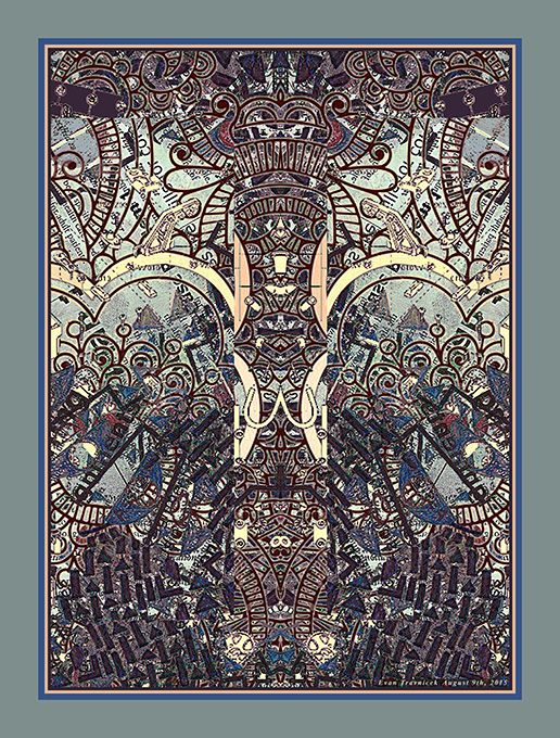
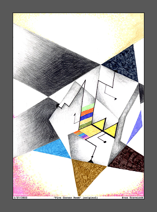
I titled this one Five Corner Room. I’m playing with the optical illusions of dimensions again here. It’s an idea that satisfies my impossibly thinking mind. You want to know what I think. Well, here it is. I also enjoy seeing landscapes of translucency in my mind. I’m trying to think back to when I first started that idea. It goes back to when I started making plans to paint a painting I titled Paradigm Shift in 2001.

I was very inspired by Paul Klee, the Swiss artist from the 20th century then, as I still am. I’d always liked how he created broad planes of color enclosed by geometric contours of lines of oil from the transfer drawing techniques he used. I made this idea back then called the Word World, a world in which words versed the planes of objects. I thought of it like a panorama through using the third dimension to illustrate the idea. In my mind, words could be placed behind words for associations and layers of awareness and attention.

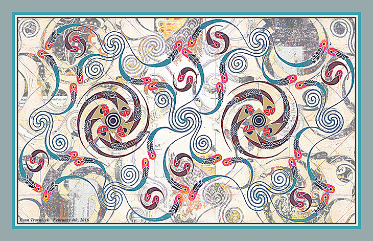
This work is a continuation with the current theme presented in the blog post previous to this one with the peice therein titled Pythagorean Meme. I mentioned the painting I painted titled Paradigm Shift because this current theme bears a kinship with that earlier expression of mine when I was producing larger works in oil and mixed media on canvas. I plan on posting that painting here on WordPress, and/or my Google blogspot. I found that I posted it to my Twitter account in 2012.

For this recent work, I’ve cut out applying water and rubbing alcohol as washes after drawing images. While I believe that process is an important step to my current artworks, I needed to try cutting that step out in order to simplify things for myself. It’s just a basic concept that the more steps one must take to get a desired result, the more likely frustration can corrupt the process. Assimilating collage work into my illustrations is another step that causes more labor. Nevertheless, the more variables an artist introduces into his or her work processes, the more surprises and new innovations are likely. 

Leave a comment

January 28, 2022 · 5:36 am

Mr. Hearthead

This isn’t a final piece here. It’s just one of the last sketch drawings I made in my recently finished sketch journal titled Art Aches. I post it here to relieve the stress that the unfree, algorithmically discriminating Instagram creates for artists it doesn’t like. Mr Hearthead has unconscious relations to two other characters who were banished to the shadows of Instagram called Iggy Noory and Spallison Sparker. WordPress is treating the Art of eVan better lately, so I thought I’d see how it treats Mr Hearthead. Mr Hearthead is an unconscious character who is derived from the heart and the head.

Leave a comment

February 11, 2020 · 10:15 pm

Blue Heart Mountain

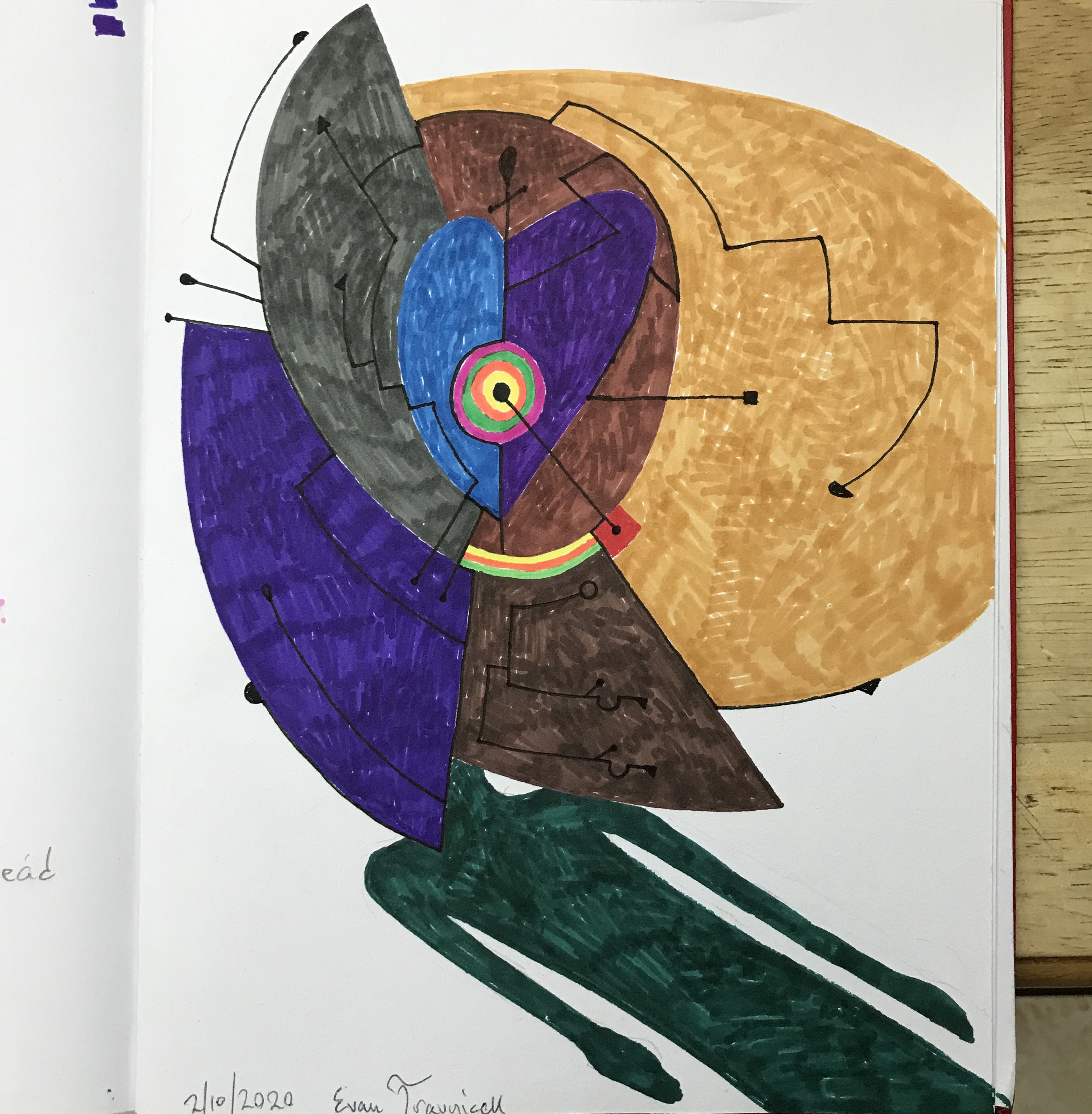
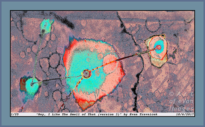
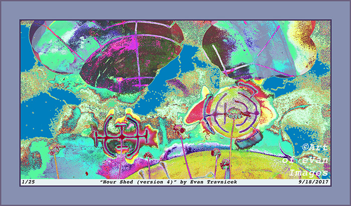
I captured this selection of a couple drawings I layered together because it emphasized this concept of letting the forces of nature do their things as I draw and create. Media have minds of their own often times I’ve noticed over the years. It first started with this notion of working with works of art I wasn’t satisfied with and not giving up and loving them anyway. Then it developed into this idea of capitalizing on mistakes as abstract expressionists showed me. Finally I realized I am a part of nature and I act upon and within nature as a natural force myself, so art just became this flow of letting all these forces of nature interact with each other and selecting material that gave me satisfaction. And so I share this satisfaction.

Leave a comment

January 15, 2020 · 8:37 pm

The Heart of a Habit (version 5)

TheHeartOfAHabit5ematted

This digital illustration here is derived from two different drawings I executed on paper a couple of years ago. That was when I was fresh out of school having graduated with a degree in Health Information Technology. It was also after I had just attained my credential as a Registered Health Information Technician. I felt so proud of myself for accomplishing what I felt were these highlights of my life.

I titled this piece The Heart of a Habit. The two drawings I used in layering it together were Topology of Hearts, Hands, and Minds, and Happy Zephyrs. I created this digital amalgamation back in February, 2016. For some reason, I stopped making these mathematically approximated tessellations. You may see some influence of M.C. Escher’s work here. I started becoming more interested in liquid ambiences from applying water to water-based pen work, and rubbing alcohol to professional marker applications.

I’ve been trying to resolve a conflict for a long time with my art, and it keeps on morphing into my fascination with styles of art that are polarized. So, for example, Escher’s work is mathematically refined, and perspicuous, but Kandinsky’s work is the opposite, and, in some cases, is quite amorphic. I truly enjoy both styles of art: Optical illusion art, and abstract art. I’d like to make a bridge between Optical-type art, and purely Abstract art, which, to me, would be the ultimate optical-psychological form of art… at least at this point in time.

A habit is often unquestioned, and, like a heart, is hidden. One can only hear the beat of a heart if one listens closely. I make this comparison of a heart to a habit because, if one observes with curiosity, and without criticism, one often finds that a habit is used to fend off some unwanted circumstance or feeling. The word habit rhymes with the word rabbit, and rabbits run from danger. A rabbit’s heart races rapidly as it flees quickly from danger, such as a predator.

My art can be seen as a habit with which I use to escape the harsh realities of the world. I don’t think it needs to be pathologized however. I think it’s a constructive outlet for all the frustrations I’ve encountered in the medical and business fields. I’ve been making art since I was a baby, so it’s pointless to try to dismiss it as a neurosis. I am glad my art seems to defy George Orwell’s postulation that “all art is propaganda.” My art has become so abstract at this point that I feel it successfully escapes the orbit of politics. I just haven’t imagined a truly satirical, powerful, salient political art idea to illustrate for a few years now.


Specifications:

Title: The Heart of a Habit (version 2)

Source mediums: Water-based ink, on paper, manipulated digitally with filters

Print medium: Hewlett Packard printer ink from Hewlett Packard DesignJet Z2100 printer on Hewlett Packard print paper (Note: print can be made with archival paper and printer if requested)

Digital manipulation completed: 1/22/2016

Dimensions of print: 30 inches by 30 inches

Number of limited edition prints: 25

Contact me: artofevan@hotmail.com

Leave a comment

January 23, 2018 · 9:01 am

Flowing Productivity (version 2)

FlowingProductivity2ematted

With this piece, I’m dealing with motion and complementary colors, such as the red and the green. A certain degree of depth is expressed as well. The intent is whim, spontaneity, and loose, flowing organic structures. I’m evoking the spirit of nature to imitate me as I attempt to imitate nature.

Lots of media came together to experience this piece. I used brush, watercolor paint, pen ink, India ink, water, lacquer thinner, rubbing alcohol, plant shrubs, paper, oil pastel, and digital editing to make it all happen. The left leaning flow of the picture, overall, is what I felt most essentially characterized this image.

The hybridized illustration you see here is a portion of a drawing I made a few days ago called Vaporous X-Ray. I captured a photo of that drawing on my cell phone, and posted it to my Instagram account. I’ve been very lazy with regard to keeping up with my WordPress blog and my Facebook page because of the amount of time, mental labor, and effort it takes me to keep all of my profiles online up to date.

It takes a lot of time, energy, space, effort, labor, materials, supplies, and equipment to keep my productivity afloat. It’s not a matter of me not working on anything. In fact, I just went through a pile of drawings I’ve made in the last couple of years this evening, and a stack of sketchbooks completely full of ideas I record regularly. There’s no way I’ll ever quit making art.

My art will one day be the public’s, or in some private collection, or even yours. I ask you to help support me and my creative efforts to serve our world better through the communication of images and ideas. Like my page, comment, show your friends and family, and contact me by email to make a purchase of anything you like. Or even hit me up for a commission piece, like a mural, or a portrait or something.

Specifications:

Title: Flowing Productivity (version 2)

Source mediums: Water-based ink, alcohol-based marker altered by lacquer thinner and rubbing alcohol, watercolor paint on paper, combined with digitally scanned organic plant matter

Print medium: Hewlett Packard printer ink from Hewlett Packard DesignJet Z2100 printer on Hewlett Packard print paper (Note: print can be made with archival paper and printer if requested)

Digital manipulation completed: 12/2/2017

Dimensions of print: 27 inches by 27 inches

Number of limited edition prints: 25

Contact me: artofevan@hotmail.com

Leave a comment

December 7, 2017 · 9:11 am

Hey, I Like The Smell of That (version 3)

HeyILikeTheSmellOfThat3ematted

Someone came up to me while I was making this image and smelled like a medicine cabinet. I actually thought “hey, I like the smell of that.” I don’t know what it was. Probably cough syrup or something. I decided to title this image Hey, I Like The Smell of That. For some reason, it makes me think of a person who thinks that in reference to another. 

It looks like there is a cabinet in the background off the the right depicted rather psychedelically, connected by a dot and a line to the large, foreground form. The large foreground form looks like the head of a person. The fact that there is just one dot with a circle around it at the center of the large form makes me think of a cyclops. 

The bigger idea here I suppose is visualizing the act of connecting seemingly disparate ideas, peoples, and events together in the truly nonlinear universe. But of course I could only crudely use linear lines to illustrate the notion of connections. I didn’t use a ruler to draw them though. 

The colors you see in this image here are not the same colors used in the original drawing. The original drawing is “larger” than this one. I titled the original drawing Bear Thread. I selected only a few objects within Bear Thread and made this image. I’m thrilled to make all these different variations from single, original, traditionally created drawings, paintings, and collages. 

I like how, when I start writing about things—anything—art—dreams—whatever, the “ice” melts with regard to the cluelessness I experience before writing. I often can’t come up with a single idea I want to write about in reference to the art I make immediately prior to attempting to write. Perhaps it’s my brain struggling to shift gears; and also the fact that I find myself trying to write at the very end of my day, late at night. Sometimes I just want to write bull-shit, like the mixed nuts with sea salt on them and the gummy bears I just chewed on. I didn’t eat that many, so I don’t feel so thwarted by guilt. I know people will find this paragraph vaguely irritating as a waste of their time, but I needed to write it for the exercise of writer’s block ice-breaking. 

Like medicine, the colors in this image are candy-like. I have found it interesting how medicine and candy have so many similar visual characteristics. I wonder if the pharmaceutical industry intended that. You know, like Skittles, Nyquil, and Desipramine? I guess people like being pleased with the items, UFOs, liquids, and pilly willies they ingest. I’m hoping people also like ingesting my images with their eyes and finding neurological fulfillment therein, or derivatives thereof. 

I can write anything here, and I like that. I don’t want to be limited. That is part of the non-literal message expressed in my work of art here. You see all the forms defying definite boundaries for the most part. I let the splotches, rubbing alcohol dribblings, and ink bleedings flow along paths of their own choosing, though I was the initiator of their expandings, distortings, and explorations. I found the drawing to be exploring itself as I stepped back and observed it at times. 


Specifications:

Title: Hey, I Like The Smell of That (version 3)

Source mediums: Water-based ink, acrylic based ink, oil based ink, alcohol-based marker altered by acetone and rubbing alcohol on paper

Print medium: Hewlett Packard printer ink from Hewlett Packard DesignJet Z2100 printer on Hewlett Packard print paper (Note: print can be made with archival paper and printer if requested)

Digital manipulation completed: 10/6/2017

Dimensions of print: 34 inches by 21 inches

Number of limited edition prints: 25

Contact me: artofevan@hotmail.com

Leave a comment

October 6, 2017 · 9:51 am

Hour Shed (version 4)

HourShed4ematted

I call this one Hour Shed, as in shedding an hour of time. I think of it as an abstract, psychedelic landscape with a warped horizon. A couple of billowing clouds hover overhead, which are more like doorways to other dimensions. I just really have fun scanning drawings I make with mixed media. With the drawing I made for this piece, I used water-based ink pens (a Schneider pen), and alcohol based marker drawn on a small sketchpad. I then applied some water with an excellent flat head paint brush to make the water-based ink bleed. I let that dry, and then applied some ammonia as an experiment to see how the already applied media would interact with it. It didn’t really do much.

I then splashed some lacquer thinner over the surface of the drawing, which made the alcohol based marker bleed, and also the ink from the Schneider pen bled. After that dried, I applied some rubbing alcohol. The results left what I wanted: Discolored, blurred, cloudy, ambient, faded, psychedelic, bled effects.

I’d recently been listening to authors and documentaries discussing the hippie culture in Laurel Canyon during the 1960s. I already knew that the CIA covertly experimented with LSD on people unbeknownst to them. I also knew that the US government really wanted to find a way to divert anti-war protesters from attracting too much attention for being against the Vietnam war. So what I discovered is that the CIA helped to create the hippie counter-culture so as to discredit anti-war protesters and to divert young people into drugs, cheap sex, and other demoralizing activities.

I have always enjoyed abstract and psychedelic art. Much of my inspiration comes from the hippie counter-culture, including a lot of the music produced from that era. It’s just that I now see what purpose that scene served. Today, it’s plain to me that entertainers, artists, actors, and public figures get fame, attention and money because they agree to the CIA’s terms of spreading “American” cultural hegemony across the globe.

It has been known for years now that the American Abstract Expressionist movement was financed and nurtured by the CIA so that America could claim a culture of its own on the world stage. Centralized planners felt that America really had no art or culture up to that point when the Abstract Expressionists were forming, so the CIA decided to create a world stage for them. Again, I’m not repelled by the counter-culture movement of the Abstract Expressionists. I just note that they were allowed to become famous because they had secret state backing.

In my learning and research into art methods, techniques, psychological values, and history, I have come to conclude (perhaps for the time being) that art serves imperial purposes. It is used as propaganda. It entertains, amuses, impresses, catches attention, and thereby communicates messages consciously and unconsciously. An Italian Marxist named Antonio Gramsci called the proliferation of imperial culture, art, and propaganda cultural hegemony. This means that a dominant state—or superpower—superimposes its entertainment industry, such as Hollywood for example, on to subordinate states, thereby achieving a psychological penetration of the collective population.

Specifications:

Title: Hour Shed (version 4)

Source mediums: Water-based ink, alcohol-based marker altered by water, ammonia, lacquer thinner, and rubbing alcohol on paper, digitally combined with organic material

Print medium: Hewlett Packard printer ink from Hewlett Packard DesignJet Z2100 printer on Hewlett Packard print paper (Note: print can be made with archival paper and printer if requested)

Digital manipulation completed: 9/18/2017

Dimensions of print: 30 inches by 16 inches

Number of limited edition prints: 25

Investment of print not framed: $80

Investment of print framed with glass: $400.00 (shipping included)

Contact me: artofevan@hotmail.co

Leave a comment

September 18, 2017 · 9:20 am

Prayer of a Pillar (version 8)

PrayerOfAPillar8ematted

The idea here is a beautified, glorified, abstractified column. It became apparent to me as I was exploring other design configurations. This piece is derived from, believe it or not, Ataraxy (version 1). Of course I combined Ataraxy with a few layers of other material. Another example of that result is the piece I posted here back in August, 2015, called Galactic Template (version 2).

As far as common history is concerned, the architectural usage of columns dates back to ancient Egyptian times of around 3000 BCE. The ancient empire of Egypt is said to have originated in that time period. I only theorize that there could have been great civilizations, not alluded to in contemporary history books, that existed thousands, and perhaps tens of thousands, of years prior to ancient Egypt. Associate professor Robert M. Schoch has done considerable research revealing civilizations our current model of history ignores.

I chose to post this piece now because I had noticed my recent usage of the word “column” in my micro-blogging. My blogging is, of course, influenced heavily by what I notice going on in the world, and by other professional bloggers whose information and insights I value. I like to rely on my intuitive sense of informational flows; one way I do that is by noticing repeating patterns, including words, sounds, and images… even feelings. Perhaps especially feelings, as feelings are the place from which most people make decisions anyway.

A column can define a column in a newspaper, or it can define the architectural noun. To me, a column is a symbol of strength, civilization, calculation, order, governance, continuity, and stability. Perhaps this sense is intended to be communicated by journalists’ official use of columns.

At the bottom left and right of this picture are what appear to be stalks of grass, composed of black mosaic pieces. Or maybe they are skeletal impressions of hands beginning to cup and shroud the base of the column. Anyway, whether if the finger-tips of grass, or the phalanges of hands, they look like they are moving into a praying clasp. Hence, the title for this piece: Prayer of a Pillar.

The metaphorical, amorphic fingers merely suggest the form of hands as if each mosaic piece is obeying the non-physical commands of an unseen field moving them to pray. I’ve seen imaginary depictions of what it looked like in ancient Egyptian buildings and temples, and it appears that Egyptian artisans and their governing priesthoods liked to use bright, bold colors to fill in the shapes, forms, hieroglyphs, and figures engraved on their walls and pillars. So my idea of a column here has a more Eastern and ancient character to it, rather than a Western, colorless, marble quality.

This piece has a lot of detail in it—a quality I wanted to achieve—with an appealing sense of balance and order. As many other pieces of mine, this work looks like it could be a still of a kaleidoscope. I also like to imagine that you are looking through a microscope at an exotic, alien world other than what you might normally see as cells and microscopic debris. After all, one of my original pieces in the Micro-Chimerisms series is titled Microscopic Works of Light.

I may add that the black mosaic phalanges coming up into a prayer formation at the bottom of this illustration can also be seen as the petals of a lotus flower. The lotus flower is an Eastern symbol of enlightenment, as they blossom on the surfaces of muddy bodies of water; from the depths of darkness, illusion, suffering, and mud is born enlightenment. So I’m really combining the Western prayer, the column of strength, and an Eastern symbol of enlightenment here.

These layers of materials, collages, drawings, and texts, along with multiple multi-layered symbols creates an idea I want to communicate to you: That we are multi-dimensional beings who perceive multiple meanings in the vast perceptions we receive and emit everyday.

Leave a comment

May 2, 2016 · 1:13 am

Binarydom (version 9)

IdiosyncraticCouple9ematted

I went through three different names for this picture before I settled on Binarydom. First, I thought Binary Idiom because there are two commensurate pinwheels on either side of the image. I didn’t like that though because I couldn’t settle on whether if there were two idioms or just one divided in itself. Echoes of Hegel’s Unhappy Consciousness can be associated here.

Then I thought of Idiosyncratic Couple as a title, which actually sounds about right to me right now. The central theme that I’m developing here however is one of basic blocks and forces of universe building; or, world creating. The title Idiosyncratic Couple doesn’t completely work as a description for me yet here because the shapes, forms, and movements aren’t evolved to the point of human intelligence and relationships. I am sure many analysts will have fun with my interpretations so far.

I progressed therefore to the idea of calling it Manichaea. Manichaeism was actually an ancient religion founded by an Iranian prophet named Mani in ancient Persia. It’s basic narrative is that we live in a dualistic cosmology of good and evil, light and dark, and so on, resembling the Chinese Ying Yang principle. I gazed into my image and just didn’t see that blatant opposition in it however because the colors on the left and the right of the image are the same—there is no oppositional emphasis. Rather, it seems like more of a harmonious synthesis.

What you may imagine looking at here is two quadrilateral (square) molecules linked up together by ionic bonding. I know that there is no such thing as a square shaped molecule, but I like imagining it as thus in my development of generating imaginary universes. Most molecules usually are hexagonal and pentagonal in structure when studied in diagrams.

I henceforth concluded in titling this piece Binarydom. It’s a kingdom of two molecular worlds bound together in harmony as they travel over the nascent inchoate urges towards clearer definition observed in the background. I drew this drawing with gel and ball-point pens first on blank white paper. I already had some pasted together paper media for future projects, which I scanned into the computer to use for this project.

I made a template of Binarydom with just the white surrounding, excluding the colors and forms, and combined that with the background of pasted together paper media. I feel I merged it all together with a certain degree of success by my standards. I altered the coloring for some of the pisciforms so that their bodies are now a cerulean blue, instead of silver. I originally made their bodies with a silver gel pen. The silver didn’t show up as well as I liked, so I adjusted them to a blue hue.

Leave a comment

February 5, 2016 · 8:19 am

Wrecked Tangles (After the Crash) H1

AfterTheCrashH1ematted

The archaic character you don’t recognize off to the lower right of this image is a character from the Glagolitic alphabet, which represents L in the English language. In my recent fascination with language and math characters from around the world, I have been drawing a few of them that catch my eye. Drawing a character from any alphabet puts its shape into my memory so I can redraw it anew in the future without having to look at it again for reference. In a sense, drawing, painting, and even writing helps me to commit anything to memory; it’s like a mapping process that helps to work out the kinks.

I drew several other letters, numbers, and punctuation marks from the English language to give you a sense of stability as a speaker of this language. While it is not my intention to alienate those of you who speak other languages, I must limit myself mostly to the usage of English when I draw a word in order to be able to explain what my intentions are for using that word in a particular art piece, as I am monolingual.

This image is basically the foundation drawing for Wrecked Tangles (After the Crash) H series. I find the letter H to identify the group it’s in to be quite fitting for it due to the fact that it looks like you are witnessing a three dimensionally imagined black-hole.

What it reminds me of is those explanations astrophysicists sometimes show to describe how a black-hole might look if it were three dimensional. They will place a heavy metal ball on to the surface of a bed, thereby depressing the part of the bed that the ball is placed on. These kinds of explanations of the curvature of space and time with respect to super-heavy objects–like black-holes–are, I feel, the best because they give a simple visual representation that anyone can understand.

I’ve been fascinated by surfaces, mediums, settings, contexts, and textures for a long time now. I’ve pretty much concluded that anything can be a tool or medium to use for artistic purposes. I wanted to reproduce a visualization I had of an information vortex, and express it in a Wrecked Tangles themed style. I have described to you before how you can imagine quilts being landscapes. Wrecked Tangles (After the Crash) H1 is another fulfillment for a variation on that theme.

I’m often amused by how the surface of beds can be used to explain the fabric of space and time, and their fabrics can also be used as surfaces to paint or draw on… that is, if they are prepared properly for that purpose. I find this all amusing because the bed is symbolic of sleep, dreaming, and pleasure. It is a doorway, if you will, for which your imagination can roam through its wildest dreams.

Leave a comment

Filed under Art of eVan