Tag Archives: Drawing

Tom Sawyer (washed) v.10

I titled this piece “Tom Sawyer.” It was a pretty random creation. I just saw some cutout material that I decided to paste on to a piece of paper. I had no conscious idea that the text on the cutout material I discarded from previous works included text about Mark Twain and Tom Sawyer. The character I ended up drawing in this illustration I decided would fit as an abstraction of Tom Sawyer. Moreover, it’s a name everyone has heard of. It’s also a classic American great.

I support great American art from history—when it’s good that is (by my own standards). What I’m doing here is integrating styles I’ve been working on over the years. Perhaps you’ve noticed, I haven’t been able to bridge the gap between my life arts nude drawings and paintings, and my imaginary and abstract stuff. Great art is known by a strong, relatively consistent style. Most everyone who has taken an art history class can identify a piece by Picasso for example.

Many artists have early and later periods of art. Usually a great artist’s early art is not recognized by collectors and publishers. Moreover, there are countless great artists who are not recognized much by Western media. For example, the Spanish artist, Modest Cuixart, is an artist of great fascination by myself, but I’d never heard of him before until I dug around artists of Catalan who lived in the same time period as Antoni Tapies

Anyhow, the styles I integrated in this piece are my stylized line art, my mosaic art, and my collage art. They came together in this piece with a composition that satiated my standard for asymmetrical balancing. My attempt at creating an illusion of space worked out well. The character is like a top spinning at the center of a large pot that has an atrium decorated with colorful and intricate mosaic pieces. 

Price for an unmatted print is: $90.00

1 Comment

September 1, 2020 · 6:06 am

Mr. Hearthead

This isn’t a final piece here. It’s just one of the last sketch drawings I made in my recently finished sketch journal titled Art Aches. I post it here to relieve the stress that the unfree, algorithmically discriminating Instagram creates for artists it doesn’t like. Mr Hearthead has unconscious relations to two other characters who were banished to the shadows of Instagram called Iggy Noory and Spallison Sparker. WordPress is treating the Art of eVan better lately, so I thought I’d see how it treats Mr Hearthead. Mr Hearthead is an unconscious character who is derived from the heart and the head.

Leave a comment

February 11, 2020 · 10:15 pm

Your Stonewashed Dubba Dubba (v.1)

Since Instagram is continuing to insist on being a major ____sucker in suppressing me and my art page there, I’m going to post here again like I originally intended. Since Facebook took over Instagram, it has turned from the hottest social media into a basket case bottom dweller. Everyone I show this piece to loves it and says it should sell for thousands in a gallery. Too bad most art galleries are also vampiric ____suckers as well. Thanks for your support, those of you who aren’t fair weather flaky ghosts blown by the wafts of fake social media winds.

Leave a comment

February 11, 2020 · 7:23 am

Blue Heart Mountain

I captured this selection of a couple drawings I layered together because it emphasized this concept of letting the forces of nature do their things as I draw and create. Media have minds of their own often times I’ve noticed over the years. It first started with this notion of working with works of art I wasn’t satisfied with and not giving up and loving them anyway. Then it developed into this idea of capitalizing on mistakes as abstract expressionists showed me. Finally I realized I am a part of nature and I act upon and within nature as a natural force myself, so art just became this flow of letting all these forces of nature interact with each other and selecting material that gave me satisfaction. And so I share this satisfaction.

Leave a comment

January 15, 2020 · 8:37 pm

Pastel Ash

It’s called Pastel Ash because I used pastels to make strikes around the macaroni shape. I digitally amalgamated another drawing I made into this piece. It looks like some weathered trash stuck together you might find by the side of the road. Beside your fallible psychological analysis, I encourage you to find beauty in trash laying around. Maybe you could pick it up and use it for something, like a work of art.

Leave a comment

January 10, 2020 · 5:45 pm

Hold

I am going to share this piece here for the first time I’ve shared on WordPress for a long time. I call it Hold. It’s a digital manipulation of a mixed media collage drawing I did a couple years ago. I like the endless multiple meanings found in the word hold. The complete abstract character of it gives it even more liberation with meaning and enables you to create your own story of it for yourself.

Leave a comment

January 9, 2020 · 2:46 am

Height of the Humble Hoach (version 3)

HeightOfTheHumbleHoach3ematted

Obviously I’m not worried about perfection here in a traditionally understood standardized, mainstream, commercial art sense. I also realize I’m really not creating anything breakthrough or revolutionary here as well. Nevertheless, the attempt here is to convey a sense of freedom and liberation from having to perform well in the execution of a work of art. There are innumerable decisions one makes in creating a work of art, and there are perhaps even more possible decisions one decides not to make, that could potentially be made, while making art. Many artists take the route of “what looks best” and “will this look cool to so-and-so?” Even art that’s intended to be rebellious on the surface is frequently merely an attempt to please another, or a group of people, when one probes a little deeper into the motivation of why an artist made this or that piece.

I realize many artists make their art out of a passion and love for what they do primarily. Yet, I still maintain that artists don’t live in a vacuum, and some of us must realize, at some point, that we are making art to show to the public, and to different audiences. It’s just inevitable that we will wonder how our art will be received. The more authentic and original an artist’s work is, the more we may worry how others will perceive it. Letting go of these worries is ultimately the best though. Some artists can’t let go however, and we get caught in webs, jobs, and circles of trying to please someone or a group of people.

I usually steer clear of posting works of art that are displayed on horizontal rectangular picture planes because of how they are reduced in size to the viewer when looking at them on a standard sized computer monitor. If you are using a smart phone, I suppose you could turn your handheld device horizontally in order to see more detail. Problem solved. This is one of my attempts to please you I suppose.

I call this piece Height of the Humble Hoach. It just came to me as I was playing with rhyming variations on the title “Flight of the Bumble Roach” written by The Residents. I didn’t know that hoach is a word, but it actually is. I looked it up and it means to be “full of” or “swarming with” according to the English Oxford dictionary. Its origins come from historical Europe with meanings of to “move jerkily” or to “shake to and fro.” I thought the object in the middle of the picture sort of resembled a bumblebee or some other winged insect. It looks like it’s cruising through the air too.

I wanted to experiment with tearing up drawings I made after soaking them in water and gluing them to new drawings, thus creating textures and layers. This piece you see here is part of a larger drawing I made for an art group I’m a part of with friends. That drawing is called “Absorb” and I haven’t posted it publicly online yet. This piece is basically the left side of Absorb, and it’s turned ninety degrees and flipped horizontally. This differentiated it enough for me to regard it as a piece in itself. For the foundation drawing Absorb, I applied some diluted white acrylic paint as splatters which soaked into the already wet surface. You can see some of that cloudiness in this representation. I also sprinkled some salt on top of the previously mentioned applications which created some interesting small craters and pocks.


Specifications:

Title: Height of the Humble Hoach (version 3)

Source mediums: Water-based and alcohol based ink on paper torn, and recombined with magazine print glued to paper as collage

Source drawing completed: 6/29/2018

Print medium: Hewlett Packard printer ink from Hewlett Packard DesignJet Z2100 printer on Hewlett Packard print paper (Note: print can be made with archival paper and printer if requested)

Digital manipulation completed: 7/31/2018

Dimensions of print: 32 inches by 11 inches

Number of limited edition prints: 25

Investment of print not framed: $65.00

Investment of print framed: $400 (shipping included)

Contact me: evan_travnicek@yahoo.com

Leave a comment

August 3, 2018 · 9:06 pm

The Heart of a Habit (version 5)

TheHeartOfAHabit5ematted

This digital illustration here is derived from two different drawings I executed on paper a couple of years ago. That was when I was fresh out of school having graduated with a degree in Health Information Technology. It was also after I had just attained my credential as a Registered Health Information Technician. I felt so proud of myself for accomplishing what I felt were these highlights of my life.

I titled this piece The Heart of a Habit. The two drawings I used in layering it together were Topology of Hearts, Hands, and Minds, and Happy Zephyrs. I created this digital amalgamation back in February, 2016. For some reason, I stopped making these mathematically approximated tessellations. You may see some influence of M.C. Escher’s work here. I started becoming more interested in liquid ambiences from applying water to water-based pen work, and rubbing alcohol to professional marker applications.

I’ve been trying to resolve a conflict for a long time with my art, and it keeps on morphing into my fascination with styles of art that are polarized. So, for example, Escher’s work is mathematically refined, and perspicuous, but Kandinsky’s work is the opposite, and, in some cases, is quite amorphic. I truly enjoy both styles of art: Optical illusion art, and abstract art. I’d like to make a bridge between Optical-type art, and purely Abstract art, which, to me, would be the ultimate optical-psychological form of art… at least at this point in time.

A habit is often unquestioned, and, like a heart, is hidden. One can only hear the beat of a heart if one listens closely. I make this comparison of a heart to a habit because, if one observes with curiosity, and without criticism, one often finds that a habit is used to fend off some unwanted circumstance or feeling. The word habit rhymes with the word rabbit, and rabbits run from danger. A rabbit’s heart races rapidly as it flees quickly from danger, such as a predator.

My art can be seen as a habit with which I use to escape the harsh realities of the world. I don’t think it needs to be pathologized however. I think it’s a constructive outlet for all the frustrations I’ve encountered in the medical and business fields. I’ve been making art since I was a baby, so it’s pointless to try to dismiss it as a neurosis. I am glad my art seems to defy George Orwell’s postulation that “all art is propaganda.” My art has become so abstract at this point that I feel it successfully escapes the orbit of politics. I just haven’t imagined a truly satirical, powerful, salient political art idea to illustrate for a few years now.


Specifications:

Title: The Heart of a Habit (version 2)

Source mediums: Water-based ink, on paper, manipulated digitally with filters

Print medium: Hewlett Packard printer ink from Hewlett Packard DesignJet Z2100 printer on Hewlett Packard print paper (Note: print can be made with archival paper and printer if requested)

Digital manipulation completed: 1/22/2016

Dimensions of print: 30 inches by 30 inches

Number of limited edition prints: 25

Contact me: artofevan@hotmail.com

Leave a comment

January 23, 2018 · 9:01 am

Hey, I Like The Smell of That (version 3)

HeyILikeTheSmellOfThat3ematted

Someone came up to me while I was making this image and smelled like a medicine cabinet. I actually thought “hey, I like the smell of that.” I don’t know what it was. Probably cough syrup or something. I decided to title this image Hey, I Like The Smell of That. For some reason, it makes me think of a person who thinks that in reference to another. 

It looks like there is a cabinet in the background off the the right depicted rather psychedelically, connected by a dot and a line to the large, foreground form. The large foreground form looks like the head of a person. The fact that there is just one dot with a circle around it at the center of the large form makes me think of a cyclops. 

The bigger idea here I suppose is visualizing the act of connecting seemingly disparate ideas, peoples, and events together in the truly nonlinear universe. But of course I could only crudely use linear lines to illustrate the notion of connections. I didn’t use a ruler to draw them though. 

The colors you see in this image here are not the same colors used in the original drawing. The original drawing is “larger” than this one. I titled the original drawing Bear Thread. I selected only a few objects within Bear Thread and made this image. I’m thrilled to make all these different variations from single, original, traditionally created drawings, paintings, and collages. 

I like how, when I start writing about things—anything—art—dreams—whatever, the “ice” melts with regard to the cluelessness I experience before writing. I often can’t come up with a single idea I want to write about in reference to the art I make immediately prior to attempting to write. Perhaps it’s my brain struggling to shift gears; and also the fact that I find myself trying to write at the very end of my day, late at night. Sometimes I just want to write bull-shit, like the mixed nuts with sea salt on them and the gummy bears I just chewed on. I didn’t eat that many, so I don’t feel so thwarted by guilt. I know people will find this paragraph vaguely irritating as a waste of their time, but I needed to write it for the exercise of writer’s block ice-breaking. 

Like medicine, the colors in this image are candy-like. I have found it interesting how medicine and candy have so many similar visual characteristics. I wonder if the pharmaceutical industry intended that. You know, like Skittles, Nyquil, and Desipramine? I guess people like being pleased with the items, UFOs, liquids, and pilly willies they ingest. I’m hoping people also like ingesting my images with their eyes and finding neurological fulfillment therein, or derivatives thereof. 

I can write anything here, and I like that. I don’t want to be limited. That is part of the non-literal message expressed in my work of art here. You see all the forms defying definite boundaries for the most part. I let the splotches, rubbing alcohol dribblings, and ink bleedings flow along paths of their own choosing, though I was the initiator of their expandings, distortings, and explorations. I found the drawing to be exploring itself as I stepped back and observed it at times. 


Specifications:

Title: Hey, I Like The Smell of That (version 3)

Source mediums: Water-based ink, acrylic based ink, oil based ink, alcohol-based marker altered by acetone and rubbing alcohol on paper

Print medium: Hewlett Packard printer ink from Hewlett Packard DesignJet Z2100 printer on Hewlett Packard print paper (Note: print can be made with archival paper and printer if requested)

Digital manipulation completed: 10/6/2017

Dimensions of print: 34 inches by 21 inches

Number of limited edition prints: 25

Contact me: artofevan@hotmail.com

Leave a comment

October 6, 2017 · 9:51 am

Hour Shed (version 4)

HourShed4ematted

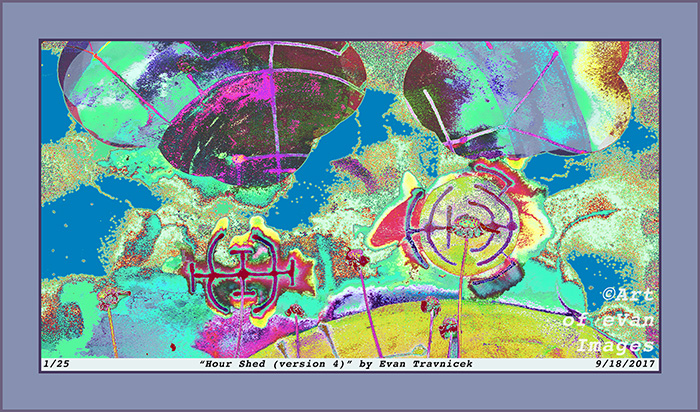
I call this one Hour Shed, as in shedding an hour of time. I think of it as an abstract, psychedelic landscape with a warped horizon. A couple of billowing clouds hover overhead, which are more like doorways to other dimensions. I just really have fun scanning drawings I make with mixed media. With the drawing I made for this piece, I used water-based ink pens (a Schneider pen), and alcohol based marker drawn on a small sketchpad. I then applied some water with an excellent flat head paint brush to make the water-based ink bleed. I let that dry, and then applied some ammonia as an experiment to see how the already applied media would interact with it. It didn’t really do much.

I then splashed some lacquer thinner over the surface of the drawing, which made the alcohol based marker bleed, and also the ink from the Schneider pen bled. After that dried, I applied some rubbing alcohol. The results left what I wanted: Discolored, blurred, cloudy, ambient, faded, psychedelic, bled effects.

I’d recently been listening to authors and documentaries discussing the hippie culture in Laurel Canyon during the 1960s. I already knew that the CIA covertly experimented with LSD on people unbeknownst to them. I also knew that the US government really wanted to find a way to divert anti-war protesters from attracting too much attention for being against the Vietnam war. So what I discovered is that the CIA helped to create the hippie counter-culture so as to discredit anti-war protesters and to divert young people into drugs, cheap sex, and other demoralizing activities.

I have always enjoyed abstract and psychedelic art. Much of my inspiration comes from the hippie counter-culture, including a lot of the music produced from that era. It’s just that I now see what purpose that scene served. Today, it’s plain to me that entertainers, artists, actors, and public figures get fame, attention and money because they agree to the CIA’s terms of spreading “American” cultural hegemony across the globe.

It has been known for years now that the American Abstract Expressionist movement was financed and nurtured by the CIA so that America could claim a culture of its own on the world stage. Centralized planners felt that America really had no art or culture up to that point when the Abstract Expressionists were forming, so the CIA decided to create a world stage for them. Again, I’m not repelled by the counter-culture movement of the Abstract Expressionists. I just note that they were allowed to become famous because they had secret state backing.

In my learning and research into art methods, techniques, psychological values, and history, I have come to conclude (perhaps for the time being) that art serves imperial purposes. It is used as propaganda. It entertains, amuses, impresses, catches attention, and thereby communicates messages consciously and unconsciously. An Italian Marxist named Antonio Gramsci called the proliferation of imperial culture, art, and propaganda cultural hegemony. This means that a dominant state—or superpower—superimposes its entertainment industry, such as Hollywood for example, on to subordinate states, thereby achieving a psychological penetration of the collective population.

Specifications:

Title: Hour Shed (version 4)

Source mediums: Water-based ink, alcohol-based marker altered by water, ammonia, lacquer thinner, and rubbing alcohol on paper, digitally combined with organic material

Print medium: Hewlett Packard printer ink from Hewlett Packard DesignJet Z2100 printer on Hewlett Packard print paper (Note: print can be made with archival paper and printer if requested)

Digital manipulation completed: 9/18/2017

Dimensions of print: 30 inches by 16 inches

Number of limited edition prints: 25

Investment of print not framed: $80

Investment of print framed with glass: $400.00 (shipping included)

Contact me: artofevan@hotmail.co

Leave a comment

September 18, 2017 · 9:20 am