Tag Archives: Art

Hold

I am going to share this piece here for the first time I’ve shared on WordPress for a long time. I call it Hold. It’s a digital manipulation of a mixed media collage drawing I did a couple years ago. I like the endless multiple meanings found in the word hold. The complete abstract character of it gives it even more liberation with meaning and enables you to create your own story of it for yourself.

Leave a comment

January 9, 2020 · 2:46 am

Vis a Vis (version 7)

VisAVis7ematted

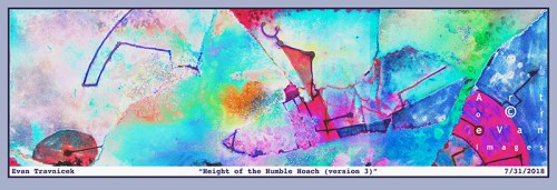
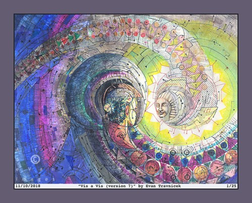
A lot of conjunctions of styles I’ve been working on and combinations of media are going on in this landmark piece. It can be traced back to a drawing I made several years ago called Microscopic Works of Light, which is on my Facebook Art of eVan page. It’s the style I used for the tails trailing on behind each head in this piece which are extant of that earlier mosaic style.

My earlier mosaic styles convey organic, micro-organic, mythological, and esoteric themes. This piece here is a revival of that quality that still beckons expression from me. The two heads are like unidentified mythological characters meeting each other in a semi-physical state, coming face to face with one another for a meeting of the self.

Long ago, I’d read some of Edgar Cayce’s readings he’d given for clients requesting spiritual help and insight into their problems. In readings he addressed as karmic, he would often use the term “meeting of the self” to describe how karmic attachments a soul may still possess that wrap one back again and again into similar situations to attempt to successfully deal with. It’s also a paradox to meet oneself as oneself, so the self is often dealt with through others who reflect back the attitudes one must deal with in oneself.

While taking anatomy and physiology classes for the healthcare education I enrolled in, I became fascinated by how many muscle groups and nerve networks there are in the human face. Around the same time, I’d read some articles about mirror neurons and how we are wired to mirror peoples expressions and moods around us. So for example, if you start eating an ice-cream cone in front of me with my favorite ice-cream on it, I will probably start salivating. I’d be mirroring your activity in my nervous system, though I don’t have an ice-cream cone in my hand.

With this piece of art, I tried to illustrate my idea of cubism. My idea is to get similar perspectives of a certain object, such as a human head, from different sources. The idea is to cut up those sources into different shapes and fit them into the shape of a head again. This implies a psychological effect of different spaces and different times compiled into one tangible object, heads in this case. I believe that muscles and nerves hold memories, and those memories are assimilated from different places, different people, and different times, thus creating psychological chimeras from memory.

A chimera is a Greek mythological beast that is put together or created from different animals. So it might have the hooves of a horse, and the head of a lion for example. In today’s biological science, chimerism means that a single organism has cells with two distinct genotypes. For example, the two genotypes could be the hemopoiesis of two different blood types within the single organism.

My art evolved from using the mosaic style established centuries ago in early Christian, Late Roman, and Byzantine art. It evolved into this style I’m describing now, which is chimeric. The whole idea is the building of something—anything—from something small, elementary, and simple into larger and more complicated structures and processes. This pretty much what life does anyway. It also includes the breakdown, entropy, and decaying of complex forms, only to rise again in new forms.

Many enlightened souls have declared that the ultimate reality is oneness, and that all this separation we normally see is just an illusion of separation while we all remain in perfect oneness throughout eternity.

In order for anything to exist and for anything to be perceived, as we understand perception in our physical bodies, there has to be movement. Movement has to be accompanied by space and time. What creates what? What if all three of these elements of existence create each other in a triangulated continuum? Space is filled with things, even on the smallest levels, and things are filled with space on the smallest of levels.

In order for something to exist, it must be contrasted and differentiated with something else. This brings in the idea of Ying and Yang and primal creation. From complete stillness and unity, movement has to be initiated, and, in order for movement to be initiated, a fracturing of oneness has to be accomplished. Yet, the balance of oneness is still maintained by circular and cyclical movements. Thus everything is still bound to complete oneness as it pinwheels throughout the cosmos forever repeating cycles until oneness is accepted once again, instead of infinite illusions of separation.

I compare the idea of Ying and Yang and the idea of primordial movement to binary blackholes rotating around one another creating vibrations of gravity waves throughout the ocean of space and time, creating space and time, influencing space and time, tweaking space and time, like musicians and cosmic dancers filling an auditorium and stage with movements of life.

Specifications:

Title: Vis a Vis (version 7)

Source mediums: Water-based and alcohol based ink, and magazine and copy machine cutouts on paper as collage

Source drawing completed: 8/31/2018

Print medium: Hewlett Packard printer ink from Hewlett Packard DesignJet Z2100 printer on Hewlett Packard print paper (Note: print can be made with archival paper and printer if requested in which case the additional costs will be calculated and added)

Digital manipulation completed: 11/10/2018

Dimensions of print: 36 inches by 29 inches

Number of limited edition prints: 25

Investment of print not framed: $100.00

Investment of print framed: $550 (shipping included)

Contact me: evan_travnicek@yahoo.com

Leave a comment

November 12, 2018 · 8:13 am

Height of the Humble Hoach (version 3)

HeightOfTheHumbleHoach3ematted

Obviously I’m not worried about perfection here in a traditionally understood standardized, mainstream, commercial art sense. I also realize I’m really not creating anything breakthrough or revolutionary here as well. Nevertheless, the attempt here is to convey a sense of freedom and liberation from having to perform well in the execution of a work of art. There are innumerable decisions one makes in creating a work of art, and there are perhaps even more possible decisions one decides not to make, that could potentially be made, while making art. Many artists take the route of “what looks best” and “will this look cool to so-and-so?” Even art that’s intended to be rebellious on the surface is frequently merely an attempt to please another, or a group of people, when one probes a little deeper into the motivation of why an artist made this or that piece.

I realize many artists make their art out of a passion and love for what they do primarily. Yet, I still maintain that artists don’t live in a vacuum, and some of us must realize, at some point, that we are making art to show to the public, and to different audiences. It’s just inevitable that we will wonder how our art will be received. The more authentic and original an artist’s work is, the more we may worry how others will perceive it. Letting go of these worries is ultimately the best though. Some artists can’t let go however, and we get caught in webs, jobs, and circles of trying to please someone or a group of people.

I usually steer clear of posting works of art that are displayed on horizontal rectangular picture planes because of how they are reduced in size to the viewer when looking at them on a standard sized computer monitor. If you are using a smart phone, I suppose you could turn your handheld device horizontally in order to see more detail. Problem solved. This is one of my attempts to please you I suppose.

I call this piece Height of the Humble Hoach. It just came to me as I was playing with rhyming variations on the title “Flight of the Bumble Roach” written by The Residents. I didn’t know that hoach is a word, but it actually is. I looked it up and it means to be “full of” or “swarming with” according to the English Oxford dictionary. Its origins come from historical Europe with meanings of to “move jerkily” or to “shake to and fro.” I thought the object in the middle of the picture sort of resembled a bumblebee or some other winged insect. It looks like it’s cruising through the air too.

I wanted to experiment with tearing up drawings I made after soaking them in water and gluing them to new drawings, thus creating textures and layers. This piece you see here is part of a larger drawing I made for an art group I’m a part of with friends. That drawing is called “Absorb” and I haven’t posted it publicly online yet. This piece is basically the left side of Absorb, and it’s turned ninety degrees and flipped horizontally. This differentiated it enough for me to regard it as a piece in itself. For the foundation drawing Absorb, I applied some diluted white acrylic paint as splatters which soaked into the already wet surface. You can see some of that cloudiness in this representation. I also sprinkled some salt on top of the previously mentioned applications which created some interesting small craters and pocks.


Specifications:

Title: Height of the Humble Hoach (version 3)

Source mediums: Water-based and alcohol based ink on paper torn, and recombined with magazine print glued to paper as collage

Source drawing completed: 6/29/2018

Print medium: Hewlett Packard printer ink from Hewlett Packard DesignJet Z2100 printer on Hewlett Packard print paper (Note: print can be made with archival paper and printer if requested)

Digital manipulation completed: 7/31/2018

Dimensions of print: 32 inches by 11 inches

Number of limited edition prints: 25

Investment of print not framed: $65.00

Investment of print framed: $400 (shipping included)

Contact me: evan_travnicek@yahoo.com

Leave a comment

August 3, 2018 · 9:06 pm

Staggering Stride (version 1)

StaggeringStride1ematted

It looks like a boat. It looks like a water strider—those bugs I used to see skate around on the surfaces of ditch water after big rainstorms in Nebraska. It also makes me think of the Mahayana and Hinayana, which are boats, or vehicles, figuratively, in Buddhist epistemology. It looks like the boat could be seen as traveling across a large body of water on the surface of a planet. You can see the curved horizon of this planet on the right side of the picture. I like how the boat appears closely to you as the viewer, but the planet appears as if it’s tens of thousands of miles away. It gives it the sense of multiple points of view—an expanded sense of perception—as may be experienced in dreams while observing something.

When a string on a cello or a guitar is plucked, it vibrates back and forth in order to produce the sound it makes. The string actually moves in a circular motion, like a jump rope might. I have noticed that vibrating strings make the shape of a boat or ship between the insertion points. Physicists have taught us that matter is really just non-physical energy at sub-atomic levels. Some theorize that matter is fundamentally made of superstrings as theorized about in superstring theory. Thus all matter is just countless superstrings harmonizing and cacophanizing everywhere.

In Judeo-Christian literature, you can read about Noah’s Ark, and the story about the world flooding due to God’s wrath. I don’t want to try to prove the veracity of this story here, but I do want to make associations and correlations for artistic and intellectual purposes. The bow of a ship is designed to “cut” through water with the least amount of resistance as possible. Thus they have narrow wedged rostrums. The idea of the least amount of resistance is also found in Taoism, as Lao Tzu wrote that water seeks the path of least resistance as it travels down the folds, crevices, and foothills of mountains.

The idea I want to emphasize here is “the least amount of resistance as possible.” This is actually a strategy that applies to people—us—manipulating and managing matter and life in general with the best outcomes in mind. For example, when I enter into a new social situation, I like to scope and gauge things before I start accepting more responsibility, management, and control. It’s my method—one of several—of attempting to create harmony.

Getting more abstract here, I imagine that certain combinations of sounds, melodies, and jingles can act as codes in environments  so as to produce certain effects. Codes, perhaps, to open doors or to lock them. Basically, waves of all kinds—physical or non-physical—are patterns, and if they are harmonious with other wave patterns, then I believe they have to potential to create beneficial situations. Beneficial to knowledgeable users of course.


Specifications:

Title: Staggering Stride (version 1)

Source mediums: Water-based ink, alcohol-based marker, pencil, water, and rubbing alcohol on paper, manipulated digitally with Photoshop

Print medium: Hewlett Packard printer ink from Hewlett Packard DesignJet Z2100 printer on Hewlett Packard print paper (Note: print can be made with archival paper and printer if requested)

Digital manipulation completed: 4/10/2018

Dimensions of print: 45 inches by 34 inches

Number of limited edition prints: 25

Contact me: artofevan@hotmail.com

Leave a comment

April 11, 2018 · 7:31 am

Such by Such (version 7)

SuchBySuch7ematted

I call this one Such by Such. SXS could be a shortened version of the title. This particular image here is version seven. I had fun tweaking the filtering and color adjustments in Photoshop to reach the results you see. I pasted paper cut out from magazines, and drew alcohol-based marker, and water-based pens on paper to complete the work. I then proceeded to my usual next step of applying water, rubbing alcohol, and lacquer thinner to achieve the psychedelic tie dye effects. The work I do in Photoshop helps to emphasize, exaggerate, and alter the natural bleeding effects that I evoke in physical media.

This current style I’ve been exploring and experimenting with currently utilizing basic lines, points, planes, some shading, and colors is a certain kind of style that mimics a scientific or mathematic spirit. The point, line, and plane are one and two dimensional visual concepts. They can be implied with the third dimension on a two dimensional picture plane by using drawing techniques established since the European Renaissance.

The fourth dimension was theorized about by Einstein in the 20th century. Simultaneously, art in the 20th century started exploring four dimensional visualizations and concepts. Artists, such as Pablo Picasso, M.C. Escher, and Salvador Dali, explored these time warping, perspective fracturing, mind bending, multiple simultaneous points of view ideas in visual art, thus giving a kind of experience for viewers viewing these artist’s works.

I’d say that this idea of multiple points of view was developed by Paul Cezanne and perhaps Eduard Manet, both great French Impressionist, and post-Impressionist artists, first. I think Picasso and Georges Braque would agree. These two artists were inspired by Cezanne and readily admitted so. They developed what they called “scientific cubism,” which takes Cezanne’s nascent perspective distortions into greater degrees of perspective fracturing and bending, thus accomplishing cubes of space, looked at from varying, disjointed points of view, for viewers to see of a whole object.

Braque and Picasso used physical objects, such as people, guitars, and tables, to represent their semi-abstract ideas in their paintings. I’d like to think that I’m taking this concept of cubism a step further by drawing completely abstract lines and shapes that aren’t attempting to represent anything but themselves as abstract lines and shapes. When combined, I often note that they have certain dimensional and cubist qualities to them. They hint at a fourth dimension for me. I simplified the idea of measuring space in the title of this piece by calling it Such by Such because I did not attempt to measure the four dimensional mimicking nature of it. I suppose I was lazy in that regard. Oh well.


Specifications:

Title: Such By Such (version 7)

Source mediums: Water-based ink, alcohol-based marker, water, rubbing alcohol, and lacquer thinner on paper, manipulated digitally with filters

Print medium: Hewlett Packard printer ink from Hewlett Packard DesignJet Z2100 printer on Hewlett Packard print paper (Note: print can be made with archival paper and printer if requested)

Digital manipulation completed: 3/13/2018

Dimensions of print: 31 inches by 36 inches

Number of limited edition prints: 25

Contact me: artofevan@hotmail.com

Leave a comment

March 14, 2018 · 5:52 am

The Heart of a Habit (version 5)

TheHeartOfAHabit5ematted

This digital illustration here is derived from two different drawings I executed on paper a couple of years ago. That was when I was fresh out of school having graduated with a degree in Health Information Technology. It was also after I had just attained my credential as a Registered Health Information Technician. I felt so proud of myself for accomplishing what I felt were these highlights of my life.

I titled this piece The Heart of a Habit. The two drawings I used in layering it together were Topology of Hearts, Hands, and Minds, and Happy Zephyrs. I created this digital amalgamation back in February, 2016. For some reason, I stopped making these mathematically approximated tessellations. You may see some influence of M.C. Escher’s work here. I started becoming more interested in liquid ambiences from applying water to water-based pen work, and rubbing alcohol to professional marker applications.

I’ve been trying to resolve a conflict for a long time with my art, and it keeps on morphing into my fascination with styles of art that are polarized. So, for example, Escher’s work is mathematically refined, and perspicuous, but Kandinsky’s work is the opposite, and, in some cases, is quite amorphic. I truly enjoy both styles of art: Optical illusion art, and abstract art. I’d like to make a bridge between Optical-type art, and purely Abstract art, which, to me, would be the ultimate optical-psychological form of art… at least at this point in time.

A habit is often unquestioned, and, like a heart, is hidden. One can only hear the beat of a heart if one listens closely. I make this comparison of a heart to a habit because, if one observes with curiosity, and without criticism, one often finds that a habit is used to fend off some unwanted circumstance or feeling. The word habit rhymes with the word rabbit, and rabbits run from danger. A rabbit’s heart races rapidly as it flees quickly from danger, such as a predator.

My art can be seen as a habit with which I use to escape the harsh realities of the world. I don’t think it needs to be pathologized however. I think it’s a constructive outlet for all the frustrations I’ve encountered in the medical and business fields. I’ve been making art since I was a baby, so it’s pointless to try to dismiss it as a neurosis. I am glad my art seems to defy George Orwell’s postulation that “all art is propaganda.” My art has become so abstract at this point that I feel it successfully escapes the orbit of politics. I just haven’t imagined a truly satirical, powerful, salient political art idea to illustrate for a few years now.


Specifications:

Title: The Heart of a Habit (version 2)

Source mediums: Water-based ink, on paper, manipulated digitally with filters

Print medium: Hewlett Packard printer ink from Hewlett Packard DesignJet Z2100 printer on Hewlett Packard print paper (Note: print can be made with archival paper and printer if requested)

Digital manipulation completed: 1/22/2016

Dimensions of print: 30 inches by 30 inches

Number of limited edition prints: 25

Contact me: artofevan@hotmail.com

Leave a comment

January 23, 2018 · 9:01 am

The Curvilinear Traveller (version 1)

TheCurvilinearTraveller1ematted

Whimsicality and spontaneity are pretty hard states and results to achieve in art. That is, when you try to line them up with the love of beauty and wonder. Beauty and wonder do require a sense of design and order to some degree or another. I haven’t measured that degree, but it does seem as if there is some intuitive knowledge there at least. It all has to seem effortless, too, which is a state one works oneself into after doing doodles, warmups, practice runs, and exercises.

This piece here achieved a result of such whimsicality and near total spontaneity that I felt it satisfied a certain, but deficiently defined, level of experiment and discovery for me. I have been trying to achieve this level ever since. But this image you see here is part of a larger image I titled Astonished Buoyancy for which I posted here a while back. Astonished Buoyancy is more suggestive of a large balloon in the foreground, whereas this image has the large foreground balloon cropped so that it looks more like the curved surface of a planet in space. There is still an orange balloon shape in the background at the upper part of this illustration however.

I just became thrilled with the nebula and clouds pervading the space around the objects, which add to the life, dimension, and mystery of the work. When I was physically drawing the drawing this image was derived from on a piece of paper, I made sure not to get overly preoccupied with the lines I was drawing for delineating the forms. This is what I feel is the whimsical aspect. The spontaneous aspect occurred in the filtering of the image as a whole in Photoshop as I altered the colors, did inversions, and executed sharpening effects. The neutral washes and background colors became even more emphasized and psychedelic as I worked on the piece.

What’s exciting about it to me is that, as I work throughout my entire process of creation for an illustration, both traditionally and electronically, space seems to always want to express itself as something more than mere flat emptiness. It always seems to want to express something more, something just beyond perception, beckoning me and you to explore further, to travel past the obvious and discover whatever it is past the fold, hill or cloud radiating from this particular window in time.

Specifications:

Title: The Curvilinear Traveller (version 1)

Source mediums: Water-based ink, alcohol-based marker altered by lacquer thinner and rubbing alcohol on paper, manipulated digitally with filters

Print medium: Hewlett Packard printer ink from Hewlett Packard DesignJet Z2100 printer on Hewlett Packard print paper (Note: print can be made with archival paper and printer if requested)

Digital manipulation completed: 9/20/2016

Dimensions of print: 25 inches by 24 inches

Number of limited edition prints: 25

Contact me: artofevan@hotmail.com

Leave a comment

December 9, 2017 · 9:01 am

Flowing Productivity (version 2)

FlowingProductivity2ematted

With this piece, I’m dealing with motion and complementary colors, such as the red and the green. A certain degree of depth is expressed as well. The intent is whim, spontaneity, and loose, flowing organic structures. I’m evoking the spirit of nature to imitate me as I attempt to imitate nature.

Lots of media came together to experience this piece. I used brush, watercolor paint, pen ink, India ink, water, lacquer thinner, rubbing alcohol, plant shrubs, paper, oil pastel, and digital editing to make it all happen. The left leaning flow of the picture, overall, is what I felt most essentially characterized this image.

The hybridized illustration you see here is a portion of a drawing I made a few days ago called Vaporous X-Ray. I captured a photo of that drawing on my cell phone, and posted it to my Instagram account. I’ve been very lazy with regard to keeping up with my WordPress blog and my Facebook page because of the amount of time, mental labor, and effort it takes me to keep all of my profiles online up to date.

It takes a lot of time, energy, space, effort, labor, materials, supplies, and equipment to keep my productivity afloat. It’s not a matter of me not working on anything. In fact, I just went through a pile of drawings I’ve made in the last couple of years this evening, and a stack of sketchbooks completely full of ideas I record regularly. There’s no way I’ll ever quit making art.

My art will one day be the public’s, or in some private collection, or even yours. I ask you to help support me and my creative efforts to serve our world better through the communication of images and ideas. Like my page, comment, show your friends and family, and contact me by email to make a purchase of anything you like. Or even hit me up for a commission piece, like a mural, or a portrait or something.

Specifications:

Title: Flowing Productivity (version 2)

Source mediums: Water-based ink, alcohol-based marker altered by lacquer thinner and rubbing alcohol, watercolor paint on paper, combined with digitally scanned organic plant matter

Print medium: Hewlett Packard printer ink from Hewlett Packard DesignJet Z2100 printer on Hewlett Packard print paper (Note: print can be made with archival paper and printer if requested)

Digital manipulation completed: 12/2/2017

Dimensions of print: 27 inches by 27 inches

Number of limited edition prints: 25

Contact me: artofevan@hotmail.com

Leave a comment

December 7, 2017 · 9:11 am

Hour Shed (version 4)

HourShed4ematted

I call this one Hour Shed, as in shedding an hour of time. I think of it as an abstract, psychedelic landscape with a warped horizon. A couple of billowing clouds hover overhead, which are more like doorways to other dimensions. I just really have fun scanning drawings I make with mixed media. With the drawing I made for this piece, I used water-based ink pens (a Schneider pen), and alcohol based marker drawn on a small sketchpad. I then applied some water with an excellent flat head paint brush to make the water-based ink bleed. I let that dry, and then applied some ammonia as an experiment to see how the already applied media would interact with it. It didn’t really do much.

I then splashed some lacquer thinner over the surface of the drawing, which made the alcohol based marker bleed, and also the ink from the Schneider pen bled. After that dried, I applied some rubbing alcohol. The results left what I wanted: Discolored, blurred, cloudy, ambient, faded, psychedelic, bled effects.

I’d recently been listening to authors and documentaries discussing the hippie culture in Laurel Canyon during the 1960s. I already knew that the CIA covertly experimented with LSD on people unbeknownst to them. I also knew that the US government really wanted to find a way to divert anti-war protesters from attracting too much attention for being against the Vietnam war. So what I discovered is that the CIA helped to create the hippie counter-culture so as to discredit anti-war protesters and to divert young people into drugs, cheap sex, and other demoralizing activities.

I have always enjoyed abstract and psychedelic art. Much of my inspiration comes from the hippie counter-culture, including a lot of the music produced from that era. It’s just that I now see what purpose that scene served. Today, it’s plain to me that entertainers, artists, actors, and public figures get fame, attention and money because they agree to the CIA’s terms of spreading “American” cultural hegemony across the globe.

It has been known for years now that the American Abstract Expressionist movement was financed and nurtured by the CIA so that America could claim a culture of its own on the world stage. Centralized planners felt that America really had no art or culture up to that point when the Abstract Expressionists were forming, so the CIA decided to create a world stage for them. Again, I’m not repelled by the counter-culture movement of the Abstract Expressionists. I just note that they were allowed to become famous because they had secret state backing.

In my learning and research into art methods, techniques, psychological values, and history, I have come to conclude (perhaps for the time being) that art serves imperial purposes. It is used as propaganda. It entertains, amuses, impresses, catches attention, and thereby communicates messages consciously and unconsciously. An Italian Marxist named Antonio Gramsci called the proliferation of imperial culture, art, and propaganda cultural hegemony. This means that a dominant state—or superpower—superimposes its entertainment industry, such as Hollywood for example, on to subordinate states, thereby achieving a psychological penetration of the collective population.

Specifications:

Title: Hour Shed (version 4)

Source mediums: Water-based ink, alcohol-based marker altered by water, ammonia, lacquer thinner, and rubbing alcohol on paper, digitally combined with organic material

Print medium: Hewlett Packard printer ink from Hewlett Packard DesignJet Z2100 printer on Hewlett Packard print paper (Note: print can be made with archival paper and printer if requested)

Digital manipulation completed: 9/18/2017

Dimensions of print: 30 inches by 16 inches

Number of limited edition prints: 25

Investment of print not framed: $80

Investment of print framed with glass: $400.00 (shipping included)

Contact me: artofevan@hotmail.co

Leave a comment

September 18, 2017 · 9:20 am

Prayer of a Pillar (version 8)

PrayerOfAPillar8ematted

The idea here is a beautified, glorified, abstractified column. It became apparent to me as I was exploring other design configurations. This piece is derived from, believe it or not, Ataraxy (version 1). Of course I combined Ataraxy with a few layers of other material. Another example of that result is the piece I posted here back in August, 2015, called Galactic Template (version 2).

As far as common history is concerned, the architectural usage of columns dates back to ancient Egyptian times of around 3000 BCE. The ancient empire of Egypt is said to have originated in that time period. I only theorize that there could have been great civilizations, not alluded to in contemporary history books, that existed thousands, and perhaps tens of thousands, of years prior to ancient Egypt. Associate professor Robert M. Schoch has done considerable research revealing civilizations our current model of history ignores.

I chose to post this piece now because I had noticed my recent usage of the word “column” in my micro-blogging. My blogging is, of course, influenced heavily by what I notice going on in the world, and by other professional bloggers whose information and insights I value. I like to rely on my intuitive sense of informational flows; one way I do that is by noticing repeating patterns, including words, sounds, and images… even feelings. Perhaps especially feelings, as feelings are the place from which most people make decisions anyway.

A column can define a column in a newspaper, or it can define the architectural noun. To me, a column is a symbol of strength, civilization, calculation, order, governance, continuity, and stability. Perhaps this sense is intended to be communicated by journalists’ official use of columns.

At the bottom left and right of this picture are what appear to be stalks of grass, composed of black mosaic pieces. Or maybe they are skeletal impressions of hands beginning to cup and shroud the base of the column. Anyway, whether if the finger-tips of grass, or the phalanges of hands, they look like they are moving into a praying clasp. Hence, the title for this piece: Prayer of a Pillar.

The metaphorical, amorphic fingers merely suggest the form of hands as if each mosaic piece is obeying the non-physical commands of an unseen field moving them to pray. I’ve seen imaginary depictions of what it looked like in ancient Egyptian buildings and temples, and it appears that Egyptian artisans and their governing priesthoods liked to use bright, bold colors to fill in the shapes, forms, hieroglyphs, and figures engraved on their walls and pillars. So my idea of a column here has a more Eastern and ancient character to it, rather than a Western, colorless, marble quality.

This piece has a lot of detail in it—a quality I wanted to achieve—with an appealing sense of balance and order. As many other pieces of mine, this work looks like it could be a still of a kaleidoscope. I also like to imagine that you are looking through a microscope at an exotic, alien world other than what you might normally see as cells and microscopic debris. After all, one of my original pieces in the Micro-Chimerisms series is titled Microscopic Works of Light.

I may add that the black mosaic phalanges coming up into a prayer formation at the bottom of this illustration can also be seen as the petals of a lotus flower. The lotus flower is an Eastern symbol of enlightenment, as they blossom on the surfaces of muddy bodies of water; from the depths of darkness, illusion, suffering, and mud is born enlightenment. So I’m really combining the Western prayer, the column of strength, and an Eastern symbol of enlightenment here.

These layers of materials, collages, drawings, and texts, along with multiple multi-layered symbols creates an idea I want to communicate to you: That we are multi-dimensional beings who perceive multiple meanings in the vast perceptions we receive and emit everyday.

Leave a comment

May 2, 2016 · 1:13 am