Tag Archives: Art

Late Wifting Wu (version 5)

Oh well. I already named it. I was listening to The Residents while making the drawing for this image. Yes, the original drawing looks different than this. See the original on my Instagram account. The Residents made a song called Weight Lifting Lulu. It provokes the imagination to say the least. While making this drawing, it was late. I made up the word “wifting”. I haven’t determined exactly what it means yet. I’ll probably leave it that way. The word wu sounds Chinese…

…And it is. I searched it with my cadre of elite digital pigeons. Upon their return, I discovered Wu is a river in China. Rivers are symbolic of “the way” or the Tao in Chinese philosophy. There’s an ancient Chinese philosophy manuscript called the Tao Te Ching and the author, Lao Tzu, discusses “the way” frequently in that profound text. Instead of exploring the way here, I encourage you to read the Tao Te Ching to see what kind of neurological artichokes you might butter up in yourself and discover. 

I already posted version four of this drawing on my Instagram account, along with the original drawing. I wanted to post this one here on my WordPress page because it feels more definitive and final in a contemporaneous sense. None of my art is final however. In my head, art is like a flowing river of ideas that I pay attention to sometimes. The ideas are like fish that I have to catch by jotting them down in sketchpads in the moment. Otherwise, they disappear, never to inspire me again. So I have to wait for another school of ideas. 

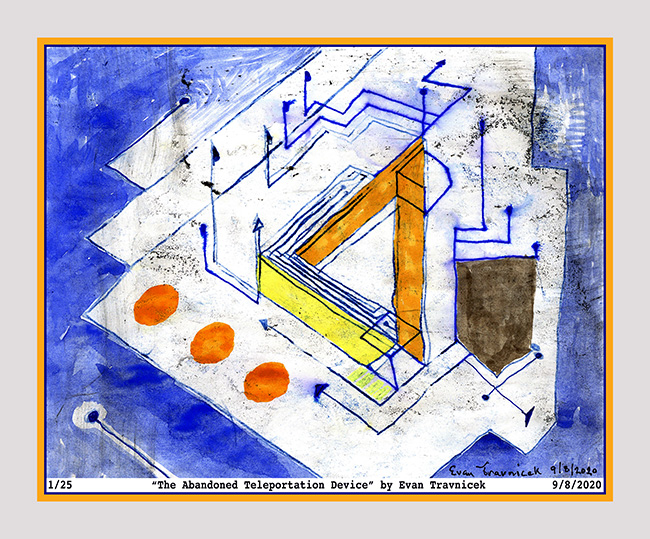
This version expresses the random foundational brushwork I prepared the surface with before drawing on it. In fact, the surface is the blue oil paint I painted on to a piece of paper to use as a transfer medium for The Abandoned Teleportation Device. It’s just a 3d depiction of a wire mesh I created inspired by iron fence vector and abstract artists from the 20th century. 

Medium: Ltd. edition print (25)

Dimensions: 34 x 28 inches (not framed) 

Framed and with glass, this piece is: $450.00

Unmatted print is: $95.00

Leave a comment

September 17, 2020 · 5:59 am

The Abandoned Teleportation Device

It looks sorry. And that’s the point. I was trying to find a word or a metaphorical title to name this piece. I thought of the word “desolate.” When I thought of that word, I saw the root word “sol” in it, which means sun in Latin. Then I thought of how desolate could mean a metaphorical definition pertaining to “de-sun-ating” something, or abandoning something, or taking the life out of something. I associate the word sol with the word soul. So it could mean “de-souling” something. That, indeed, would make something sorry. 

When I was a little boy, I used to collect Matchbox and Hot Wheels cars. I remember I found this one Matchbox car that was all beat up one time somewhere, like maybe on a school playground or a parking lot somewhere. It was tossed by another kid who probably got a new car and lost interest in this old beat up one. I liked this car, even though it was all beat up with paint chipping on it. It was like a yellow 1970 Mustang with flames on it. It still raced well in a straight line across my living room floor when I raced it with my other cars. 

I liked this little car because I felt like its strength shone through all the abuse it took from its previous owner. The beat up character of the car made me like it even more. To me, as I look back on the lesson of this memory, it means to me that life still goes on after abandonment, and desolation. It doesn’t end. In fact, life can be even more grand, and more fulfilling after being abandoned and desolated because of the abandonment and desolation.

How does this relate to this piece I’m posting now? The beat up, crude, sorry character of this drawing is actually supposed to highlight its utter uniqueness and individuality. The basic design of it—a triangular composition—emphasizes its strength. The triangle, in architecture, is one of the most stable structures. 

A couple days ago, I got re-inspired to work on impossible shape ideas as introduced to the art world by Roger Penrose, the famous mathematician. In my skeletal, contour, line drawing work, I like deconstructing shapes, but not completely. Just enough to suggest other possibilities than the completions of corners, shapes and expected endings. 

I thought of how the impossible triangle suggests a fourth dimension in a two dimensional drawing as the eye travels around the triangle to see how the fuck it’s possible to end up where one started. This suggested to me a time machine, or a teleportation machine. In this 21st century age, a machine would more likely be called a device, so I named this piece “The Abandoned Teleportation Device” as a possible story of some inventor who tossed this idea away into the annals of trashed history, a place where untold amounts of history are tossed, not to mention all the probabilities that also exist in nascent, unattended states. 

It worked out fine in this reality, too, because I actually did teleport one medium to another by using the oil transfer drawing technique. This seriously gives credence to the idea of a ghost imprinting itself from one reality into another, such as ours, and appearing more like an imperfect, “empty”, white noise distorted apparition. 

Medium: Ltd. edition print (25)

Dimensions: 35 x 29 inches (not framed) 

Framed and with glass, this piece is: $450.00

Unmatted print is: $95.00

1 Comment

September 9, 2020 · 3:58 am

Chalked Up Tchotchke v.3b (flipped)

The art of sheer randomness and utter whim is actually not that haphazard. This image is based on a mixed media drawing I made last night. I manipulated the hell out of it in Photoshop, and this is one of the images that resulted from that process. To make the drawing, I used a design I’d previously drawn as a template for a manual, handcrafted, oil transfer print on to another surface of paper. The background noise in the space is intentional. I rely on its randomness and unconsciousness to express movements in an illusory space from the pressure of my hands as they work to draw whatever design I want to transfer.

Theory of Mind research shows us that the unconscious mind is 30,000 times more powerful than the conscious mind. This is why the phenomenon of resistance to change seems to be so universal to humankind. Surrealist artists hoped to express contents and elements of the unconscious mind through their art and poetry mostly using dream imagery and symbolism. 

I take the unconscious mind to another level of expression. Of course it’s based on Paul Klee’s work and main method of creating art—the oil transfer technique—but the level I take it to is the work I do in Photoshop which allows me to use filters that that emphasize, alter, highlight, and distinguish elements and effects in my art that would otherwise be mostly hidden. In effect, I’m making the invisible visible. I emphasize ambience, space, and unnoticed particles and entities.

When he was still with us on earth, Art Bell used to have ghost hunting experts on his show for interviews. The ones I listened to explained that they used recording equipment in abandoned locations that were said to be haunted. They wanted to see what kind of possible ghostly, intelligent, semi-comprehensible, audible information they could pick up with their equipment. I like to think of my art making as a process similar to EVP recordings in spirit. 

The German philosopher Immanuel Kant wrote a classic volume of philosophy called The Critique of Pure Reason. I was lead to look at this book because of a really cool book I’d read several years ago called Art Theory For Beginners. I recommend anyone interested in the thought processes behind Western art to read that book for a much better understanding of Western art. It’s not in depth, but it touches on so many philosophical and historical understandings of great art and the time periods it was made in. 

Kant questions what is a thing in itself? Can we really know what a thing is without the biases, and finite perceptions of our localized, politicized brains? Hence, abstract art seems to be becoming more interesting to people. So the title to this piece is Chalked Up Tchotchke. Yes, I saw that word tchotchke recently on my Twitter feed. It basically means something that’s more decorative rather than functional. 

Media: Ltd. edition print (25)

Dimensions: 36 x 22 inches (not framed) 

Framed and with glass, this piece is: $450.00

Unmatted print is: $95.00

2 Comments

September 4, 2020 · 9:10 pm

Tom Sawyer (washed) v.10

I titled this piece “Tom Sawyer.” It was a pretty random creation. I just saw some cutout material that I decided to paste on to a piece of paper. I had no conscious idea that the text on the cutout material I discarded from previous works included text about Mark Twain and Tom Sawyer. The character I ended up drawing in this illustration I decided would fit as an abstraction of Tom Sawyer. Moreover, it’s a name everyone has heard of. It’s also a classic American great.

I support great American art from history—when it’s good that is (by my own standards). What I’m doing here is integrating styles I’ve been working on over the years. Perhaps you’ve noticed, I haven’t been able to bridge the gap between my life arts nude drawings and paintings, and my imaginary and abstract stuff. Great art is known by a strong, relatively consistent style. Most everyone who has taken an art history class can identify a piece by Picasso for example.

Many artists have early and later periods of art. Usually a great artist’s early art is not recognized by collectors and publishers. Moreover, there are countless great artists who are not recognized much by Western media. For example, the Spanish artist, Modest Cuixart, is an artist of great fascination by myself, but I’d never heard of him before until I dug around artists of Catalan who lived in the same time period as Antoni Tapies

Anyhow, the styles I integrated in this piece are my stylized line art, my mosaic art, and my collage art. They came together in this piece with a composition that satiated my standard for asymmetrical balancing. My attempt at creating an illusion of space worked out well. The character is like a top spinning at the center of a large pot that has an atrium decorated with colorful and intricate mosaic pieces. 

Price for an unmatted print is: $90.00

1 Comment

September 1, 2020 · 6:06 am

Minnie the Manx Playing with Pranx & Tanx (original)

image 4-27-20 at 10.53 pm

I love absurd, long old titles for artworks. It’s like how The Surrealists did it. Surrealism is a label; it’s a designation; it points the viewer’s mind in a curious direction; it creates a predicament; an irresolvable frustration that is resolved in utter nonsense. But you know that utter nonsense is sense to the unconscious mind, even while the conscious mind abjectly rejects such bafflement.

I’ve come to see smoke used symbolically as prayers, or intense thoughts. The flaming head of this girl is the smoke on the horizon of revolutions to come. The idea of playing with tanks and pranks, along with a ball of something with “God” printed on it denotes the naïveté of playing with life, DNA, spirituality, psychology, technology, religion, deeply held beliefs, youth, the elderly, and on and on and so forth.

We have a new domain of action in life called the internet. We’ve never had this before in our known little chiaroscuro of history crafted for us by our leaders. Many of us are also waking up to previously denied and suppressed psychological and spiritual powers, such as psychic perceptions and so forth. Our potentials are indeed baffling. Yet, the powers that be remain eager to stay on top and retain the illusions, fallacies, and paradigms they’ve always enjoyed without question.

Leave a comment

May 9, 2020 · 2:10 am

Worked Organic Fire v.4

I am revisiting this hybrid digital artwork I made back in 2013. It’s helping me resolve a dilemma with space vs objects. Space, ultimately, is empty. As an artist, you can play with space by creating subtle variations of tone, shade, and color in it. In music, this would be ambience. The space surrounding the objects in this piece are mosaic, but their colors are very similar, thus creating a continuity that space in 2d art mimics. Mosaics are like nonlinear, endless keyed pianos to me. Everything has a tone; everything has a vibration.

Leave a comment

March 4, 2020 · 3:00 am

Your Stonewashed Dubba Dubba (v.1)

Since Instagram is continuing to insist on being a major ____sucker in suppressing me and my art page there, I’m going to post here again like I originally intended. Since Facebook took over Instagram, it has turned from the hottest social media into a basket case bottom dweller. Everyone I show this piece to loves it and says it should sell for thousands in a gallery. Too bad most art galleries are also vampiric ____suckers as well. Thanks for your support, those of you who aren’t fair weather flaky ghosts blown by the wafts of fake social media winds.

Leave a comment

February 11, 2020 · 7:23 am

Blue Heart Mountain

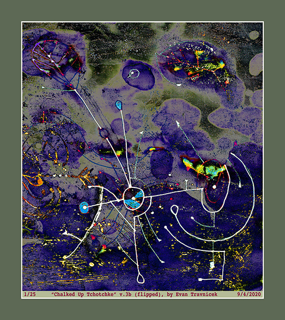
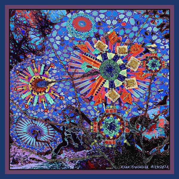
I captured this selection of a couple drawings I layered together because it emphasized this concept of letting the forces of nature do their things as I draw and create. Media have minds of their own often times I’ve noticed over the years. It first started with this notion of working with works of art I wasn’t satisfied with and not giving up and loving them anyway. Then it developed into this idea of capitalizing on mistakes as abstract expressionists showed me. Finally I realized I am a part of nature and I act upon and within nature as a natural force myself, so art just became this flow of letting all these forces of nature interact with each other and selecting material that gave me satisfaction. And so I share this satisfaction.

Leave a comment

January 15, 2020 · 8:37 pm

Off The Hearts (version 2)

The roots of the word symbol mean together, throw. In other words, a symbol is something someone threw together with different materials to re-present something for the betterment of a collective understanding (maybe). This piece, I feel, is truly something that was spontaneously thrown together. I haven’t formulated what it means however. I thought it looked like certain candidates running for office, but that was too political for me. Anyway, the background is from an original drawing I made called “Ich Self?” I just can’t help but to revel in my alienating, mainstream incomprehensible wit. The bust is a cutout of a model from a magazine. I altered, distorted, partially selected, and flipped the image around enough to appropriate it more into my own creativity.

Leave a comment

January 12, 2020 · 4:16 am

Pastel Ash

It’s called Pastel Ash because I used pastels to make strikes around the macaroni shape. I digitally amalgamated another drawing I made into this piece. It looks like some weathered trash stuck together you might find by the side of the road. Beside your fallible psychological analysis, I encourage you to find beauty in trash laying around. Maybe you could pick it up and use it for something, like a work of art.

Leave a comment

January 10, 2020 · 5:45 pm