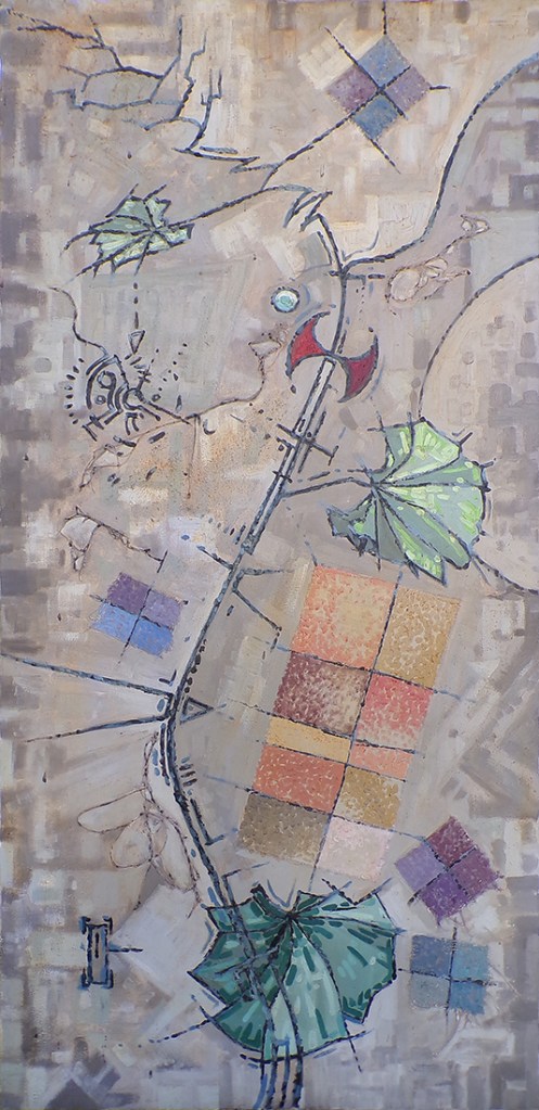
The Tension Between Reality and the Unknown (January 2002), by Evan Travnicek. Mixed media on stretched canvas. Dimensions: 59.75″ x 29″
This painting was created in 2002. I was starting to experiment with mixed media on canvas as I expanded my palette from using only artist’s oil paint. I have continued my mixed media passion to this day. It comes from the do-it-yourself, punk rock, ad hoc spirit of the late 1970s, which was, and still is, in many ways, a symbolic sacrifice of ideal, traditional visions of perfection in order to get out of one’s own way for the purpose of creating in the moment rather than waiting for the perfect moment.
A passion for the line in art is expressed here. I was experimenting with variations in stylized lines. There is something technological and biological about it. Lines, as seen in nature, are really just surfaces of objects as seen level with the surface, rather than perpendicular to the surface.
The leaves of the plant I represented in this painting are called mallow, which is a common garden weed found in the midwest. I like their kidney shape. I also like the natural corrugation that fans out from the center of the leaves which creates a kind of rooftop effect for lighted and shaded surfaces on the leaves.
I find one of the most neutral colors one can use for a background to be raw umber mixed with some titanium white. It’s like the middle grey used in traditional photography which reflects about 18% of light that falls on it. The rest of the surface has a gentle absorbing sense about it, including the green colors in the foreground. The nascent forming qualities of the background give a platform on which lines can be defined.
It’s mixed media. I used a reed pen and diluted black Chinese ink from a vitamin supplement bottle converted into an ink well. My foundation is working with oil paint, but my work in recent decades has transitioned into wet and dry mixed media, on and off of digital media doc makers.
This drawing harkens back to a painting I made in 2002 called The Tension Between Reality and the Unknown. I will post that painting here after posting the versions of this drawing I want to post first. Then I’ll link the painting to its title so you can look at it for ease of viewing.
I’ll admit that I have been struggling with regulating my time, space, and mind with my smartphone usage and social media. I’ve posted authors, videos, and articles about the targeted map to addiction that social media giants and smartphone makers have made out of the human brain to exploit maximum usage of their apps and devices on my X account to raise awareness about this problem that I believe most people with smartphones struggle with.
My art is about relationships and connections. The internet and social media are about relationships and connections, too, but in a much different way. The colors, shapes, and lines are what represent relationships in my art. Maximum time, and data output from their users are what represent relationships for social media giants. I’m not anti-smart phone or anti-social media however. I am pro strategizing ways to maximize my own creative powers so I can be more active in working on my vision rather than passively scrolling through other peoples’ lives.
I realize that the still images made by a relatively unknown artist are like muted forms on digital wallpaper of cyberspace living rooms, but I don’t care. I realize typing something like that out doesn’t particularly help me promote myself as a confident and ambitious character out of a romance novel. Fuck that shit. I’d rather just be raw & real as I continue to fight and struggle on my path of positive passion.
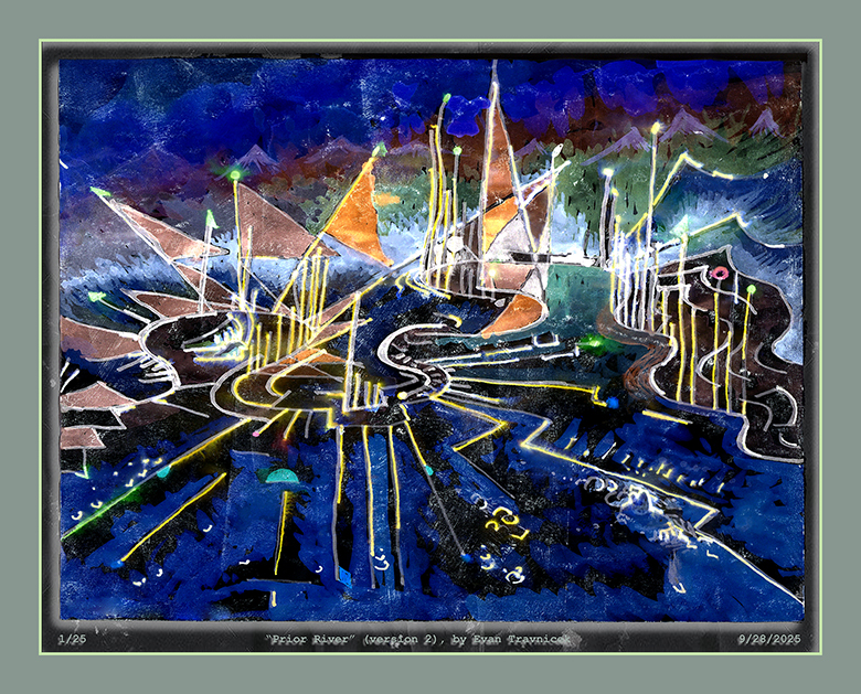
Prior River has connections to a main theme in my dreams. I sometimes dream about walking down to a river from a gradually descending series of river banks. I realized that this theme has connections to my childhood memories of traveling down Dellyne Avenue NW, and Taylor Ranch Drive to go to Albuquerque. The Rio Grande is at the base of descending down the bank on which Taylor Ranch Drive is paved. This part of the city was still rather undeveloped back in the 1980s, so it really was part of the outskirts.
I suppose Prior River is symbolic of making connections to a river of life from the past that’s still there. It connects me to how creative I used to be and still am.
Original mixed media watercolor on homemade paper collage surface
24” x 10”
This image is digitally mounted
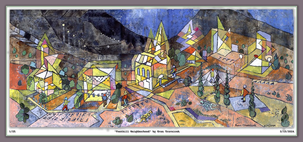
They look like robots walking around in the foothills of a southwestern landscape. The little characters on the paths look like those characters in Oskar Schlemmer’s Triadisches Ballet. This ballet is an inspiration for this piece. That, and, of course, the Bauhaus school of art and design. I have been reading Paul Klee’s volume one book titled The Thinking Eye, which goes into detail about his thought processes and theories behind his abstract art. I’ve learned a lot so far about space, line, shape, and color.
Gradients and progressions stand out in particular to me currently. The illusory creation of space using delineated gradients and progressions will never cease to repel and fascinate me in cycles of disgust and redemption. I get disgusted by the limitations of two dimensions to work with in attempting to suggest dimensions past the third. But I then get fascinated by the possibility of successfully visually communicating dimensions past the third utilizing only the surface of a two dimensional plane.
The simultaneity is already accomplished on a two dimensional surface because you don’t see the eventful sequences of times I built up the image you’re looking at. You just see it all at once. This instantaneous production reflected in your mind is a doorway to other dimensions.
This mixed media watercolor painting is painted on glued together pieces of paper, pages from magazines, and printouts. Before drawing the linear composition, in which I filled in the spaces with watercolors, I washed the surface with a diluted primer paint so that the images and text from the collaged surface would show through to the eye, hence subtly emphasizing the notion of layers built up through sessions of work and time. I used variations of the color yellow to fill the spaces of the buildings because yellow is a bright, warm, outstanding color to use against a more neutral background.
I intentionally made a progression from light to dark with the lines dividing the landscape from foreground to background, and then the sky. The sky is an evening or early morning dark blue. I wanted to convey the idea of a staff or lines on a sheet of musical notes. The staff is the hilly lines of the landscape and the notes are the buildings and the characters walking around on the paths. Hence my joy of capturing the illusion of space with abstracted lines, shapes, and colors.
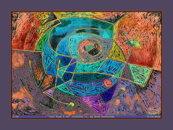
Sir Vick L Os (version 7) Image derived from mixed/digital media Standard print size: 32 x 24 inches Contact artofevan@hotmail.com for interest
I titled this one Sir Vick L Os. I’m sure your inquisitive mind will figure out the Phoenician phake nooz. Geek beyond geek and squeak past squeak. The original drawing is of different colors than this variation. I thought I’d park my attention on this variation and write a li’l randomness about it for a blog.
I recently got some soft oil pastels because I wanted to experiment combining drawings using them with ink pens and washes. So that’s what I did with the original drawing of this piece. The original is drawn on a 7.5 x 10 inch piece of paper. The varied prints of it, manipulated in photoshop, can be of larger sizes. For economic reasons, I like to stick to the standard sizes so I can frame them more expediently.
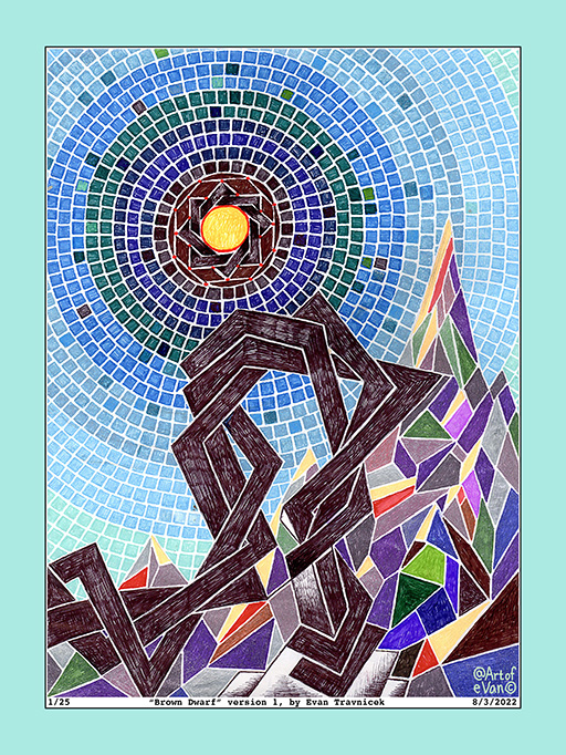
Title: Brown Dwarf (version 1) Media: gel and ballpoint pens on paper Original drawing: 8 x 11 inches Print: 24 x 32 inches Contact: artofevan@hotmail.com
At first, I was thinking of titling this piece Twisted Mountain because of the twisting formation I drew in the foreground. The idea here grew from the Rub el Hizb form I drew at the beginning of this drawing. Rub el Hizb is an Islamic star, it’s an eight pointed star, as opposed to the six pointed star of the Star of David. I just like the shape of it. It reminds me of a mathematical attempt to estimate Pi, the circumference of a circle, and represent it as a finite number.
The overlapping squares make me think of frames, as in picture frames. Frames attempt to capture beauty, or a thing of interest, for an artist and his or her audiences. It’s like the light of this star is being bound by a limiting frame. I drew some parallelogram mosaic pieces surrounding the black frame holding the star bound in its place in the sky.
After making these observations, I decided to title this piece Brown Dwarf. I remembered from an astronomy class at RCC that there are stars called brown dwarfs, which are astronomical bodies that are between planets and stars. So they’re becoming stars. Jupiter is considered a potential star, but both brown dwarf stars and Jupiter are not massive enough to sustain the nuclear fusion that is necessary to turn hydrogen into helium at their cores.
This drawing is composed of ballpoint, and gel pens as media that I used to draw on paper media. It took me a longer time to complete because drawing each mosaic square with these pens was a patient and extensive process. If you are interested in the original drawing, or if you are interested in acquisitioning a high quality, ltd edition print of it, please email me at artofevan@hotmail.com. The print edition of this piece is limited to 25.
Media: Digital print on paper Limited edition print of 25 Dimensions: 30 inches by 24 inches Price framed: $500.00 Price non-framed: $100.00 (Shipping included in price)
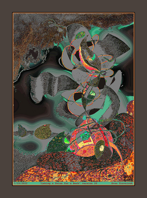
I thought I made up the word “bock“, which is included in the title for this piece. But then I searched for the word upon a suspicion that it might be an obscure word not commonly used. Sure enough, it is an actual word. It’s a dark lager beer with a high alcohol content, which is made in the Fall and drunk in the Spring. This just added more interesting character to the story behind the title I used.
It looks like a murky, smokey phenomenon, for the center of interest in this image, in an underground cavern on an alien moon. The smokey or gray parts look like halos, adding a mysterious spooky quality to them. Like they are the ectoplasm from supernatural activity.
It’s titled Laking a Twine for a Bock. I changed some letters and words in the expression Paul Klee used “taking a line for a walk” when he summarized what he did when he made art. As I mentioned, this piece looks like its an abstract scape of an underground cavern, so there is what looks like a pool of molten lava in the foreground to me. The pool of molten lava associates with the word in the title “lake.” This image was derived from a physical drawing I made with pens, markers, and paint that had almost nothing to do with this current digital incarnation. That’s why this one is “version 20.” I made 19 prior versions.
Twine associates with the word “line” and both of these things can be used to wind up in loops or other shapes. The fact that the illustration has a dark theme to it associates with the word “bock”, which means dark beer. I made the drawing neither in the Spring nor the Fall, but I feel it still can be visually consumed for those who have a taste for this form of edification.
I remember seeing a science fiction novel laying around the house when I was a kid about some kind of intelligent lifeforms that live on the surface of a star. I couldn’t remember the name of that novel, nor who the author was. Neither could my dad when I asked him about it. So I decided to put ye olde SEO to work on Google to see what popped up. After a few rewordings, I found a novel called Dragon’s Egg, by Robert L. Forward. I realized that this is the novel that I remember from childhood because it’s about intelligent creatures the size of sesame seeds who live life at a pace of a million times faster than humans on a neutron star with a gravity of 67 billion times more than Earth. Humorously, the creatures are called “cheela.” Cheelas on Earth are Indian pancakes.
I mention that novel because it’s always been an inspiration lingering in the back of my head of intelligent lifeforms that don’t necessarily take the humanoid form, but still possess consciously intelligent organizing powers and abilities. That’s what I think of when I look at this artwork. I also think of Paul Klee’s puppets and dolls.
In this image, I’m trying to visualize characterized organizing functions of intelligences other than human, which is rather difficult to do because most people have little to no interest in anything nonhuman. So I’m trying to make them human related in the form of art so as to establish connections with the imagination and unconscious mind more than the daily drag of basic survivalism. This segues into Carl Jung‘s idea of the unconscious mind, and Richard Schwartz‘s concept of parts in psychology to me because the parts Schwartz describes composing the human psyche are sometimes “mute” or they don’t communicate by words, but they are still there.
Opening up this doorway leads to shamanism I’ve found, which starts with Jung’s concept of the Active Imagination, which actually is a book about the topic that he wrote. Other ideas come to mind, such as The Trickster, as described by Joseph Campbell, and his research into ancient myths.
Digitized media on paper Dimensions: 32 inches x 25 inches Ltd Edition print to 25
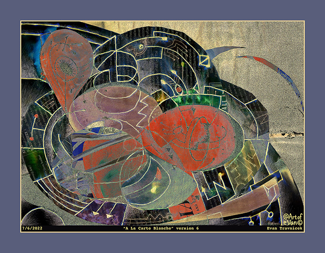
I don’t know what to write about this. It makes me think of some of Georges Braque’s paintings. Braque certainly inspires me. His form of cubism is more human, more warm in my opinion. At least some of his later work.
This piece is like a still life. It doesn’t seem that inspiring to me though. I’ve been struggling to develop a style I feel passionate about for the last decade or so. I lost my studio in Nebraska when I moved to this ghetto state of sociopathy in 2006.
In Nebraska, I was creating large paintings like Paradigm Shift, and The Socratic Tree. I was getting into truly mixed media of trash, dirt, sawdust, found objects, branches, fabrics, nails, and twigs. I was really on to something developing my own body of work. But, as change in life is merciless with its lessons of spiritual tragedy, the farm became a family loss.
I struggle with my own bitterness. Since I was born, life has had a love affair of depriving me of many things others take for granted. I wrote one time in a sketchbook from the 1990s that “my art is my lifelong love affair” or something like that. Life loves to taunt me with beautiful trolls who love throwing salt on my mortally afflicted heart because the trolls see me as being more blessed than they are, so they have to “get back.” It doesn’t matter how much I really actually suffer to them. Their weltanschauung is all that matters to their mortally limited beliefs.
I realize that last paragraph leaves me wide open to the criticisms and judgements of lifeless world leaders whose life purpose it is to destroy life as they profess in lies about saving life, covertly stalking radio hosts looking for a bit o’ sensation to get ratings from, economists in denial of their own bitterness and distrust, and self-delusion made rockstar, zen-master, life coaches jumping out from YouTube like ravenous piranhas tripping out on the latest marketing juice.
Oh well, I’m letting it flow and it feels fucking good. Blame is a thing I struggle with for life too. It feels good to take my power back at times when I realize the blame game has got too out of hand in my head. I just feel repelled by all the pop self-help gurus and their choruses of “take full responsibility for your life” bullshit. I really don’t think they know what they’re talking about as they market their narcissism to other lost souls.
So this piece really does echo some of the shit I want to use for more serious, detailed, more involved, bigger works. Its got paper cutout stuff pasted on the surface. I used pencil shading in some parts. I drew my trademark line drawing, circuit-like doodles over the various surfaces thereafter and then applied water to make the contours bleed.
I wanted to experiment with a border that looks like the piece is mounted on a board for display. I’ve been feeling annoyed with the borders I’ve been making digitally for my art online. They were intended to look like matting boards of a variety of colors. I’ve just been feeling like they are too cheesy however recently. I may change my mind again about it after posting this recent piece with no e-matting, but a mount on which the piece is fixed.
It looks like there is an Ouroboros that constitutes the light green annulus that occupies the center of interest. I hadn’t intended that effect while I was in the process of making it. I needed to bust out of another rut or block I’ve been in. So this piece is representative of that. There really was no pre-planning or preparation for it, other than the style I’ve been using for the last few years. I just cut out some material from weird fashion magazines after I’d drawn the shapes with pro-markers. I’m still entertaining mixed media concepts, which usually includes markers, pens, pencil, cutouts and simple chemical transformation processes.
I let a lot of things get in the way of my creative actions, and it becomes, not just battles that are swiftly won, but internal wars with my habits, my conflicting desires, and my obsession with politics. This piece looks like a knot in a way, giving some symbolism to my conflicts. I got interested in topological knots a few years ago because of how I realized they represented complex closed loops and how I imagine they characterize psychological compulsions, obsessions, and other self-limiting habits. I wanted to make something creative out of something destructive, and hopefully helpful to others.
I’ve been reading books by Moshe Feldenkrais, a Ukrainian-Israeli engineer and physicist who developed a body awareness and movement training process. I recently finished reading Body & Mature Behavior, a book he wrote after world war two. He discusses the balancing senses as found in the ears, and, more specifically, the semicircular canals. If you pull up a diagram of these structures, you can see that my illustration associates with them. I hadn’t intended this either.
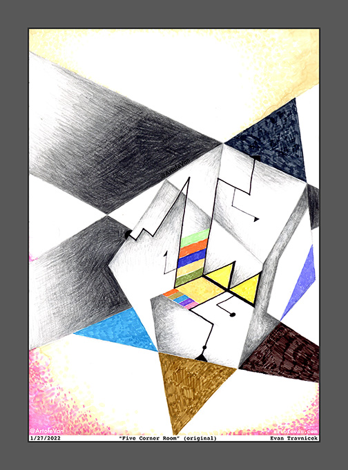
I titled this one Five Corner Room. I’m playing with the optical illusions of dimensions again here. It’s an idea that satisfies my impossibly thinking mind. You want to know what I think. Well, here it is. I also enjoy seeing landscapes of translucency in my mind. I’m trying to think back to when I first started that idea. It goes back to when I started making plans to paint a painting I titled Paradigm Shift in 2001.
I was very inspired by Paul Klee, the Swiss artist from the 20th century then, as I still am. I’d always liked how he created broad planes of color enclosed by geometric contours of lines of oil from the transfer drawing techniques he used. I made this idea back then called the Word World, a world in which words versed the planes of objects. I thought of it like a panorama through using the third dimension to illustrate the idea. In my mind, words could be placed behind words for associations and layers of awareness and attention.
This work is a continuation with the current theme presented in the blog post previous to this one with the peice therein titled Pythagorean Meme. I mentioned the painting I painted titled Paradigm Shift because this current theme bears a kinship with that earlier expression of mine when I was producing larger works in oil and mixed media on canvas. I plan on posting that painting here on WordPress, and/or my Google blogspot. I found that I posted it to my Twitter account in 2012.
For this recent work, I’ve cut out applying water and rubbing alcohol as washes after drawing images. While I believe that process is an important step to my current artworks, I needed to try cutting that step out in order to simplify things for myself. It’s just a basic concept that the more steps one must take to get a desired result, the more likely frustration can corrupt the process. Assimilating collage work into my illustrations is another step that causes more labor. Nevertheless, the more variables an artist introduces into his or her work processes, the more surprises and new innovations are likely.
I feel like there is so much more that can be done with cubism, and optical illusions. It seems like artists of the 20th century—in western worlds at least—allowed themselves to get lazy on creativity, imagination, and innovation. As it always seems to throughout the ages, I think art got institutionalized by elite tastes in the 20th century up to now here in the 21st century.
I use the term “elite tastes” because it’s more accurate than the 19th century term “bourgeois tastes.” The term bourgeois comes from Marxism which negatively frames entrepreneurs, small business owners, and non-elite class libertarians. Most of us alive today have grown up in a world that has been manufactured by Marxist oriented agendas because of an elite, government, corporate, political, ruling class. I say that because of the current, primary, global monetary system that has evolved from the Federal Reserve.
The Federal Reserve was created because of a few destabilizing events that occurred a few years after the beginning of the 20th century, one of which was the Panic of 1907 from which culminated because of an earthquake that occurred in San Francisco in 1906. Deposits were unavailable for weeks while money was needed for an economic boom.
The Federal Reserve was formed in 1913 by bankers, headed by J.P. Morgan, and political authorities in the United States Senate at the time to remedy businesses and shortages and lack of access to money. This is why I say that it was the first major tool of socialism for elites, bankers, politicians, and other titans of the time. It was formed to bail out banks, industries, and commerce. While it helped to stabilize the economy for smaller businesses too, its main purpose was to create an institution—a socialized insurance policy—against failure for elites.
So this has been going on for longer than a hundred years here in America, creating a permanent class of politicians who merely revolve through doors of banking, politicking, war-making, and sausage making. In summary, we have had a class of royalty under “capitalist” monikers, something the founders of the US fought to free itself from British Royal rule.
I wrote the last three paragraphs to set the context in which art in America has developed. Artists have never been narrated as being titans of finance, or savvy businessmen. Artists have always been subordinate to elite, ruling classes, whether if it was being a scribe in ancient Egypt, a court painter in Victorian Europe, or an intelligence-propaganda asset of the political tyranny of the CIA.
It’s especially hard for artists to get a foot in the world today because we aren’t creating anything excessively dopamine stimulating, such as porn (I realize some are); anything convenient and immediately gratifying like a sugar-carb permeated snack; or socially useful like an iPhone, which provides a handheld desktop for an endless amount of entertainment, guidance, media-making and editing, business, or social media apps.
In order for artists in America to really succeed with a self-sustaining, independence supporting income, we have to be connected to and socially pleasing to wealthy collectors, politicians, bankers, gallery owners, most all of whom are left-leaning. I note here a phenomenon of right-leaning politics to be less imaginative, daring, and innovative in the arts. I think that’s because conservatives are naturally rule and law abiding, whereas liberals tend to be more free with breaking rules.
I conclude this blog by saying the cliche that only one percent of artists “make it” with their careers as artists because of this highly selective, socialized, hand-picked world of western art. Most everyone is in debt to the debt making machine of Washington and its magical acts of fiduciary conned-fidence. At its core, money is what really, really matters to most people. And art is a fleeting oddity that passes by one’s scrolling through digital media on a handheld device. It’s hardly even an entertaining pleasure to most people anymore.
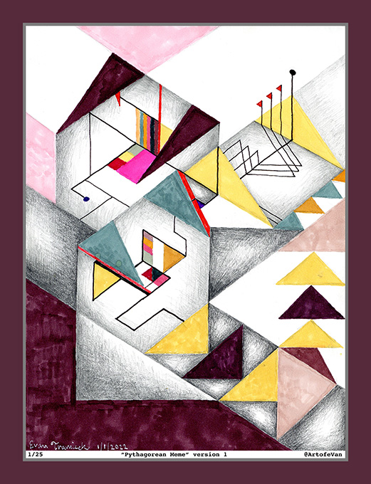
I titled this piece Pythagorean Meme because of its geometric shapes. They look like abstract housing structures on a landscape. The idea echoes the Bauhaus architectural school as well as mortgages for housing and the FDIC. I used the word meme in the title because I didn’t want to use the word dream. Dream is overly used in my opinion, but it still communicates so much about our illusion based world that’s relevant. So I sublimated it with an associated rhyming word.
As you may know, I’ve been fascinated with optical illusion art for the last few years at least. I’ve always loved the Bauhaus artists and philosophies of art. The word bauhaus has meaning to me because it contains the word house in its German form, and housing, home, security, family, mortgaging, financing, etc. are all associated with it. Art is housed by housing, shelter, and environmentally protecting structures. This recent style of art is enabling me to explore more of that and expand upon it with my own vision. Theo Van Doesburg is an inspiration, as well as Oscar Reutersvard.