Such by Such (version 7)

SuchBySuch7ematted

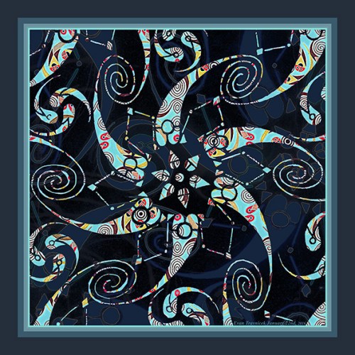
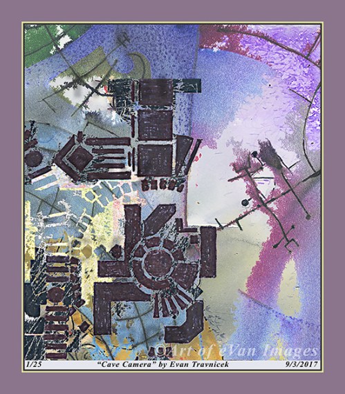
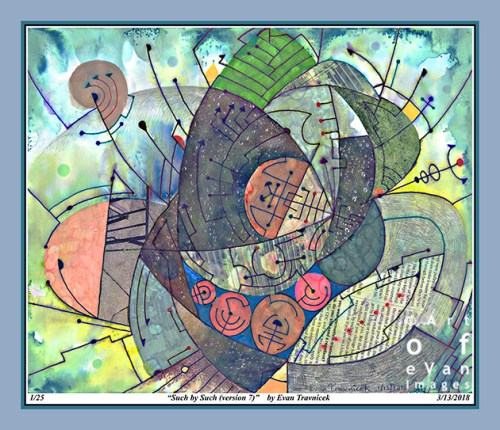
I call this one Such by Such. SXS could be a shortened version of the title. This particular image here is version seven. I had fun tweaking the filtering and color adjustments in Photoshop to reach the results you see. I pasted paper cut out from magazines, and drew alcohol-based marker, and water-based pens on paper to complete the work. I then proceeded to my usual next step of applying water, rubbing alcohol, and lacquer thinner to achieve the psychedelic tie dye effects. The work I do in Photoshop helps to emphasize, exaggerate, and alter the natural bleeding effects that I evoke in physical media.

This current style I’ve been exploring and experimenting with currently utilizing basic lines, points, planes, some shading, and colors is a certain kind of style that mimics a scientific or mathematic spirit. The point, line, and plane are one and two dimensional visual concepts. They can be implied with the third dimension on a two dimensional picture plane by using drawing techniques established since the European Renaissance.

The fourth dimension was theorized about by Einstein in the 20th century. Simultaneously, art in the 20th century started exploring four dimensional visualizations and concepts. Artists, such as Pablo Picasso, M.C. Escher, and Salvador Dali, explored these time warping, perspective fracturing, mind bending, multiple simultaneous points of view ideas in visual art, thus giving a kind of experience for viewers viewing these artist’s works.

I’d say that this idea of multiple points of view was developed by Paul Cezanne and perhaps Eduard Manet, both great French Impressionist, and post-Impressionist artists, first. I think Picasso and Georges Braque would agree. These two artists were inspired by Cezanne and readily admitted so. They developed what they called “scientific cubism,” which takes Cezanne’s nascent perspective distortions into greater degrees of perspective fracturing and bending, thus accomplishing cubes of space, looked at from varying, disjointed points of view, for viewers to see of a whole object.

Braque and Picasso used physical objects, such as people, guitars, and tables, to represent their semi-abstract ideas in their paintings. I’d like to think that I’m taking this concept of cubism a step further by drawing completely abstract lines and shapes that aren’t attempting to represent anything but themselves as abstract lines and shapes. When combined, I often note that they have certain dimensional and cubist qualities to them. They hint at a fourth dimension for me. I simplified the idea of measuring space in the title of this piece by calling it Such by Such because I did not attempt to measure the four dimensional mimicking nature of it. I suppose I was lazy in that regard. Oh well.


Specifications:

Title: Such By Such (version 7)

Source mediums: Water-based ink, alcohol-based marker, water, rubbing alcohol, and lacquer thinner on paper, manipulated digitally with filters

Print medium: Hewlett Packard printer ink from Hewlett Packard DesignJet Z2100 printer on Hewlett Packard print paper (Note: print can be made with archival paper and printer if requested)

Digital manipulation completed: 3/13/2018

Dimensions of print: 31 inches by 36 inches

Number of limited edition prints: 25

Contact me: artofevan@hotmail.com

Leave a comment

March 14, 2018 · 5:52 am

Hydrogen (version 1)

This piece I made back in 2013. I’m reblogging it for fun…

Art of eVan's avatarArt of eVan

Hydrogen (version 1)

While in the process of preparing the different versions of A Synthesis of Matter and Mind, my eye was attracted to the idea of making one of the smaller circles into a work of its own. Luckily, with the software I have on my computer, I can do that.

So I selected this circle from the lower left hand corner of A Synthesis of Matter and Mind, flipped it around, and altered some of the colors so as to create more of the effects I wanted to bring out.

It’s another simple idea with some complexity added to it from the distortions, textures, and amorphous clouds of color. I’ve been attracted to an idea, as of late, that expresses non-physical vibrational fields, anchored to more physical, dense fields.

So the little black mosaic pieces composing the definite designs and compositions anchor the more amorphous and cloudy fields of color.

While…

View original post 86 more words

Leave a comment

January 25, 2018 · 6:36 am

The Heart of a Habit (version 5)

TheHeartOfAHabit5ematted

This digital illustration here is derived from two different drawings I executed on paper a couple of years ago. That was when I was fresh out of school having graduated with a degree in Health Information Technology. It was also after I had just attained my credential as a Registered Health Information Technician. I felt so proud of myself for accomplishing what I felt were these highlights of my life.

I titled this piece The Heart of a Habit. The two drawings I used in layering it together were Topology of Hearts, Hands, and Minds, and Happy Zephyrs. I created this digital amalgamation back in February, 2016. For some reason, I stopped making these mathematically approximated tessellations. You may see some influence of M.C. Escher’s work here. I started becoming more interested in liquid ambiences from applying water to water-based pen work, and rubbing alcohol to professional marker applications.

I’ve been trying to resolve a conflict for a long time with my art, and it keeps on morphing into my fascination with styles of art that are polarized. So, for example, Escher’s work is mathematically refined, and perspicuous, but Kandinsky’s work is the opposite, and, in some cases, is quite amorphic. I truly enjoy both styles of art: Optical illusion art, and abstract art. I’d like to make a bridge between Optical-type art, and purely Abstract art, which, to me, would be the ultimate optical-psychological form of art… at least at this point in time.

A habit is often unquestioned, and, like a heart, is hidden. One can only hear the beat of a heart if one listens closely. I make this comparison of a heart to a habit because, if one observes with curiosity, and without criticism, one often finds that a habit is used to fend off some unwanted circumstance or feeling. The word habit rhymes with the word rabbit, and rabbits run from danger. A rabbit’s heart races rapidly as it flees quickly from danger, such as a predator.

My art can be seen as a habit with which I use to escape the harsh realities of the world. I don’t think it needs to be pathologized however. I think it’s a constructive outlet for all the frustrations I’ve encountered in the medical and business fields. I’ve been making art since I was a baby, so it’s pointless to try to dismiss it as a neurosis. I am glad my art seems to defy George Orwell’s postulation that “all art is propaganda.” My art has become so abstract at this point that I feel it successfully escapes the orbit of politics. I just haven’t imagined a truly satirical, powerful, salient political art idea to illustrate for a few years now.


Specifications:

Title: The Heart of a Habit (version 2)

Source mediums: Water-based ink, on paper, manipulated digitally with filters

Print medium: Hewlett Packard printer ink from Hewlett Packard DesignJet Z2100 printer on Hewlett Packard print paper (Note: print can be made with archival paper and printer if requested)

Digital manipulation completed: 1/22/2016

Dimensions of print: 30 inches by 30 inches

Number of limited edition prints: 25

Contact me: artofevan@hotmail.com

Leave a comment

January 23, 2018 · 9:01 am

The Curvilinear Traveller (version 1)

TheCurvilinearTraveller1ematted

Whimsicality and spontaneity are pretty hard states and results to achieve in art. That is, when you try to line them up with the love of beauty and wonder. Beauty and wonder do require a sense of design and order to some degree or another. I haven’t measured that degree, but it does seem as if there is some intuitive knowledge there at least. It all has to seem effortless, too, which is a state one works oneself into after doing doodles, warmups, practice runs, and exercises.

This piece here achieved a result of such whimsicality and near total spontaneity that I felt it satisfied a certain, but deficiently defined, level of experiment and discovery for me. I have been trying to achieve this level ever since. But this image you see here is part of a larger image I titled Astonished Buoyancy for which I posted here a while back. Astonished Buoyancy is more suggestive of a large balloon in the foreground, whereas this image has the large foreground balloon cropped so that it looks more like the curved surface of a planet in space. There is still an orange balloon shape in the background at the upper part of this illustration however.

I just became thrilled with the nebula and clouds pervading the space around the objects, which add to the life, dimension, and mystery of the work. When I was physically drawing the drawing this image was derived from on a piece of paper, I made sure not to get overly preoccupied with the lines I was drawing for delineating the forms. This is what I feel is the whimsical aspect. The spontaneous aspect occurred in the filtering of the image as a whole in Photoshop as I altered the colors, did inversions, and executed sharpening effects. The neutral washes and background colors became even more emphasized and psychedelic as I worked on the piece.

What’s exciting about it to me is that, as I work throughout my entire process of creation for an illustration, both traditionally and electronically, space seems to always want to express itself as something more than mere flat emptiness. It always seems to want to express something more, something just beyond perception, beckoning me and you to explore further, to travel past the obvious and discover whatever it is past the fold, hill or cloud radiating from this particular window in time.

Specifications:

Title: The Curvilinear Traveller (version 1)

Source mediums: Water-based ink, alcohol-based marker altered by lacquer thinner and rubbing alcohol on paper, manipulated digitally with filters

Print medium: Hewlett Packard printer ink from Hewlett Packard DesignJet Z2100 printer on Hewlett Packard print paper (Note: print can be made with archival paper and printer if requested)

Digital manipulation completed: 9/20/2016

Dimensions of print: 25 inches by 24 inches

Number of limited edition prints: 25

Contact me: artofevan@hotmail.com

Leave a comment

December 9, 2017 · 9:01 am

Flowing Productivity (version 2)

FlowingProductivity2ematted

With this piece, I’m dealing with motion and complementary colors, such as the red and the green. A certain degree of depth is expressed as well. The intent is whim, spontaneity, and loose, flowing organic structures. I’m evoking the spirit of nature to imitate me as I attempt to imitate nature.

Lots of media came together to experience this piece. I used brush, watercolor paint, pen ink, India ink, water, lacquer thinner, rubbing alcohol, plant shrubs, paper, oil pastel, and digital editing to make it all happen. The left leaning flow of the picture, overall, is what I felt most essentially characterized this image.

The hybridized illustration you see here is a portion of a drawing I made a few days ago called Vaporous X-Ray. I captured a photo of that drawing on my cell phone, and posted it to my Instagram account. I’ve been very lazy with regard to keeping up with my WordPress blog and my Facebook page because of the amount of time, mental labor, and effort it takes me to keep all of my profiles online up to date.

It takes a lot of time, energy, space, effort, labor, materials, supplies, and equipment to keep my productivity afloat. It’s not a matter of me not working on anything. In fact, I just went through a pile of drawings I’ve made in the last couple of years this evening, and a stack of sketchbooks completely full of ideas I record regularly. There’s no way I’ll ever quit making art.

My art will one day be the public’s, or in some private collection, or even yours. I ask you to help support me and my creative efforts to serve our world better through the communication of images and ideas. Like my page, comment, show your friends and family, and contact me by email to make a purchase of anything you like. Or even hit me up for a commission piece, like a mural, or a portrait or something.

Specifications:

Title: Flowing Productivity (version 2)

Source mediums: Water-based ink, alcohol-based marker altered by lacquer thinner and rubbing alcohol, watercolor paint on paper, combined with digitally scanned organic plant matter

Print medium: Hewlett Packard printer ink from Hewlett Packard DesignJet Z2100 printer on Hewlett Packard print paper (Note: print can be made with archival paper and printer if requested)

Digital manipulation completed: 12/2/2017

Dimensions of print: 27 inches by 27 inches

Number of limited edition prints: 25

Contact me: artofevan@hotmail.com

Leave a comment

December 7, 2017 · 9:11 am

Hey, I Like The Smell of That (version 3)

HeyILikeTheSmellOfThat3ematted

Someone came up to me while I was making this image and smelled like a medicine cabinet. I actually thought “hey, I like the smell of that.” I don’t know what it was. Probably cough syrup or something. I decided to title this image Hey, I Like The Smell of That. For some reason, it makes me think of a person who thinks that in reference to another. 

It looks like there is a cabinet in the background off the the right depicted rather psychedelically, connected by a dot and a line to the large, foreground form. The large foreground form looks like the head of a person. The fact that there is just one dot with a circle around it at the center of the large form makes me think of a cyclops. 

The bigger idea here I suppose is visualizing the act of connecting seemingly disparate ideas, peoples, and events together in the truly nonlinear universe. But of course I could only crudely use linear lines to illustrate the notion of connections. I didn’t use a ruler to draw them though. 

The colors you see in this image here are not the same colors used in the original drawing. The original drawing is “larger” than this one. I titled the original drawing Bear Thread. I selected only a few objects within Bear Thread and made this image. I’m thrilled to make all these different variations from single, original, traditionally created drawings, paintings, and collages. 

I like how, when I start writing about things—anything—art—dreams—whatever, the “ice” melts with regard to the cluelessness I experience before writing. I often can’t come up with a single idea I want to write about in reference to the art I make immediately prior to attempting to write. Perhaps it’s my brain struggling to shift gears; and also the fact that I find myself trying to write at the very end of my day, late at night. Sometimes I just want to write bull-shit, like the mixed nuts with sea salt on them and the gummy bears I just chewed on. I didn’t eat that many, so I don’t feel so thwarted by guilt. I know people will find this paragraph vaguely irritating as a waste of their time, but I needed to write it for the exercise of writer’s block ice-breaking. 

Like medicine, the colors in this image are candy-like. I have found it interesting how medicine and candy have so many similar visual characteristics. I wonder if the pharmaceutical industry intended that. You know, like Skittles, Nyquil, and Desipramine? I guess people like being pleased with the items, UFOs, liquids, and pilly willies they ingest. I’m hoping people also like ingesting my images with their eyes and finding neurological fulfillment therein, or derivatives thereof. 

I can write anything here, and I like that. I don’t want to be limited. That is part of the non-literal message expressed in my work of art here. You see all the forms defying definite boundaries for the most part. I let the splotches, rubbing alcohol dribblings, and ink bleedings flow along paths of their own choosing, though I was the initiator of their expandings, distortings, and explorations. I found the drawing to be exploring itself as I stepped back and observed it at times. 


Specifications:

Title: Hey, I Like The Smell of That (version 3)

Source mediums: Water-based ink, acrylic based ink, oil based ink, alcohol-based marker altered by acetone and rubbing alcohol on paper

Print medium: Hewlett Packard printer ink from Hewlett Packard DesignJet Z2100 printer on Hewlett Packard print paper (Note: print can be made with archival paper and printer if requested)

Digital manipulation completed: 10/6/2017

Dimensions of print: 34 inches by 21 inches

Number of limited edition prints: 25

Contact me: artofevan@hotmail.com

Leave a comment

October 6, 2017 · 9:51 am

Hour Shed (version 4)

HourShed4ematted

I call this one Hour Shed, as in shedding an hour of time. I think of it as an abstract, psychedelic landscape with a warped horizon. A couple of billowing clouds hover overhead, which are more like doorways to other dimensions. I just really have fun scanning drawings I make with mixed media. With the drawing I made for this piece, I used water-based ink pens (a Schneider pen), and alcohol based marker drawn on a small sketchpad. I then applied some water with an excellent flat head paint brush to make the water-based ink bleed. I let that dry, and then applied some ammonia as an experiment to see how the already applied media would interact with it. It didn’t really do much.

I then splashed some lacquer thinner over the surface of the drawing, which made the alcohol based marker bleed, and also the ink from the Schneider pen bled. After that dried, I applied some rubbing alcohol. The results left what I wanted: Discolored, blurred, cloudy, ambient, faded, psychedelic, bled effects.

I’d recently been listening to authors and documentaries discussing the hippie culture in Laurel Canyon during the 1960s. I already knew that the CIA covertly experimented with LSD on people unbeknownst to them. I also knew that the US government really wanted to find a way to divert anti-war protesters from attracting too much attention for being against the Vietnam war. So what I discovered is that the CIA helped to create the hippie counter-culture so as to discredit anti-war protesters and to divert young people into drugs, cheap sex, and other demoralizing activities.

I have always enjoyed abstract and psychedelic art. Much of my inspiration comes from the hippie counter-culture, including a lot of the music produced from that era. It’s just that I now see what purpose that scene served. Today, it’s plain to me that entertainers, artists, actors, and public figures get fame, attention and money because they agree to the CIA’s terms of spreading “American” cultural hegemony across the globe.

It has been known for years now that the American Abstract Expressionist movement was financed and nurtured by the CIA so that America could claim a culture of its own on the world stage. Centralized planners felt that America really had no art or culture up to that point when the Abstract Expressionists were forming, so the CIA decided to create a world stage for them. Again, I’m not repelled by the counter-culture movement of the Abstract Expressionists. I just note that they were allowed to become famous because they had secret state backing.

In my learning and research into art methods, techniques, psychological values, and history, I have come to conclude (perhaps for the time being) that art serves imperial purposes. It is used as propaganda. It entertains, amuses, impresses, catches attention, and thereby communicates messages consciously and unconsciously. An Italian Marxist named Antonio Gramsci called the proliferation of imperial culture, art, and propaganda cultural hegemony. This means that a dominant state—or superpower—superimposes its entertainment industry, such as Hollywood for example, on to subordinate states, thereby achieving a psychological penetration of the collective population.

Specifications:

Title: Hour Shed (version 4)

Source mediums: Water-based ink, alcohol-based marker altered by water, ammonia, lacquer thinner, and rubbing alcohol on paper, digitally combined with organic material

Print medium: Hewlett Packard printer ink from Hewlett Packard DesignJet Z2100 printer on Hewlett Packard print paper (Note: print can be made with archival paper and printer if requested)

Digital manipulation completed: 9/18/2017

Dimensions of print: 30 inches by 16 inches

Number of limited edition prints: 25

Investment of print not framed: $80

Investment of print framed with glass: $400.00 (shipping included)

Contact me: artofevan@hotmail.co

Leave a comment

September 18, 2017 · 9:20 am

Services (version 2)

Services2ematted

Note the pinpoints of organized light, like they are coming from the windows of a skyscraper working at night. Like there’s a story of workaholics to be told here. They were formed by a flooding technique I used that’s provided for users to use in Photoshop. Overlapping text can be determined—however inchoately—as composing the vertical and horizontal structures. It can’t be determined, however, whether if the larger text arising from the bottom to the middle of the picture is implying “services” or “devices.” In a larger, holistic context, devices perform services, so there is indeed some meaningful overlap there.

Usually I make and show images with a lot of color in them. This piece doesn’t meet that standard, so it is sort of an odd one for me. It still expresses a style I’d imagined and been inspired by. It achieves an apparently complicated and random background—sort of like white noise—but makes gestures towards order and implications towards meaning. It’s like a subconscious stew or alphabet soup. Perhaps I may develop some ideas playing with the shapes of letters and transforming them into aberrations of traditional letters as found in the English alphabet.

After reviewing this piece and preparing it for my online galleries, I am reminded of Maria Elena Vieira Da Silva’s art, and how it inspires me. I find this piece to be very similar to some of the paintings she produced. I’m not ashamed of that either. Usually I strive to be as original and independent as I can from other artists, but, with this piece, I feel it’s a model that only resembles Da Silva’s; and it acts as a stepping stone for me for inspirations of newer and even more original work.

I find this illustration to be rather top heavy due to the concentration of white points collected at the very top of the image. This vaguely annoyed me, and I wanted to add some space above that concentration. After looking at it for a few more moments, I decided to leave the canvas shape and size as it is. I find it to be an asymmetrical balance that creates tension, but not enough to be obnoxious. Moreover, I selected a rectangular shape in the lower left side of the picture plane, and darkened it slightly so that it differentiates to a slight darker shade from the rest of the dark grey background. It could be the silhouette or shadow of a building in the foreground in one’s imagination.

Leave a comment

September 8, 2017 · 5:33 am

Cave Camera (version 1)

CaveCamera1ematted

In putting this image together, I saw light casting out from a mechanical device. I thought of film, as in film for a traditional 20th century camera, and how it chemically forms images on its surface after being exposed to light. Then I thought of the primitive ritual art that cavemen made in prehistoric times on cave walls. I combined these thoughts in the title Cave Camera. 

I wanted to combine a futuristic robotic or computerized device with the idea of a caveman painting something on a cave wall along with light cast upon it so that the image can be seen with added special effects. Simultaneously, in a more contemporary time period, I see associations with a movie director and how movie directors set up movements in time to be filmed. Images capture moments in time, whether if they are more subjective, as in a painting, or more objective, as in a photograph. Movies capture movements in time, such as with films and videos. Movies used to be created by image frame stills in the 20th century. Many stills were linked together so that, when they quickly passed over a source of light, the images cast upon a wall or silver screen gave the illusion of movement. This surely would have been a magical experience for a caveman. 

I was inspired by some of these ideas by reading The Work of Art in the Mechanical Age of Reproduction, by Walter Benjamin, and Meditations on a Hobby Horse, by Ernst Gombrich. It seems like we are entering a dark age here in the Western world, so I have ideas now that reach back to the origins of art and why people made art in prehistoric times. I realize pretty much everything time related is cyclical, so, if we do end up collapsing our civilization all the way down to a dark age, it will only be temporary; temporary in a larger sense of time that is.

This image comes from three different sources of my art that I’ve blogged about before. One of which I’ve blogged about already—Astonished Buoyancy. Another image I blogged about here, Archimedes’ Light, is part of a larger drawing I made called Tree Fish, which is amalgamated into this illustration. A part of New York Station is also incorporated into this piece. My goal is to explore the varying degrees of approximation the different layers and sources have with one another as I form new images. They sometimes merge well as if they were all from the same source, and other times I can tell that its been put together. Either one of these perceptions is okay with me because I work with the new image enough to usually satisfy my visual field and sense of composition. 

In Meditations on a Hobby Horse, Ernst Gombrich discusses the idea of replacement, substitution, and surrogation. A hobby horse is meant as a substitution for a real live horse so that a kid can enjoy imagining riding a horse as he or she rocks back and forth on it. While this is an outdated idea today because kids don’t ride hobby horses in this day and age, it still represents the idea of substitution in art. In history, art has been a vehicle for representations of reality as people perceive it. More recently, art became a vehicle for representing an artist’s inner world and how he or she expresses it for the masses to represent a collective inner reality. That’s where I am at in my artistic endeavors. 

The layers of previous works that I’ve made introduced into new images and combinations are concepts I use to build in my imagination. These concepts are usually found in objects, people, places, or ideas. My art becomes a subtle substitution for a multiplicity of things. I aim to create eye food for you. Something to help you organize your mind. 


Specifications:

Title: Cave Camera (version 1)

Source mediums: Water-based ink, and ball-point pen, on paper, digitally combined

Print medium: Hewlett Packard printer ink from Hewlett Packard DesignJet Z2100 printer on Hewlett Packard print paper (Note: print can be made with archival paper and printer if requested)

Digital manipulation completed: 9/3/2017

Dimensions of print: 32 inches by 28 inches

Number of limited edition prints: 25

Investment of print not framed: $90.00

Investment of print framed with glass: $430.00 (shipping included)

Contact me: artofevan@hotmail.com

Leave a comment

September 4, 2017 · 8:11 am

June Joinder (version 4)

JuneJoinder4ematted

I made the foundation for this image back in June, 2017. It’s a selection from the piece I posted and blogged about then titled Supplant. I titled this selection June Joinder. Three lines are joining a circular fiducial marker structure in the center lower left. They look like they could be composed of metal. They also make me think of some alien technology doing measurements on some earthly plant life as they scan a selection of organic matter.

Anyway, I had fun introducing a drawing I’d done earlier this summer with marker and ball-point pen on a manilla folder into a background of organic plant matter. The plant matter is just weeds I gathered from the backyard and scanned into digital documents. It’s the idea of every little detail being observed by an adjoined point of sense.

I’m noticing I’m taking a path opposite of the trending pop art craze. I read an article recently showing that people are looking at contemporary art in museums and galleries a lot more currently than they are looking at the more classical art movements. Even impressionism and post-impressionism are being ignored more by the younger generations.

Compared to the more classical art styles and movements, contemporary art is generally more simple in content, detail, and composition. Pop art is, of course, a great representative of contemporary art. I see pop art everywhere I look in current culture and society. I know what purpose pop art serves. It doesn’t require people to think, contemplate, and discover. It’s all just surface.

I just know from my own experience that anything my mind has to work at to understand frequently discourages doing so. There’s always so many more things my mind can consume that are easier to understand. A new word I don’t know, while I’m reading something, can often trip me up and discourage me from reading further. I surmise that this is generally the case with others.

But now that “the world” is a handheld device, it’s so easy to look a word up. And I often do so. I just gave that example in the above paragraph to describe a common challenge we all experience as mortals with limited abilities and resources. I think our current educational system and fast-paced world discourage noticing subtle nuances and details in our surroundings because so much information usually doesn’t serve someone else’s purpose.

So with my art, I put a lot of detail and nuance back into the picture plane. I want to encourage sensitivity to things usually ignored. I like how, over time, nature and natural forces overcome manmade things—including pop art. Pop art can be found in amusement parks and carnivals. I like imagining visiting an abandoned amusement park in the future that has been overtaken, to an artistic degree, by natural entropic forces.

Many pop artists like the mockery and worship pop art makes of itself. They seem to enjoy the irony of it, while profiting off the cultures of dumbshits educated to ignore vast experiences of nuanced perceptions. I like the impersonal mockery time and nature make of securely established elite pop artists and their pop art.


Specifications:

Title: June Joinder (version 4)

Source mediums: Ball-point pen on manilla folder digitally combined with digitally scanned organic plant matter

Print medium: Hewlett Packard printer ink from Hewlett Packard DesignJet Z2100 printer on Hewlett Packard print paper (Note: print can be made with archival paper and printer if requested)

Digital manipulation completed: 8/10/2017

Dimensions of print: 30 inches by 25 inches

Number of limited edition prints: 25

Investment of print not framed: $85.00

Investment of print framed: $425.00 (shipping included)

Contact me: artofevan@hotmail.com

Leave a comment

August 12, 2017 · 5:18 am