Plenipotent Firebrand (version 5)

Plenipotent Firebrand (version 4)

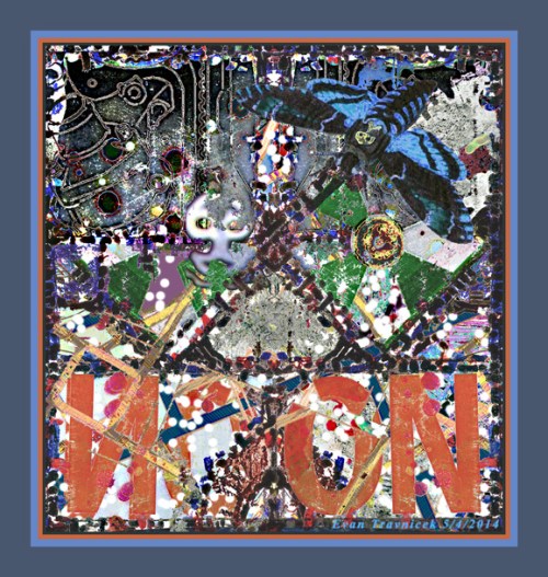
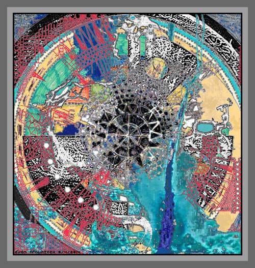
There are five different sources from which this image is derived. Two of those sources are my own hand drawn images, and the three others were images obtained from the internet. One of them is an image of vessels taken from a fluoroscopy, another one is a circular fiduciary marker, and the one you can see in the foreground–the blue and teal colored form–is actually a picture of the fire tornado that was recently seen in the California fires this year (2014).

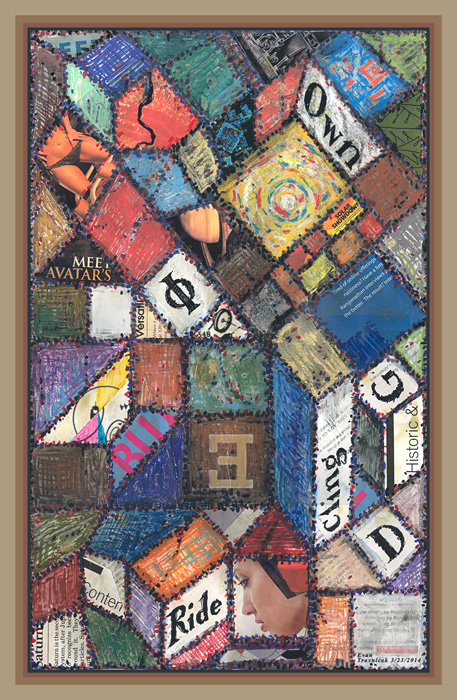
I’d been considering how imprinting works in many different domains, physical, emotional, psychological, and spiritual. One comparison I’d recently read about is the type-writer ball. A type ball has the letters or characters of an alphabet on it, and spins accordingly to the correct character when a key is punched on the keyboard. That’s how typewriters from the 20th century were.

In many ways, people are like type characters in that they imprint the external world, and even their internal worlds, with their thoughts, feelings, actions, and energies. This image sort of looks like a type ball, or it can be compared to it at least. So many of the symbols represented in the selections combined in the creation of this picture seem to allude to an imprinted and imprinting soul.

The circle itself is a symbol of the self, as Carl Jung indicated in his research as a psychoanalyst. You can barely see the fiduciary marker coming through from the bottom layer here but it is basically the black and white colors you see coming through all the cracks . Fiduciary markers are used to mark locations in the body before a patient undergoes surgery for a certain procedure in his or her body, thus an imprinting is done to accomplish this.

The words I chose to title this piece indicate a character who has full authority to brand his or her world with fire. Branding with fire used to be done by ranchers in order to mark their cattle with a distinct character so as to distinguish one rancher’s cattle from another’s. I reversed the colors on the fire tornado–which you can see in the foreground on the lower right of this picture–so that the colors are different hues of blue. Normally, yellow, orange, and red are associated with fires, but natural gas can be blue when it’s emitted as a flame from a stove for example.

There is enough yellow and red anyway characterizing the picture that it easily communicates a sense of heat; a heat we are all experiencing this Spring and Summer.

1 Comment

June 5, 2014 · 7:19 am

No One’s Frenzy & the The Or @ician (version 1)

No One's Frenzy and The The Or @ician (version 1)

What we really have here is a play on words that got a little out of hand. You see, of course, the letters N-O-O-N at the bottom of this image, and they are undulated by and wound up in various entwining layers.

There’s a moth in the upper right that I used again for this particular series–the A series to my Wrecked Tangles (After the Crash) online art project. Briefly, After the Crash is intended to communicate foreknowledge of an impending crash in the global economy, and Wrecked Tangles is, yet, another play on words meaning to communicate “rectangles.”

So about the title to this piece… well, see, I was out downtown on Friday night, and when I left from walking around and talking to people, I got in my truck and thought of a different way of spelling “theoretician.” I broke apart the word into separate words, thus re-creating it into: The Or @ician. I really didn’t know what to do about the last six letters, as I couldn’t find a creative way to re-represent them.

“No One’s Frenzy” is a revision of “noon” for which you see at the bottom of this image. Noon can be reconstructed into no one. And the fact that there’s a moth dive bombing towards the capital letters at the bottom of the picture sort of conveys a moth-like frenzy at noon time. The image could really make a good piece for people to marvel and wonder over at a dive bar during the noon hour.

Leave a comment

May 5, 2014 · 8:35 am

Anti-Depressant / Anti-Expressant (catalog #107)

Anti-Depressant / Anti-Expressant (catalog #107)

Originally, I thought of titling this painting as “They Twisted My Words.” This was to convey a message from the man Christian history calls Jesus. When I painted this painting, I hadn’t read too many different perspectives and histories about the western bible, but I had a suspicion that many of the messages written in the bible were actually twisted and distorted so as to serve the purposes of holding power over people from the centralized religion of Christianity.

I had struggled with some of the teachings contained in the bible years ago, and sometimes I still do. This painting is supposed to represent what Jesus actually taught as opposed to what many twisted souls teach within the corrupted edifices of the Christian religion.

It’s not my intent, again, to try to proselytize anything with this piece. I really don’t have any insecurities concerning what religion anyone practices.

The human face central to this piece is the face of Jesus, and the mask inferiorly superimposed over the posterior side of his face is a continuation on the theme of my Masks of Human Emotion motif. So Jesus represents the true self symbolically, and the mask represents the societally crafted mask that those in various capacities of power have helped to create for everyone through education and religion.

The pills off to the left represent the anti-depressant drug called Prozac. This is what is called an SSRI, or selective serotonin re-uptake inhibitor. This is just a fancy way of saying the chemical serotonin in your brain, which is a chemical that makes you relax, gets inhibited from passing through your neurotransmitters, thereby creating an overload of release of serotonin and causing you to feel better about things in general. Well, that was one of the intents of this medicine anyway.

What we have now in our culture, however, is many depressed, and psychotic people, who take this drug, or a derivative of it, and get even more imbalanced. Most of the cases involved in the shooting rampages in the last few years included this kind of drug in the prescriptions of the characters who carried out the atrocities. But of course the media won’t report on that because they are mega-corporations who have agreements with Eli Lily, which is a big pharmaceutical corporation. In other words, profits are more important than morals or ethics to the centralized entities running America’s economy today.

The targets, and the arrow going through one of them, symbolize what sin actually means. Sin really means “missing the mark,” or being in error with respect to perception and judgement. Much of what we interpret in our world is erroneous, and based on false beliefs about ourselves and others. Hence, sin becomes a whole interdependent world in which we all have to work it out with each other.

The multiple fish-hooks on the right symbolize the passage in the bible in which Jesus tells his disciples “I’ll make you fishers of men.” I didn’t fully understand that passage until later in my life when I learned more about marketing and psychology. 

The stairways descending upward into the upper background of this painting obviously denote a “stairway to heaven.” I think I was listening to a lot of Led Zeppelin when I was working on this piece back in 1996.

Leave a comment

May 5, 2014 · 7:21 am

Masked Quaternity (catalog #64)

Masked Quaternity (catalog #64)

This is the second painting I made concerning the mask theme in my career as an artist. It was painted after I’d graduated from high school, and was in college. I wanted to explore the mosaic style as expressed in oil paint some more at this period in my art, so you can see the pixelations on the masks as orderly strokes of oil.

I got the word “quaternity” from reading one of Carl Jung’s books on psychology. I think the specific volume is called Archetypes of the Unconscious from which I’d learned of this word. Jung was describing a psychological, symbolic, and archetypal concept using the word quaternity as an extrapolation from the concept of the trinity for which most people are familiar with.

In the trinity, there are things like unconscious, conscious, and superconscious; or, body, mind, and soul. In terrestrial terms, there is land, sea, and air. In religious terms, specifically Christianity, there is the Father, the Son, and the Holy Ghost. This painting, and this blog, however, is not intended to instill a specific religion’s message.

According to Jung’s quaternarian archetype, there is a fourth character that is introduced to a trinitarian model. Usually the fourth character is sort of a shady character. For example, to the Father, Son, and Holy Ghost can be added Satan, hence completing the quaternity. Or, to the trinity of land, sea, and air can be added the fourth domain of space, which, indeed is quite dark considering the fact that most of the universe is now supposedly composed of dark matter, according to scientists, and astrophysicists.

So, to introduce the quaternarian model to the idea of the human masks, or the chemical/psychological masks we all wear in our relations with one another, I created this painting as a second step in that direction. None of the masks executed by the executant in this painting necessarily convey a dark, evil intent, but that’s not really the function of masks anyway. Masks are usually crafted so as to cover up, or obnubilate intent.

The mask theme develops in subsequent paintings, as I’ll show you in the future, but for now, I leave you with this painting to ponder in your daily meanderings as your moods change, your faces change, and your relationships diversify and/or simplify.

1 Comment

April 27, 2014 · 3:28 am

The Masks of Human Emotion (catalog #31)

The Masks of Human Emotion (catalog #31)

This is the first painting I ever made concerning an idea I had been thinking about around the 1992-1993 Winter era. It is a painting I made in high school, so there are amateur elements to it. I’m not too concerned about that though. I think the act of creating art is a risk one takes. Albeit, a social risk, but nonetheless, it still is a risk of being mocked, misunderstood, or criticized.

It is understood in science now that we all possess nocireceptors in our nervous system which are basically nervous receptors for pain. What researchers have found, more to my point here, is that people actually experience pain in these receptors, though there may be no immediate physical impacts upon one’s body. A person can witness seeing someone else get hurt, and their nocireceptors react with pain to the observed situation.

This brings me to the notion of the social masks we all wear so that we can function and interact with one another on a daily basis. Our masks are the roles we play for anyone in our lives. Some masks can be quite deceptive to the people around us so as not to let on to any clues about how one really feels.

Taken a step further, people often feel so unworthy and rejected by others (though this may be false belief patterns) that they decide to take psychotropic drugs advertised to them in the media so that they will think, feel, and interact with others “better” and will have a “stable” life that doesn’t create drama and depression.

After all this conditioning is experienced in a person’s day, he or she goes home, and goes into his or her room and closes the door so that solitude and reflection can be had once again. When this happens, the masks are taken off, and a person is once again “real” and more honest with his or herself.

During this time in my life, half of my day was in class at high school, so I painted this painting during art class to express something I didn’t necessarily have a desire to put into words. I was also very into the band Bauhaus, and there was a single that I bought via mail order called Terror Couple Kill Colonel that they made. The title for that song actually pertained to a news story that the members of Bauhaus decided to use for lyrics in one of their songs. On the cover of that single are some masks hanging from a hook. Here’s a link to that song and the cover of the single I’m writing about… http://www.youtube.com/watch?v=PN0woWd4Tj8

1 Comment

April 21, 2014 · 5:01 am

Tungsten Street (version 1)

Tungsten Street (version 1)

In my attempts to salvage this series into something I felt more satisfied with, I decided to zoom in on some of the details composing the multi-layered surfaces of previous manipulations. The details look random and natural enough to escape the overly controlling conscious mind, and that is part of the reason why I wanted to reveal the nakedness of losing control in this manner through an expression of art.

You can see random words and letters strewn about in a semi-orderly fashion, though they don’t necessarily form sentences for comprehension however. I’m attempting to show a roughness, and crudeness; a child-like, though almost brutal truth. Stress is exhibited throughout the picture plane here. It’s a panorama of texture and media.

I thought of the title for a moment, and saw the diagram of a tongue in the lower left hand corner of the image. The upside down word “Latin” can also be seen in the upper left hand area of the picture. Latin and tongues obviously associate with language and linguistics, so I associated this with the sound of the word “tungsten.” A street plasters its way across the picture in a crook-neck fashion, and I thought of all the names that pass you by when you drive or walk down a street passed intersecting streets. Hence, the name “Tungsten Street” became pertinent in my mind as a title for this piece.

1 Comment

April 1, 2014 · 8:49 am

After the Crash (version E1)

After the Crash (version E1)

The original drawing, for which almost all of which you see here, did not have the letter E in it. At first I thought that this would be the D series to my After the Crash, Wrecked Tangles, art project. But lo and behold! I logged on to Facebook and found that I’d already created a D series.

This indicates that I’ve put this project off for too long. I haven’t forgot about it though. I’ve been dreaming of completing it before the end of 2015, for which a projected crash in the dollar’s value is estimated by some economists.

So in order to give you the idea that this series is associated with the character E as a value, I decided to embed a digital E on top of the scanned drawing. I attempted to naturalize it as best I could after flipping it around to a backwards representation.

My letter! A lot can be said just about a mere letter! It also is the letter that starts my first name. Art of eVan is capitalized in this piece signifying a waypoint of completion. I feel this work is important in some way, as I’ve reached a degree of mastery with this style that has increased satisfaction.

I’d been bored and even repulsed by some previous series in this art project, as I started to standardize the process of drawing the originals. The process of standardization is common to many artists who fall into a niche with their work. So in order to reduce some of this repetitiveness, I started focusing on the colors I drew in each square or shape. There are a lot more subtleties that can be added to each corner that help to convolute some of the sterility and transform it into a detailed richness which can be explored upon multiple viewings.

The above outlines some of the challenge I consciously set out to grapple with in the beginning of the Wrecked Tangles art project. And that was to find as many different representations of the basic shape of the square, the rectangle, as well as the circle. The triangle is used in many works as well, but the primary shape I challenged myself with was the rectangle.

1 Comment

March 24, 2014 · 7:30 am

Remarkable (version 1)

Remarkable (version 1)

Remarkable (version 1)

I just was not satisfied with any of the images within this series, so I pulled up the original scanned drawing for the After the Crash A series and went to work on rearranging parts of it around into something I felt was more tolerable.

I actually incorporated some signage from world war two Europe in a layer underneath the main layer. The main layer is most of what you see here, but you’ll also catch some words from signs here and there as they show through some of the small deleted spaces.

My Wrecked Tangles art works are reminiscent of cubism somewhat, but they are not cubist artworks. The fact that I’m using the rectangular shape as a motif throughout these series, however, can remind a viewer of cubism.

It’s really more of an interdimensional quality that I’m trying to give expression to, as the semi-hidden words and items show through the cracks of stress and entropy. It can be a capturing of disjointed pieces from a full cycle of reincarnation, as the legs of a person transverses different boulevards of memory and experience.

I simply titled this piece Remarkable because I realized that the word remarkable is suggestive of re-visiting a path of thought, a remembered event, of returning one’s eye to something that caught it for a second look. I find that first looks can be deceiving, so investigations, then, become necessary, and what opens up before you can be revolutionary at times.

1 Comment

March 4, 2014 · 9:23 am

Worked Organic Fire (version 4)

Worked Organic Fire (version 4)

Since I started a trend with purple and blue in the last image I posted here, I thought I’d continue it with this violet fiery eye muse. Perhaps some of you may remember this same image, but in different colors: orange and yellow primarily. This is a different version of it.

It’s amazing how just changing the colors of an image can create an entirely new experience with a work of art. That’s why I love exploring many different variations on a certain theme, or composition.

I used a lot of different materials, both digital and physical materials, in the making of this series. I used some portions from my painting The Fabric of Life, which are essentially the bright flower-like structures, and I also used some graphics from Islamic mosaics for the background in the sky. These patterns can be associated as leaves on trees. It’s a visual vignette, if you will.

There are trunks of trees near the bottom which add to your impression that you are looking at a landscape, though quite alien in perception. The title is Worked Organic Fire implying the “fire” that courses through all of life, working it in organic, energetic, and ever renewed ways.

1 Comment

March 3, 2014 · 7:52 am

Broken Hearted Sun Lovers (version 7)

Broken Hearted Sun Lovers (version 7)

Though this image was created back in 2011, I pulled it out just this evening, and reworked a few things to render the results you see here. It attracted my attention because I had also been reviewing some philosophical ideas of mine concerning structure.

It seems like most everything people make or create is designed to increase structure, safety, security, understanding, protection, and stability. This goes for language, and the standardized understandings contained within languages, idioms and all.

I noticed this structural tendency manifesting in many of my digital art works. It’s almost like I’m on a search for security with the adventures of my mind. And I want to share these way points for you so that you may also experience the abstract stories I embark on as well.

With this particular piece, it looks like there are four pillars leaning towards each other and towards the center of this image. Pillars are symbolic of long lasting strength. In ancient Roman and Greek times, pillars were used for governmental and religious buildings. They were designed to give the people of the land a sense of continuity, stability, strength, and safety, if not even democracy.

It looks like you are looking down at the pillars here however, and their leaning perspectives are aimed outwards towards the corners of the picture, while the tops of them are leaning inward. This triggers the sense that perhaps perspective, as we understand it, isn’t always one dimensional, and that it could, perhaps, be multi-dimensional in other alien perceptions.

Leave a comment

March 3, 2014 · 6:35 am