Did the Quilted Universe Manufacture Textile Factories? (version 1)

DidTheQuiltedUniverseManufactureTextileFactories1

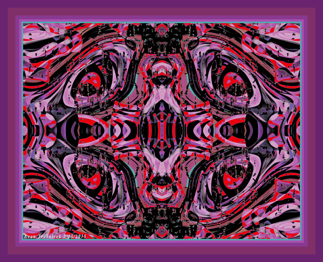
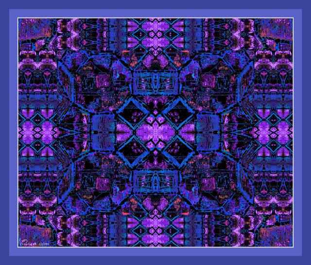
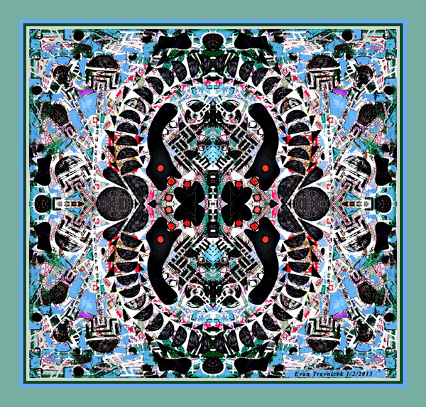
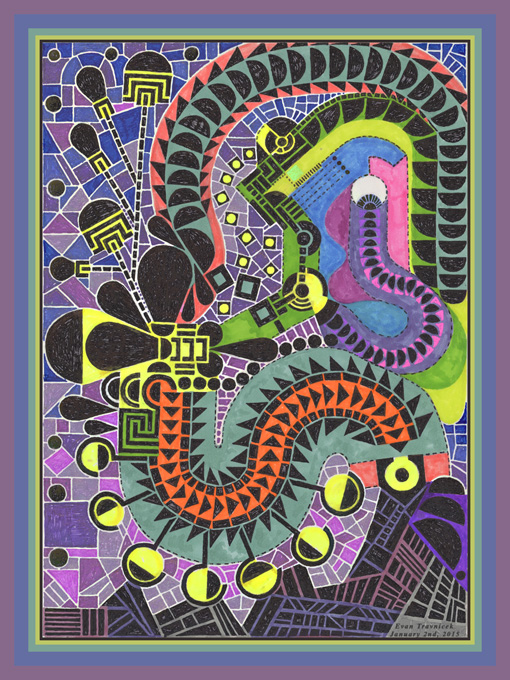
The inspiration for this piece has several sources. One idea that is integrated in it is the idea of the fractal universe. Most people have seen fractal designs and understand the concept behind it—that is, the idea that there really is no end to how big or small a perception can penetrate the universe.

Another idea that is integrated into this piece is the repetition and continuity of life. Life replicates itself, whether if it’s at the cellular level, or the animal and human level. I often work out repetitive designs in my work, such as this piece, as a response to mimicking and appreciating nature. I feel that an artist’s abstract designs can be imagined as just as alive as a living organism. In fact, I’d be so bold as to say that the entire universe is alive, not to mention the subatomic particles composing it.

The next concomitant idea that is integrated into this piece is the similarity to quilt patterns that it has. My grandmother and her sister used to make quilts and patterns for quilts as I remember when I lived on the family farm in Nebraska. I often marveled at how similar these patterns were to some mosaic art. As you know, one of my main sources of inspiration is mosaic art. So, my inspiration with mosaics and quilt patterns nicely dovetailed together, resulting in what you see here at this point in my development of them.

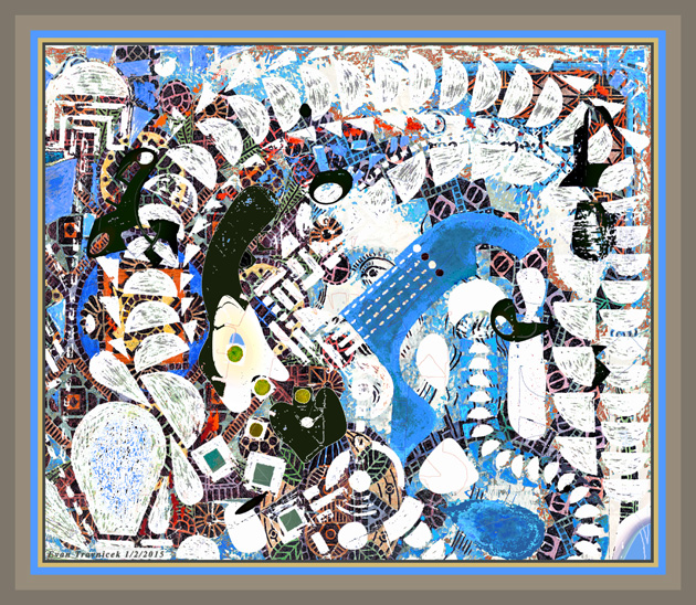
The last idea that I can think of in the completion of this piece is the title. I have been fascinated with the world and the ideas of the 20th century science fiction writer, Philip K. Dick, for a while now. One of the books he wrote was titled “Do Androids Dream of Electric Sheep?” The first time I’d heard that title, I just thought it was so damn far out that it practically snapped me in that direction for a few moments of wonder.

I often try to think of different ways to say cliches, or common sayings, so as to put a twinge of interest on the otherwise irritating boredom that they provoke. Well, I didn’t want to necessarily just reword the title of Dick’s book for the title of my image. I did like the notion of asking a question with a title however. So, for a growing, living universe, including the economic and manufacturing activities of humans, I decided to associate the universe with the idea of fields. Fields often look like quilts to me, and I imagined the beautiful patterns on quilts being so potent with creativity that they would be able to manufacture textile factories, which, in turn, would also manufacture quilts.

Leave a comment

Filed under Art of eVan

Open Your Heart to Me (version 1)

OpenYourHeartToMe1

How can I speak to this one? The intricacies? The detail? Let’s explore it and find out. It came from a piece I made back in March of 2011 called Four Hearts With Spines. That piece involves this piece times four; it’s a 4X repeat of this piece you see here, but its dimensions are square instead of rectangular.

The intricate details in this piece remind me of the inner chambers of the human heart. I’d learned about the complexity of the cardiovascular system in my schooling for the medical field, so this image is representative of that. The heart has four chambers in it—the left and right ventricular and atrial chambers—which pump blood in and out of it so as to refresh and re-oxygenate the blood.

The pink and red colors and tones are suggestive of Valentines Day, which is one circumstance that inspired the posting of it for you to see in regards to updates on the Art of eVan. I titled this picture Open Your Heart to Me because it looks like a complex and artistic catalog of an open heart. It looks like an open heart surgery perhaps.

The chambers and the flows of the waves, currents, and layers of the convolutions give a sense of motion to a living biological pump called the heart. These qualities provide the viewer impressions of life, passion, love, relationships, and romance. I usually don’t explore such topics as romance in my art, but it is a central theme to humankind, so I flirt around with it every so often.

When you peel back the layer of romance, passion, and relationships, you get to a more core quality of trust, faith, and confidence. Confidence is a topic I explored with you in the piece I titled Fiducial Mechanics. This piece is allegorical with that one, as well as Stories to Tell, a painting I made back in the early 2000s.

Trust and faith have religious connotations attached to them. I have no resistance to this notion because I see all of life, and patterns in nature repeating themselves. Rituals compose the activities of life, whether if they’re found in the various religions so as to connect people with one another and higher sources, or if they are found in the endless fractal patterns of crystals.

I associate the word faith with confidence. I have been seeing how so many human activities are based on common ritualistic activities—such as buying food at a grocery store—that are just patterns of confidence. I say these things are patterns of confidence because we just take it for granted that there are grocery stores where we can buy food at any time. The repetition of an act builds confidence to the point that it merely becomes second nature.

The heart is a complex activity that is so unconscious to our conscious selves that we just take it for granted that it will continue to beat till the ends of our lives. I raise awareness of this unconscious, bodily activity with this image for all to see, and to marvel at in a picture, a visual interpretation, artistically.

Leave a comment

Filed under Art of eVan

Broken-Hearted Sun Lovers (version 7)

1922397_753821334643164_1267528892_n

Though this image was created back in 2011, I pulled it out just this evening, and reworked a few things to render the results you see here. It attracted my attention because I had also been reviewing some philosophical ideas of mine concerning structure.

It seems like most everything people make or create is designed to increase structure, safety, security, understanding, protection, and stability. This goes for language, and the standardized understandings contained within languages, idioms and all.

I noticed this structural tendency manifesting in many of my digital art works. It’s almost like I’m on a search for security with the adventures of my mind. And I want to share these way points for you so that you may also experience the abstract stories I embark on as well.

With this particular piece, it looks like there are four pillars leaning towards each other and towards the center of this image. Pillars are symbolic of long lasting strength. In ancient Roman and Greek times, pillars were used for governmental and religious buildings. They were designed to give the people of the land a sense of continuity, stability, strength, and safety, if not even democracy.

It looks like you are looking down at the pillars here however, and their leaning perspectives are aimed outwards towards the corners of the picture, while the tops of them are leaning inward. This triggers the sense that perhaps perspective, as we understand it, isn’t always one dimensional, and that it could, perhaps, be multi-dimensional in other alien perceptions.

Leave a comment

Filed under Art of eVan

Organic Copy Machine (version 4)

OrganicCopyMachine4ematted

Organic Copy Machine is an amalgamation unto itself. I say that because I hadn’t used any previous material of mine, nor any digital material not of my making, in the layering enumerated in this picture. There are three things that popped out at me after situating portions and selections drawn from Question Scoops (see previous post). Nevertheless, I think you may have fun finding things herein that I hadn’t identified or thought of.

The first and foremost thing that pops out at me are the four silhouetted, hand-like shapes gathered towards the center. They appear to be going after and eating the red dots, which are also gathered around the center. The fact that the hand-like shapes are silhouetted gives them a mutable, inchoate quality.

This, of course, propagates the enigmatic qualities found in art in general. A basic example of this is when you see faces and patterns in the textures of the paint on your walls, or see forms and shapes in clouds. That is really the exciting part of peoples’ participation in the multi-faceted venture into art. It’s meant to take viewers past the world of definition into areas of ambiguity for healing purposes in my estimation.

You can reflect on yourself in looking at art, as it is a mere representation of what goes on in your mind. Art is a relief valve, allowing you to bypass the harsh judgements of others, and consider things you would otherwise actively resist consciously. The characters, shapes, events, and activities of your life can be projected on to art, such as pictures like this, which give them some sense of order, structure, understanding, and recognition, even if they still remain undefined in your conscious mind.

Resolutions don’t always have to be confronted directly front and center. I sometimes avoid resolving things through directly confronting them, as this can deter and scare off solutions. Sometimes it’s better to indirectly approach a situation, a person, or a personal issue. That’s what the tracks surrounding the center of this work of art suggest.

The tracks of half-lunar like shapes forming a figure eight-like shape look as if they could represent the movements and activities of two different worlds, and they meet one another in their cycles of movement. It also looks like the cell-dividing process called mitosis, hence the title Organic Copy Machine. On the right and left hand sides, germinating processes appear to be illustrated as bulbs breaking into the air from the ground. Also, a couple of faces can be seen at the top, and repeated at the bottom. You may see the eyes and chin.

Leave a comment

Filed under Art of eVan

The Occasional Eye (version 4)

TheOccasionalEye4ematted

Here is a real combination of previous art work of mine, and a drawing I just finished. Before I explain to you what drawings are layered into this image, I want to explore what it looks like, and the influences it reminds me of however. What influences am I talking about? Doesn’t it remind you of some 20th century surrealist art? Like early Salvador Dali, or Joan Miro?

It does to me. Joan Miro is famous for using large, boldly colored, abstract shapes in his paintings. I was not thinking that I’d like to do what Miro or Dali did here however. As usual, I was just going with the flow of my creative processes, and happened upon decision-making points that seemed to guide down to what you see as a result.

The Big blue shape in the right-center area, along with the four white dashed lines ending in black and white dots, are really the culprits that most remind me of Dali’s early work and Joan Miro’s work. So, while this piece may not be anything new to the art world, it still is a step I find some excitement with in the results of my own art making.

The background layer is composed of a Micro-Chimerism (a series of mosaic styled art by Art of eVan) titled Organic Tell-Tale. That drawing is quite intricate and detailed as a strange landscape of plants, a big bowl, and portrait of Shakespeare in the sky. That’s right, Shakespeare is in the sky in that drawing. I couldn’t help but flesh out his features as a background image that was printed on one of the papers I used for drawing on.

Here in this picture, you can see Shakespeare’s left eye (oculus sinister) peeking out from behind that blue Miro-esque shape I described earlier. He’s not looking at the viewer however. His eye looks like it’s fixated on another line of interest off to your left side. It looks, however, like it could very easily look down at that balloon shape in the lower left-hand corner of this representation.

The composition of the shapes shapes lead the viewer’s eye down to the lower left-hand corner of this picture, then are lead up, then to the right, and then back down to the lower right-hand corner. Your eye mingles around with all the precarious shapes hanging around in the middle and bottom border. You notice a smaller, cord-like structure leading up to what appears to be an eyeball that’s larger than the Shakespearian one. It is indeed an eye-ball. It is part of the top layer drawing I used for this image. That top layer drawing is the blacked out elements I selected from Question Scoops. I had inverted their color to white however, rendering them as snowy and icy shapes, along with the blue shapes.

Leave a comment

Filed under Art of eVan

Balloon Collection (version 2)

BalloonCollection2ematted2

Derived from Question Scoops, I focused on the collection of light-bulb or balloon-like shapes as a piece to be shown in itself. I let the crude, stressed, recycled qualities unfold as I copied and pasted parts and shapes from the original image on to this one. It’s supposed to look like a reprint of a reprint, but the artist went back and tweaked a few things in order to differentiate it from the original print.

As I look at this image right now, I’m starting to find some dissatisfaction with the edges. The circular edges of the shapes touching the borders of the top, left, and bottom of this picture are creating too much tension, I feel, for the viewer’s eye to find relief in exploring the other parts of the representation. I think I’ll leave it as is for now, and use it as a motivator to perhaps “improve” upon it in ways that would allow for more space surrounding these points of tension.

You can really see the direction of the strokes of the pen as I blacked out and filled in the designated balloon-like areas. It looks like a contraption, or a machine of some sort. Perhaps it’s a pump for an irrigation system, or maybe it’s a medical device. Anyhow, the intent here communicates a kind of helping mechanism. As you peer into the contours, colors, and shapes of this image, your unconscious mind can review difficulties you may have been having, and the structures here can help you realign areas of your life that may have not fit into your sensibilities satisfactorily.

Perhaps the tensions that I pointed out to you in this composition communicate a need to grow past some borders you may have been questioning lately. It is a centered piece, in that the visual gravity is directly in the center, rather than off to one side or the other. Yet, it is not perfectly symmetrical. Each quadrant doesn’t bear the exact proportions of one another. There is enough differentiation to maintain intrigue.

The general motion of this illustration is upwards, suggesting the forces contained in balloons gently and persistently pushing upwards. There is what looks like a weight pulling downwards, but it appears to not be able to overcome the upward forces of the balloons, hence giving a sense of centeredness, ballast, and balance.

Leave a comment

Filed under Art of eVan

Question Scoops (version 1)

QuestionScoops1ematted

This drawing was originally initiated using a black ball-point pen. It should be obvious which shapes herewith are filled out in this media. Other elements of this drawing involve the usage of magic markers, felt-tip pens, and gel pens. The magic markers and felt-tip pens have an interesting trait that they share with water color. These pens, however, are different in that an artist has more directional control over their production.

I like the shape of the light-bulb—the traditional 20th century tungsten light-bulb, that is. Its shape is analogous to hot-air balloons and question marks. A water tower in Wahoo, Nebraska also shares in the contours of this shape. It’s a very utilitarian shape that people usually take for granted. It has been one of my intents, as an artist, to explore, highlight, and represent basic utilitarian items, shapes and objects by drawing on their relationships in odd and strange ways.

The odd, the strange, and the weird have been life-long interests of mine, as I am often annoyed by standardized, cliche, unquestioning ways of thinking. Yet, I usually have no choice but to draw upon these mundane aspects of the life, the culture, and the society that surrounds me. So, when things or people come within my vicinity, my conscious, or unconscious mind, goes to work in highlighting all of those unquestioned, curious, and strange overlooked spaces.

In a certain way, the black blocks and shapes composing the skeletal structure of this drawing are symbolic of those areas shrouded by the standardized collective mind. It’s as if you are looking at a spiritual MRI, or supernatural x-ray. Seeing through the layers of my surroundings, people, places, things, animals and organisms into their core truths, philosophies, intents, and thoughts has been a theme for a number of years now in what I strive to show you, my viewer.

The notion of titling this piece Question Scoops was derived from the scoop-like question mark shapes dipping across the lower region. They are upside-down, reminiscent Spanish grammar and sentence structure with respect to querying, or interrogation. Questions are meant to obtain more information, as seekers of their bearers attempt to relieve themselves by asking others for satisfactory answers. The scoops in this image look as if they are scooping into piles of earthly elements on a landscape.

The center of interest here is the machine-like contraption filling most of the space out with its tubes, funnels, extensions, arms, and bulbs. It is meant to look like an organism however, redeeming it from the idea of a non-living, mechanical apparatus. It is meant to convey character, autonomy, and curiosity.

Leave a comment

Filed under Art of eVan

The Control of Forgiveness

TheControlOfForgiveness2ematted

The Control of Forgiveness was created back in 2005 when I was still living in Nebraska. As you may know, I was exploring many different mediums during that period of my life. It sort of saddens me to think about the resources I had as an artist back then. I had multiple places and spaces in which to create. And I had so many items, objects, mediums, and tools with which to construct the things I imagined.

In this image, I used some ink I had bought at an auction in Fremont of an artist who had decided to quit being an artist. The bottles of ink came in a small wooden suitcase along with some other ink and drawing tools. In my large room upstairs in the farm house, I decided to start using these bottles of ink by dripping and splashing on pieces of paper with them. I would then embellish the designs I found notable after the ink dried.

The Control of Forgiveness is one result of that period of creativity. I have many more of these kinds of drawings stored away, so I’ll have to upload more of them in the future. In this particular image, I implemented some type to convey a message for what I had been considering about a paradox of forgiveness.

I had been thinking of forgiveness as a paradox because I often found it odd that, when I let go of an issue or situation I wanted to have more control over, I unwittingly found I had more control over it. But when I found myself struggling in one conflict or another to gain control, it seemed that my expectations would be dashed more often than not.

Forgiveness, as I understand it, is about letting go of feelings that don’t serve one’s good intentions. It can also be about letting go of anger towards another, obviously. I had combined this notion of “letting go” with an act of letting go of the need to control ink with a pen, and just letting it fall like experimental precipitation. As an aside note, the word “aphesis” means letting go in Greek, but I did not know this word at the time of creating this image. Nevertheless, it is an associative reference point.

The control that is expressed in this picture, after letting go of the brown ink as drops on the paper, is the stripes and strokes carefully blacked out with graphite. So you see the polarity between the utter freedom of falling drops of ink, and the minuscular detail filled out in the strokes of graphite. This image also hints at a landscape, as I had put stick twigs and trunks underneath the drops so as to make them look like trees. Then I put ink marks around the splotches to give a simplistic association with foliage.

Leave a comment

Filed under Art of eVan

A Pond In Which Nuclear Glass Broke

Exif-JPEG-422

Here is a painting I made in 2003. It involves the usage of strips of canvas, spray paint, charcoal, as well as, both, acrylic and oil paints. This painting represents the beginnings of my experimentation in the usage of multi-mediums. Up to the point when I moved to Nebraska in 2000, I had always been a strict traditional artist in the sense that oil is to be used on canvas and pen and ink on paper.

I started questioning the boundaries of standardized traditions within art such as the above after a year or two of living in Nebraska. One would think that by moving to the Midwest, my imagination would be reduced. This presumption was totally false however, as the time, space, and resources afforded to me in this situation allowed my imagination to explore more than I ever had before.

A Pond In Which Nuclear Glass Broke is a depiction of alternate realities in space being expressed as shattered glass. So it’s as if the explosions of cosmic creation happened, not only by nuclear explosions as we understand them, but also by fractures and fissures in medium of space and time itself. I used the word nuclear to convey the idea of radiation from stars and galaxies, and glass as a way to visualize space and time as mediums.

I likened a portion of the imagined universe for which I was peering into as a subject for this painting as a pond. You may remember some of my paintings pertaining to The Universal Pond. The Universal Pond was a painting I made in high school that looks like a simple three dimensional cartographical view of underwater life underneath a water planet. While there is no horizon in this painting, as there is in The Universal Pond, it still bears similarities in the colors used—blue—as well as the pieces and shapes used.

Leave a comment

Filed under Art of eVan

Art of eVan Jack 2014 (version 1)

GE DIGITAL CAMERA

Yes, I titled this one with “version 1”, even though it’s colors are reversed, hence looking like it could be the second version. But this is how I started manipulating the original image, so I just went with it.

I found this image to be a little more haunting than the version 2 image. Something about the white and light blue areas makes the lantern look ghostly. The orange lighting above the face also gives the picture a strange dimensional effect. Happy Halloween!

Leave a comment

Filed under Art of eVan