Storms of Dark Matter (version 5)

StormOfDarkMatter5ematted

It looks like leaves, feathers, and zephyrs swirling and undulating around nebulae up in the sky as a person from a different time on earth gazes upwards. Of course such perceptions are imagined as bold. This because of the lack of city lights in that time. Who knows what year it is? Who cares? When one is lost in the beauty, mystery, and awesomeness of this unfathomable universe or the next, one loses meaningless needs to measure and compare.

Well, I still like having my rational mind about me, and even sharpening it for a better understanding of my surroundings, things, and people. It’s just nice to take flights of fancy into incredible reveries so that I can capture a few of their elements in drawings and writings.

I just finished a new drawing I call Happy Zephyrs. While this is not that drawing—and I haven’t posted it on my Art of eVan blog yet—it does have elements of Happy Zephyrs embedded in it. There’s no hidden text in this piece, so don’t concern yourself with sublime communications. I titled it Storm of Dark Matter.

This electronic illustration makes me think of peering up into space. Or, perhaps—I imagine—I am in space, traveling around in it on the outskirts of galactic clusters, penetrating the folds of dark matter (whatever that is) and taking snap-shots of what I see. Because, really, astrophysicists don’t even know what dark matter is, but they do know something more permeates our universe because of the amount of stuff measured in it as compared to what we can see.

This piece makes me think of the Hopi Indians, and how they left artistic markings in stones consisting of characters and spiral formations. I imagine the Hopis looked into the night sky often and let themselves unleash with wonder, awe, and imagination. It is indeed energizing to feel the unseen properties and elements of space and time. Rather like waves lapping on a shore of consciousness and audible conch shells in a backwater location.

In my sketching of new ideas, I’ve been exploring trebeculations interconnecting irregularly, and then adding convolutions and spirals to them. So it’s a play on straight and curved lines really, which makes me think of bitmap and vector imagery combined into one level of a fractal snapshot. Like nautilus shells placed in open boxes so that one can put them together as a piece of art and hang them on the wall.

Leave a comment

January 24, 2016 · 6:00 am

Ring Swimmers (version 1)

RingSwimmers1

This piece is derived from Meme Catcher. It’s basically one of the corners of Meme Catcher repeated four times. Can you guess which corner? I like the way the corner looks in Meme Catcher, and I knew it could be used as material for a picture in itself.

All in all, it really is just an attempt at a pretty design. I’ve been to Hobby Lobby a couple times recently, and I really enjoy the wall decor they’ve been selling there lately. They are just fascinating arabesques crafted with metal and wires. I feel this is a piece that could be sold there. I have made it as a print however.

In the future, when I have access to more materials and resources, I’d like to get into making wall reliefs, metal decors, arabesques, and so forth. So I’ve been recording every day a development of ideas on this kind of theme. It really is exciting! I feel that it is an addition to my Micro-Chimerisms idea, as well as my Wrecked Tangles theme.

The ideas I develop are like stylized worlds unto themselves. To explain it in a certain way, each ideological theme is like one artist, say, for example, Van Gogh, and the next theme is, for another example, like Paul Klee. In another way of explaining it, each ideological theme I develop is like the product of a character portrayed in a novel. Since I am one person—the creator, the artist—the thematic worlds I imagine and develop sometimes merge.

This is where new ideas are born—the merging and hybridization of two or more previous ideas. That’s why you often see layers upon layers of imagery in my recent works. The last idea I posted, Cherubesque, was an attempt at this. I’m not satisfied with that picture though. In fact, I think it’s rather mediocre. Nevertheless, Cherubesque has an idea in it I want to develop more. That is the idea of intertwining human bodies. William Blake often depicted this in his works. I’d like to develop works involving many human bodies composing intertwining shapes and forms, such as eight-pointed stars and so on.

Ring Swimmers has binary fish swimming around inside golden rings, joining together symmetrically in the center of the vignette. I say vignette because the center of interest has a highlit quality to it, even though it is indeed defined by the framing borders. I didn’t really think about the symbology of four rings, and eight fish. I invite you to imagine what it means to you. Other than that, I feel it’s a nice calming meditative piece, indicating wealth and security.

Leave a comment

January 14, 2016 · 9:45 am

Cherubesque (version 7)

Cherubesque7

What you have come to expect is a miracle. What I give you is fish so that you may swim through the messages, come upon an understanding, and walk upright thereafter. Then I shall make you fishers. And when you have mastered the art of playing cards on roiling seas aboard schooners of imperfect reason, I shall make you fishers of your brothers and sisters.

I titled this piece Cherubesque as a hybridized name. Cherubs are angels, and arabesques are intertwined and interweaving patterns. I felt that certain figures within this amalgamation communicated associations with cherubs. I also notice how sharks, deep sea divers, and yoga pants wearers have similar skins in common. Therefore, the spinning, swimming, intertwining patterns of the fish, the divers, the engine parts, the search for food, and the hunt for understanding combine into one sub-terrestrial, underwater, aquarium of amusement and fulfillment.

Leave a comment

January 7, 2016 · 8:48 pm

Meme Catcher (version 3)

MemeCatcher3ematted

I purchased a package of gold, silver, and white pens as a package of four metallic pens for these recent projects. I was looking specifically for gold metallic pens, but I found a package of these three characteristics. A while back before this, I had been discouraged by a white gel pen I purchased as part of a large collection of glittery and metallic pens at Sam’s Club. I mean, that thing was like as translucent as milk when I applied it to drawings I had been working on. So, the new white gel pen I now have is much better than that.

In this version of Meme Catcher, the metallic gold quality has been filtered out of the looping ribbons of the mandelic weaving patterns. I did this because I wanted to explore the usage of silver instead of gold. While I do have a silver pen I can use—and plan on using—for current artworks, I didn’t use it for Meme Catcher. I think I’ve been using the gold metallic pens because of the holiday seasons.

As you can see, there’s a lot going on with this picture. It has three drawings of mine layered into it. Basically, the work called Lucky Trust is placed behind Meme Catcher. I selected and hollowed out areas on the planes of Meme Catcher so that any layers behind it could be seen. As you may have read from previous blog posts, Lucky Trust consists of two drawings of mine: One, Lucky Trust (version 1), and, two, A Synthesis of Matter and Mind.

I’m fascinated by torus knots, and topological formations lately, and, as you may know Celtic designs, and Islamic mosaics. The symbolism of the intricate weavings of Celtic designs I have learned is to communicate a sense of the interconnectedness between all things. I think this same idea is communicated in Islamic mosaics as well. This may have been the intention of the artists of those most precisely calculated designs—I don’t know. This is a history I feel compelled to research some more.

With my mosaics and designs, one can get a sense of small individual pieces comprising a whole, much like cells in an organ; the Celtic/Islamic weaving patterns provide a more smooth consistency, allowing the eye to slide and loop around the picture plane like a passenger on a train can let the blur of a landscape pass by, every once in a while, focusing in on a point of interest.

I am increasingly becoming more interested in wire meshes and decorative iron fence vector. There is just something about the space that gives supporting “body” to the rather two dimensional constructions. I suppose it’s the polarity between that which is non-physical and “hard” matter. As you may know, the smaller and smaller one focuses in on the elementary particles of matter, the less material matter seems. Perhaps everything really is just space, and this world we live in is just a simulated illusion we’re contracted with someone to live out as part of an agreement.

In a way, this version of Meme Catcher can almost be seen as a fear of space, of emptiness, of loneliness: It has so many nuances and patterns within patterns in it that it seems like me, and the greater forces of creation behind it, wanted to pack it with so much differentiated color and activity that it looks like an attempt to escape from complete void. I don’t think there’s too much to worry about however. This universe—even dark matter—seems to be chock full of stuff.

1 Comment

December 24, 2015 · 10:46 am

Meme Catcher (version 1)

MemeCatcher1ematted

Here is the latest continuation on my pisiform design. The previous work, Lucky Trust, had a seven pointed star as the central design around which the fish shapes curled around. This piece has an eight pointed star at around the center. For some time now, I’ve been fascinated with torus knots, so I added extensions of loops from the overlapping bars of the star shape. Basically, the central design is one complicated, but orderly, closed loop. If it were to be seen in a more three dimensional depiction, it would look like a torus, or a doughnut.

The fact that this design has an eight pointed star around the center, not seven, gives the picture a more orderly and stable sense. The fact that it’s framed in a perfect square shape adds to its stability and confidence. What we have here is a ballet of shapes, forms, and designs. If it were an animated GIF, it would show the pisiforms as uniformly coiling around the star shape. The smaller fish in the loops and rings would be just endlessly circling round and round.

I had researched some of the designs that are used for decorative iron fence vector, and made some simple designs of my own to add to the details and finer structures supporting the composition. You can see the results of these as the catching the background and space like weathervanes.

The idea of space in art catches my interest again in my recent work. The space that is shown here has stuff in it however. That is really how I see space anyways. Astrophysicists will tell you that space is actually full of radio and cosmic rays, as well as particles, such as photons, and electrons. Space really is not a vacuum. It has much information, physical and material, passing through it all the time.

I liken my notion of space to the subconscious mind and information that’s just under the surface of awareness. You can see this expressed by text cut out from old books and prepared for this piece that is showing through a translucent layer of primer. I filled the spaces around the decor vector and bars of the star and rings with some light blue and lavender felt-tip pen. This gave the illustration a sense of collected or bunched up space.

This drawing, overall, is a collection of charming designs, colors, shapes, and ideas—hence the title Meme Catcher. I hope to make more drawings, paintings, and prints of these types of designs in the future. I have many of my ideas stored away in notebooks and sketchbooks, so when the right times arise, I use those times to work on them and give them more reality with whatever medium I want to create them in.

Leave a comment

December 18, 2015 · 9:27 am

Lucky Trust (version 4)

LuckyTrust4ematted

I originally started this drawing intending to fill in its background with something. It was a struggle figuring out what I thought would look good. I finally decided to fill it with a very light gray watercolor wash. This gave the original drawing a cloudy look. Please see Lucky Trust (version 1 [the Art of eVan post previous to this one]) to see what I’m talking about.

I had thought of filling the background with a lavender color, using felt-tip pens, but this just seemed like the color would be too bold and dark. In this version you see here, I used A Synthesis of Matter and Mind to put as a layer behind the Lucky Trust design. I posted A Synthesis of Matter and Mind (versions 12 and 14) back in 2013. It was just sort of a spur of the moment idea to combine these two pieces.

I think it worked well. It makes me think of looking down from a bird’s eye view at an ancient Greek or Chinese fish pond. You can see the swirling patterns of fish forming triangulations in the spaces surrounding the center. They aren’t as evident in this version as they are in the original drawing because the blue hues in the background approximate with the green in the bodies of the fishes.

There probably is a lot more symbolism in this piece than I may be aware of, but the things that are significant to me right now is the biblical quote by Jesus of “I will make you fishers of men” when he is talking to his disciples. I’ve sometimes pondered how far reaching the idea behind that quote is, as it actually applies to modern day marketing and sales. After reading Buyology, by Martin Lindstrom, I have learned how religion can be used intimately with selling something.

I painted a seven-pointed star in a painting I made in 2004 called The Dead God is Reborn. Back then, I was really impressed with Egyptian art, architecture, hieroglyphs and jewelry. I got a book on the discoveries archeologists found in King Tutankhamun’s burial site. One of the items they found was a beautiful gold and bejeweled necklace of a scarab beetle. Briefly, the scarab beetle symbolized birth, death, and rebirth to ancient Egyptians. The number 7, to me, is a symbol of studiousness and research. It also has a cutting, dissecting, sharp aspect to it, rendering people who bear it in their numerological charts as “sharp,” and intelligent.

Lately, I have been fascinated with the decor found in old iron fences, like how Europeans used to make surrounding mansions. They use spirals and overlapping undulations in their design vectors. I used to not take too much note of them, but now I do. I’d made the connection between the intricate webbing that can be found in the dream catchers of certain Native American tribes. I realized that these kinds of universal patterns and designs, such as spirals and networks, are like psychic storage “units” for energy, memories, dreams, thoughts, healing and so forth.

I present this piece here as a lucky blessing to all who view it. May you find comfort, safety, and security as you gaze upon the intricate designs, and help yourself build faith in accomplishing your goals, whatever they may be.

Leave a comment

November 27, 2015 · 12:21 am

Lucky Trust (version 1)

LuckyTrust1ematted

Fifty-one point four is what I measured with my compass. I then plotted out the course for each degree setting for the seven rays emitting forth from the center of this picture. I had to draw a circle around the center as a frame for which each successive degree point could be plotted so that, then, I could draw the connecting lines with a straight-edge ruler. I have long known how to make a seven pointed star, drawing it by hand and eye-ball for measurement, but, this time, I needed it to be more exact so that the designs and patterns wouldn’t be too asymmetrical the further out from the center they proceeded.

In some of my blogposts on my Art of eVan fan page on Facebook, I had been giving hints as to what this drawing I’ve been working on for a couple weeks now was based on. I mentioned inspirations for this piece as coming from some of M.C. Escher’s art, Celtic knot patterns, and Islamic mosaic designs. I had been exploring my pisciform spirit designs in my sketchbook as a new addition to the Micro-Chimerism series I’ve been working on since 2008.

I started imagining what it would look like to have these fish-like designs coiled around a simple post. Then I started to imagine having the forms coiled around the bars of star designs. It’s all a very exciting development to me because it showed me how complicated designs and intricate measurements don’t just appear in my mind in finished form in the beginning of a series. I have to start with basic ideas and shapes. I build from there, and my mind starts grasping more and more intricacies, and leads me further into estimations of complexity.

A lot of the underlying composition for the repeated designs is based on the line and the peak and the trough of a wave. Three dimensional depictions are fleshed out from basic two dimensional shapes and lines. The coiling fish follow patterns of waves, while the structure of the gold star follow straight line patterns, save for the spiral patterns at the ends of the seven arms of the star.

Lucky Trust is what I titled this piece. The usage of a metallic gold pen was a later decision I made in the planning stages. I decided it would be a good color to use, as gold is symbolic of wealth and royalty. I used green and red for the colors in the bodies of the pisciforms. As the Christmas season approaches here in the United States, green and red colors predominate the markets, and styles for decorations. I like the combination of these colors regardless of the season however. I just figured I’d use the gold, green, and red colors to ride the wave of the current trends here.

I also wanted to play upon the notion that a design can attract things like wealth. So the picture is intended to be like a lucky charm for you to imagine having it as a framed print hanging on your wall. Seven is often associated with luck, and seven points are what compose the star in this drawing. It also has an elaborate golden braiding quality to its extensions, along with spirals denoting the ends. The triangulations of smaller fish filling the fields between the braids of the star are swimming around what look like little golden coins.

What I’ve learned about money in my research of it is that it is basically founded in trust and relationships. Money is meaningless without other people to conduct transactions with and share it. So Lucky Trust became the title, as security, structure, relationships are expressed in the symbology, colors, shapes, and forms herein what you see.

1 Comment

November 5, 2015 · 8:51 am

Topology of Hearts, Hands, and Minds (version 6)

TopologyOfHeartsHandsAndMinds6ematted

This is a version of Topology of Hearts, Hands, and Minds that looks like chili peppers on a vine. It has green, red, and orange colors appropriately associating with such a notion. In the West, we are entering the holiday season; red and green are the standard colors associated with such a season.

I wanted to post this version after posting the one previous to it because I felt it is more defined, bright, and has more depth to it. It looks like the spiraling mesh of figures are casting shadows on a cement wall from a directional light casting light on them. It really looks like chili peppers on a vine. I hadn’t intended this effect, but in the free and experimental processes of creation I often stumble upon new expressions. It’s like a process of discovery; like some mysterious guidance is subtly leading me into areas previously unexplored.

The background in this version became increasingly evident as I adjusted the filters and settings to give it the shadow-like quality it exhibits. It makes me think of those old iron fences that can be found around houses in the Midwest. This illustration also makes me think of black and white films from the 20th century, like The Grapes of Wrath, and To Kill a Mockingbird.

Some films from the earlier decades of the 20th century possess slightly haunted qualities—qualities that become exceedingly difficult to sense in films as they approach the present. It seems sort of ironic that I am trying to capture such a sense in my art and in the writings that accompany them in digital media, but it’s a direction I feel compelled to take, as the connection to an audience through the internet is really the only way I have of communicating my ideas.

I like the emotions that barn weathervanes evoke in me. Perhaps it’s because a large part of my family heritage is agricultural. The shadows cast by iron fences also provoke exciting possibilities that open doorways from this reality in historical settings into imaginative other worlds. Emotions, dreams, and memories, I feel, can be captured and kept alive in such patterns.

Similarities can be drawn between Islamic mosaics and Celtic knots and patterns to the simple pattern of chickenwire fence lines, for example, as the undulating weavings overlap and connect with one another in varying degrees of complexity. There is something about structures, boundaries, textures, fabrics, patterns, and neighboring mediums that capture and embody dreams and magic for me. Hopefully they do in this piece for you as well, and that I am sharing such experiences with you as I show you this, my latest creation.

3 Comments

October 8, 2015 · 8:02 am

Topology of Hearts, Hands, and Minds (version 8)

TopologyOfHeartsHandsAndMinds8ematted

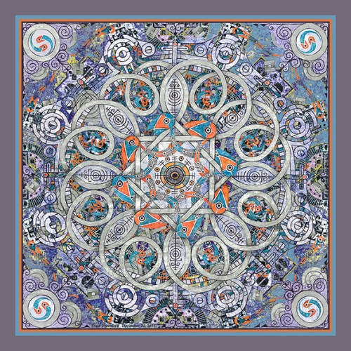
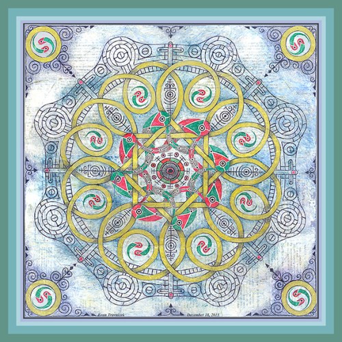
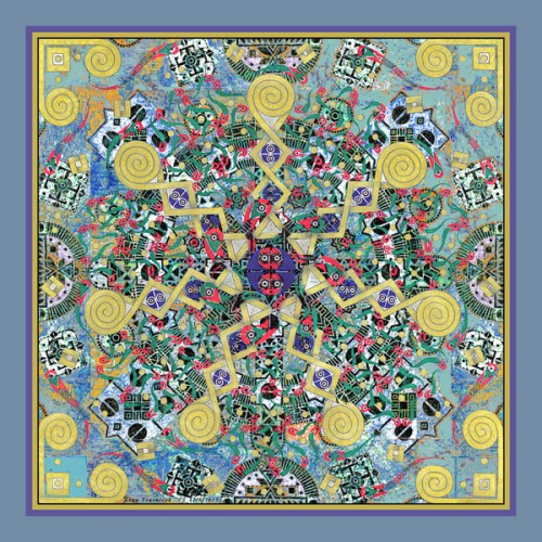
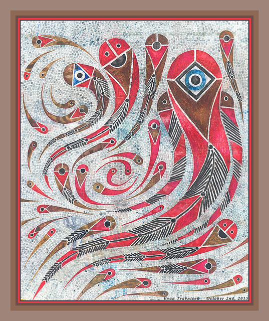
I made several multilayered and diverse versions of this piece already, but I wanted to focus in on the original elements that are a part of the natural media of the drawing. There is indeed a cookie-cutter layer behind the shapes embodying the color, but I tried to make it as close as possible to the color of the paper that the original drawing was drawn on.

I didn’t use the original drawing after scanning it in because my goal was to finish connecting the interlinking conglomerations. In the original drawing, I only succeeded in getting two full representations of the pinwheel-like spiral shapes. This was just simply not enough to display a continuous representation of them. So I repeated them by copying the drawing and repeating it once over. I had to do some detail work so that the two pieces would dovetail together and look like one piece.

Creating this piece, both with traditional media and digital media, was an interesting attempt at a mathematical concept by using my approximation skills. In other words, the proportions and measurements weren’t done with rulers, compasses, and French curves. I wanted to challenge myself in making measurements by just eyeballing it. I knew that there would be mistakes and inconsistencies, and I welcomed these… except for when I spilt some coffee on the drawing earlier when I was working on it in a cafe. I knew I’d be able to edit this problem out though.

This brings me to another point to discuss in the making of art. When I was very young, I used Van Gogh’s method of creating as my protocol with respect to creating art. In his letters to his brother and in conversations with other artists, Van Gogh would discuss “attacking the canvas.” In other words, he rarely did any preparatory sketches or any sketching on his canvases before applying paint to them when he went out for a day’s work.

I admired this commitment to fate that Van Gogh expressed in his art. But I also realized that oil paintings don’t dry quickly, and colors or shapes that don’t work in a composition can be scraped off, and/or manipulated into more successful situations. As this applies to me and my art, I had for a long time made it a practice to capitalize on accidents. Many of my works are inspired by Jackson Pollock’s completely liberated style of flinging splatters of paint onto canvases.

Lately, I’ve been betraying my mistake making capital in explorations of using the eraser in traditional or digital land. When one is attempting to create geometric inspired plane-scapes without using rulers and compasses, one must make friends with the eraser to arrive at satisfactory and complete works. Art is definitely in an infinite and boundryless universe. Artists just try to frame particles of that universe as best they can with the tools they have using the unique individual filters they were born with and have acquired through the progressions of their lives.

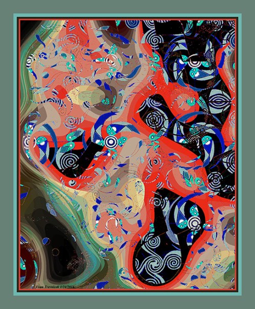
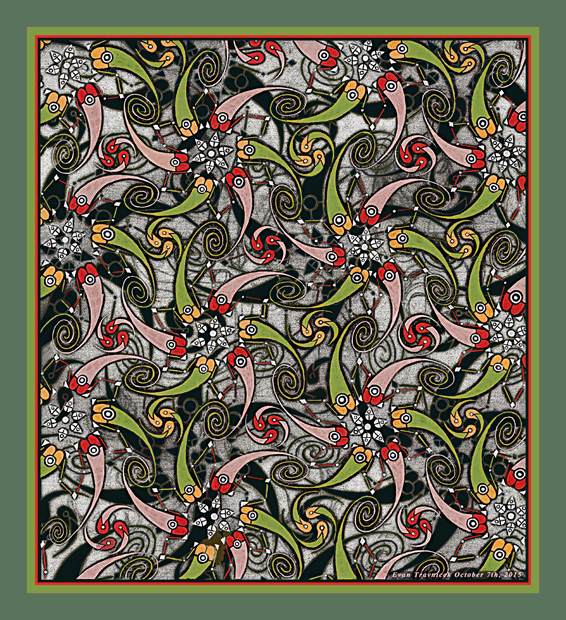
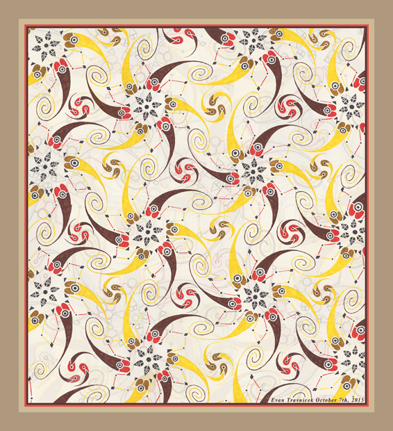
The other ideas that directly relate to this piece are found in its title: Topology of Hearts, Hands, and Minds. Topologies are used to map out computer networks within a business for example. They help to define locations and connections of each computer within a network. My idea here was to create these little spirit beings that have their heads connected to hubs for which they rotate around. You’ll notice that these little spirit beings have single eyes like cyclopses. I had no conscious reasoning for this though. They just looked simpler and more eye-catching.

The hands of each spirit being are joined with one another. The upper torsos of the spirit beings also look like hearts. This was intentional. It was to denote the concept of hearts within spiritual networks. Robert Monroe, in his out of body trilogy books, describes disembodied people or souls as “curls.” I often wondered why he referred to souls as curls; perhaps it’s just the nature of energy as found throughout the universe—whether if that’s draining water, spiraling hurricanes, or revolving galaxies—curls also display this pattern. So, to give this notion of a curl some visual representation, I made this drawing.

Next to last, but not least, the idea expressed here is one of love for one another. We are all interdependent with one another, and we produce higher and higher productions of creation when we join together in friendly synchronized patterns and organizations. Our gestalt formations allow for oversouls of greater power to flow through us and give us more meaning and purpose in our lives. It’s like we create health management organizations with our emotional and spiritual energies in non-physical banks, and we can draw upon this energy the more connected we are to these banks and one another.

In negative forms of these types of organizations, totalitarianism and fascism can develop. Politicians of today are aware of such organizations. These are what give them the power they crave if they can only achieve enough successful corruption and criminal activity to obtain thrones and positions of power over everyone else. And so I tried—in this work of art—to show individual differences between the spirit beings. This is the natural defense you and I have for not losing selfhood to complete collectivism and assimilation.

Ultimately, the vision behind this illustration is intended to inspire true democracy among all peoples of the world.

2 Comments

October 7, 2015 · 8:11 am

Pisciform Spirits (version 1)

PisciformSpirits1ematted

The Latin word pisces means fish. I titled this piece Pisciform Spirits because the forms in this illustration look like fish spirits. I have recently been exploring this idea with these designs as you will notice that they are the same ones used in Individuality Formations, the blogpost previous to this one.

A couple of the fish have what look like two eyes with smiling mouths, while most of them have single eyes. The largest figure in this piece has an ojo shape to it. Ojo means eye in Spanish. Indigenous peoples in the Americas developed a craft of what they call Ojo de Dios, which means “God’s Eye.” This craft involves weaving colored yarn around pieces of crossed wood. It is considered a spiritual practice of contemplation, much like Eastern mandalas are.

I knew I wanted to expand the sizes of the forms seen in Individuality Formations, and to make variations with that template. So I selected a prepared piece of paper I pasted together composing pages from an old science textbook from the 1990s. The surface of this medium was prepared with a wash of diluted primer. I did this so that the text on the pages would show through somewhat.

To build up the forms, I used, first, gouache, then, on top of that, I added water-based felt-tipped marker of the same colors. Basically, red, brown, and black were used. At the time of starting this piece, I had a fascination with the color combination of red and brown. Both are warm colors, red being the warmest. Red is such an eye catching color and I enjoy using it in various works of art of mine very much. I had started a series years ago when I lived in Nebraska that involved thick impasto applications of red to canvas that represented broad planes for backgrounds for abstract shapes of blue and yellow in the foreground.

The background in this piece however uses little pixels of diffuse blue. They are meant to compose a water-like medium in which the spirit fish are traveling through. I wanted to capture patterns of fish swimming in swirls, hence illustrating the theme of Ying Yang, conflict, movement, muscle, constriction, and power. I had tried to capture this idea in Individuality Formations with the swirling and traveling forms within that piece, but I wasn’t satisfied with it completely.

I should say that I was satisfied, but I knew there were so many more variations on this theme that I could explore. At the point of writing this, I have developed several more ideas related to this theme that involves using geometric structures as the foundations for swirling pisciform designs. I will keep you posted with this idea. I’ll just say right now that it is inspired somewhat by M.C. Escher’s usage of geometric patterns.

1 Comment

October 2, 2015 · 8:58 am