Whispered Context (version 4)

WhisperedContext4ematted

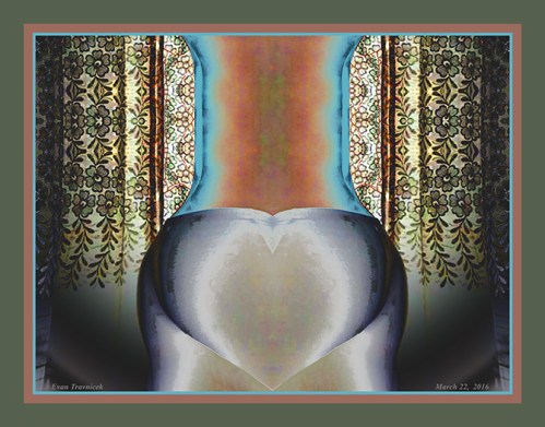
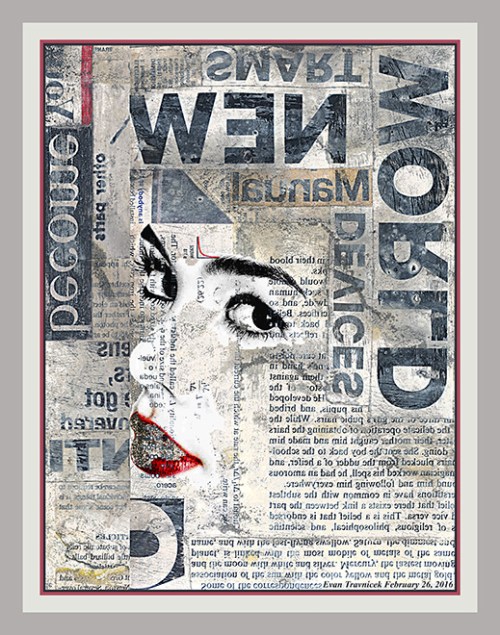
Whispered Context is what I call this one. The female form visually whispers to the reader of the text as one reads it. It’s too obvious here to be a subliminal communication, but it implies this concept anyway. The last image I did like this I blogged and showed you, called New Morals, captured a new idea I happened upon in my lucid states of creativity.

I read Facebook’s rules concerning showing art with nudity in it, and it sounds like they are okay with it. After all, busts of the Greek statue David can be found pretty much anywhere, so I felt confident in sharing this image with you. This new series I’m developing reminds me of Greek statues, what with their marble statue resemblances behind the lithography of text.

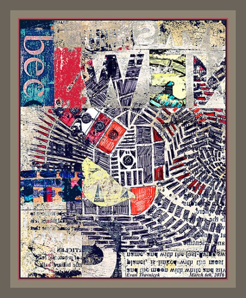
As is a well-practiced art now, I used reversed and flipped text in this piece to bring attention to the shapes, patterns, and groups that letters, words, and sentences form. The designers of fonts put a lot of effort into designing letters so that they allow the eye to flow across them as they are read. Johannes Gutenberg, the inventor of the printing machine, back during the Renaissance, even did mathematical calculations for the characteristics of each letter, such as the middle part of o’s being wider than their tops and bottoms for example.

The foundation of this digital illustration is a collage. I pasted texts, words, and paragraphs from different sources together at different angles. They are all perpendicular to one another however so as to create a degree of stability. The piece as a whole is vertical, making it nice for near a doorway perhaps, or any other area of your house that can allow some vertical space.

As I mentioned previously, I’d like to use portraits of people who are interested, and incorporate them into future works. The face, I find, expresses so many things for people. People are just drawn to faces in art. I wanted to combine undefinable abstractions (such as reversed and flipped text) with the human face and form in order to create a synchronistic synergy. You may notice the text next to the left of the woman’s hair, creating an effect that looks like a breeze or wind is blowing her hair to the left (her right).

Another synchronicity I played on is how the woman’s eyes are right next to the bold text “EYES,” drawing attention to that area with your own eyes. Eye contact is another powerful connection people make with one another all the time. In art, I believe it’s a centering, and deliberating contemplation you can make as you wonder how this specter moves so well through all the black and white print as if she were made of a liquid lighter than water, combing with ease through all the denser materials collected together in this space.

This limited edition print (limited to 25) is: 30 x 20 inches

For: $90.00

If you want it framed with glass, it is: $400.00

If you are not satisfied with your purchase within 60 days of purchase, you can return it to me for a full refund.


Buy Now Button

PayPal Acceptance Mark

Leave a comment

March 25, 2016 · 5:10 am

Apex of a Heart (version 5)

ApexOfAHeart5ematted

What is this? It looks like the shape of a cartoon heart at the bottom center. I didn’t realize that I would get this shape when I was in the process of manipulating the photograph from which it came. I think I will let you figure out the source. I mean, it’s pretty obvious, isn’t it?

I wanted to turn the digital photo I was working with at a certain point into the shape of a vase. But the heart shape didn’t resemble the bottom of your typical vase. Therefore, I decided to title this piece Apex of a Heart. In anatomy and physiology, the apex of the human heart is at the bottom of the heart. I found this to be contradictory when I learned about that because when I normally think of the word apex, I think of the apex of a mountain, which is its peak.

Anyway, to overemphasize the “bottomness” of the heart’s apex, I made the point of the heart you see in this image touching the very bottom of the picture plane. The curtains behind the central form give you the sense that they entirely surround it, hiding it from everyone’s view (except yours) as a strange anomaly that oddly resembles something you can almost identify.

I filled in some holes and gaps to touch up the continuity of the form and the curtains. I made other variations of this image, which are more colorful. I decided however that I would like to use this fifth version to show you because the colors weren’t too jarring. Not that jarring colors are bad in general, it’s just that for this piece I felt I balanced this palette well enough after the second day of working on the visual document.

I would like to work with the human form to create more abstractions like this in the future. I would like to work with portraits of friends and acquaintances and incorporate them into my textual artworks. You saw an example of that in New Morals. If interested, send pictures of yourself with minimal background so I can select your image and put it into new works. This theme, and many other concepts, I’m developing currently. You’ve seen my other themes already, so I don’t need to explain them.

The diffuse glow, the soft feeling of cotton, and the exclusivity that this piece invites you to feel makes it an intimate experience. The nice thing about it is that you can return to it and remind yourself of it again and again. Just imagine having it as a limited edition print (25) in your collection of art from original artists. This print is 23 x 18 inches. Just the print itself is $70.00. Remember, there are only 25 that I will make, thus insuring their value for those who own them.

1 Comment

March 22, 2016 · 8:10 am

Bed Count (version 1)

BedCount1ematted

They look like wrinkles in the sheets of a bed. They look like nine square beds fit closely together for storage, creating a plane of mattresses and sheets; like fields of farms below an airplane as you travel overhead. Of course I hadn’t thought of this perception while I was drawing the original piece on collaged paper, which is derived from After the Crash J1 for which I posted previous to this one.

I selected this area of that drawing and repeated it eight more times, thus creating nine cells for which you see here. I turned each cell however so that each adjacent cell is not identically positioned, thus rendering a random—what looks to be—coded image.

It looks like the black cloudy spots in each cell could be nuclei for biological cells, and the surrounding speckles on the borders of each cell are the membranes. There are skin cells in the human body called cuboidal cells. I liken these abstractions to them.

Having made two comparisons already—cells and beds—I note to you that skin cells on the epidermis of your body are rubbed off each night on the sheets of your bed. The colorful impressions of your dreams are added to the folds of your soft sleepfulness as well. But you turn every once in a while to reposition your body in a more comfortable position while you sleep, like the Andy Warhol film called Sleep.

In my healthcare statistics class, I calculated simple formulas for hypothetical bed counts in hospitals. That’s part of the reason why I titled this piece bed count. When a hospital is a maximum capacity, all the beds are used leaving no more beds for new arrivals. That’s why an exact bed count is so important for healthcare workers to know working in a hospital. If there are less patients than there are beds, they can be calculated in ratios.

I don’t know if you can see the salt crystals mingled with the blue areas, but there is indeed salt that I used on the original drawing. I did this to create clouding and bleeding effects. I also used rubbing alcohol, which I splashed on the nervously applied random dots speckling the borders and the spots. You can see the bleeding effect in some of these areas creating an off purple color.

Leave a comment

March 21, 2016 · 7:20 pm

Tri-Iteration (version 1)

TriIteration1ematted

Is it time for some therapy for non-physical beings bound and whipped by the addictive pleasures of the flesh? Well, whatever. Apparently, art therapy is the thing critics and journalists like belittling and criticizing as of late. I sort of don’t blame them due to all the coloring books for adults that even Wal-Mart now sells. If I were more paranoid, I’d say that centralized PR firms caught on to my doodling after observing me from all the surveillance cameras around every corner for the last few years.

I would work on larger more extensive art projects, but, for whatever reason, I’ve been condemned to doodle on scraps of paper glued together into collages. I’m becoming cooler and cooler with that as the world’s years hammer away at my trembling heart. It’s cool; I needed to develop some courage. I hope I’ve gained a thread of it from a badge of courage awarded from heaven.

Anyway, I titled this piece Tri-Iteration because of the repeated lower-case i’s in the lower part of this abstract illustration. An iteration is a repeated utterance. This drawing is basically the foundation drawing for my Wrecked Tangles (After the Crash) J series. Besides the i’s, included in this picture is a t and an H. I suppose you political hacks could find a hidden connection there between the letters I incorporated herein, and current events.

Maybe my unconscious mind was trying to tell me and everyone else something. I wasn’t consciously trying to intend a message. In fact, this drawing was an attempt on my part to escape my over-thinking, analytical mind. Hence, “art therapy.” It allows me to rest my left brain, and enter the playful, experimental, careless regions of my right brain. Having been credentialed as a Registered Health Information Technician lately, I have been trained to think more scientifically, quantitatively, and rationally. I’m glad the artist self within me hasn’t been completely gutted by this world.

What I note to you about this drawing with pens, pastels, diluted acrylic, and collaged pieces of paper is that I used two new agents as transformative properties in it. I used salt and rubbing alcohol to help weather and distort the colors of dust and magic marker. In previous Wrecked Tangles drawings, I had struggled to make the wrecked parts of the angles and lines mimic nature’s and time’s characteristic features of entropy, weathering, stress, and crumbling.

I first made the frame around this piece solid colors with no interference, but then I decided it needed some pocks and perforations to give it a distressed look. So I copied a selection of the pocks, points, and perforations inside the image and stretched them over to the frame. I was satisfied with that result. It can be changed to solid if you want that format. I can also make the image as a print without any pseudo-matting so that you can get it framed yourself if you so desire.


Buy Now Button

2 Comments

March 17, 2016 · 6:13 am

Oriole Radiation (version 10)

OrioleRadiation10ematted

In this piece, I’m looking for shapes that arise from combining two or more individual works together into one piece. Interesting, unexpected results arise from my playful experimentations. It reminds me of community billboards on college campuses outside. There are so many pieces of paper stapled on top of layers of previously posted pieces of paper, and they all have different degrees of erosion and decomposition having been exposed to the weather.

I used New Morals, the piece I recently posted, and Interleukin, the piece that began my ball-point pen Micro-Chimerisms project back in 2008 in this amalgamation. This work looks like it’s been aggressively dealt with by someone or some force that was ruthless enough to scrape over it leaving it in the state that you see now. Perhaps the person who ran roughshod over it was interrupted by another person or force and was left laying in the condition you see here.

Anyway, the force that left it—be it nature or human—I imagine left it as a mess with an intriguing design; unintended, of course. Though I ultimately made this image, I still sometimes like imagining stories behind what created them in order to generate more amusement, excitement and wonder. Maybe a combination of weather and a manual laborer worked there impersonal energies upon this picture plane. One could almost imagine that this is a bird’s eye view of a worksite where piles of dirt rest waiting for laborers to shovel them into wheel barrows and make deliveries to other areas. Meanwhile, stages of snow, rain, and wind visit the site every so often, and leave it slightly more tattered than before.

I titled this piece Oriole Radiation because it looks like something is emitting or radiating from the yellow lips near the lower left of the picture plane. An oriole is a colorful bird found in the Midwest and Northeastern states of the US. I thought it was fitting because they are song birds who sing in the Spring, thus radiating sweet chirps and warbles. Oriole is similar to the word “oral.” I was going to use the word oral, but then I decided to word associate it with oriole. Maybe the message here is a beautiful cry for help.


Buy Now Button

Leave a comment

March 7, 2016 · 5:54 am

Annulus (version 1)

Annulus1ematted

The quadruple pinwheeling pisciforms compose the background forces of this eidolon. They seem so dominant and bold with their colors that they are fighting with the cool light blue foreground design. Intentional or not, it is what it is, and, overall, it works together in an orderly structure. I did leave clues of the squared off graph sketch I made in preparation for the original drawing, which is Happy Zephyrs.

I titled this piece Annulus to signify the light blue shape right in the middle of the picture plane, which looks like a waistline with a belt around it. Annulus is an Arabian word for ring. I learned of that while reviewing the structures of the heart and the aortic arch connecting to the heart.

Inversions, flips, reversals, hue warping, and combining two individual drawings into one piece is what this one’s about. The blue foreground design comes from a piece I did several months ago called Growing Independents. Obviously there’s a political message in that title. Perhaps this one’s alternate title could be Merging Independents to signify the growing awareness that partisan politics, in the traditional sense, are just empty marketing jingoisms.

It takes active oppositional forces for change to start significantly altering superstructures of state. The cool blue design in the foreground can be seen as a relief to the growing heat and tension arising in the background… for now. Its icy and fragile structure will soon give way to the full blown revolution of the zephyrs and proletariats blowing like empty potato chips bags in the background.

Certain patterns must accumulate certain amounts of energy by accomplishing enumerable repetitions, much like the running legs of a jogger, or the curls of a weight lifter. In art, exhaustive oceans of intricate design can come together to make greater coherent wholes, and the transmute into different structures frequently. I captured a certain state here.

An interesting aspect to digital, in contrast to traditional art, is that it never decomposes, deteriorates, or entropies. A piece of art online forever remains the same. I wondered to myself how deterioration, or corruption, could happen to art in the cyber-world. Viruses can corrupt files I thought, and I’ve seen examples art mapped from computer viruses that artists have created before, but these aren’t caused by the forces of time; they’re caused by human factors.

I still wonder how time can deteriorate art seen online. I suppose a computer can become so old that it might distort an image, but it wouldn’t be the internet itself that deteriorates the image. Again, I come the idea that perhaps, if the internet were to be accessible to us indefinitely from now on, the art found on it would never get old, fade, scratch, or decompose. Perhaps it is only the sensory modulators—natural or digital—that corrupt and entropy over time and not that which is perceived. Perhaps we and everything around us is contained in compressed learning experiences that are really artificial in the greater scheme of things, and timelessness exists past the barriers of our physically indoctrinated perceptions.

Leave a comment

March 6, 2016 · 7:02 am

New Morals (version 3)

NewMorals3ematted

The media used for this piece is nothing new to art. Collages and assemblages have been used by artists since the early twentieth century. There may even be instances before the 20th century as well where craftspeople used readymade printed on paper and objects to construct images or sculptures. The shifting paradigms around art in the 20th century, however, allowed for collages and assemblages to be conceived for acceptance to wider appeal.

Moreover, the techniques I used to give this piece it’s weathered and scraped look is nothing new to art. In fact, the distressed technique in the kitsch and decorative arts have been well established for a number of years now. So I don’t necessarily feel that original in this way with regard to this piece.

I suppose one thing that comes to mind is the reversal of the text so that it semi-illegibly hints at something a little more original, but even that technique is well-worn by many artists. I do, however, enjoy the subliminal, creative, and suggestive aspects of mixing words and letters up. This technique, of course, originates from William S. Burroughs, an author from, again, the 20th century.

In my review of assemblages and collages, the artists I can think of right now who were the originators of them are Robert Rauschenberg, Kurt Schwitters, Max Ernst, and many other Dadaists and surrealists. I suppose my fascination with these art forms is found in their recyclable qualities, and their suggestions to re-use found objects & periodicals for irrational reasons. I’m repelled and drawn to these modern day kitsch, arts & crafts, scrap-booking art-forms simultaneously.

I’m repelled by scrap-book art because it’s so common now-a-days, but I’m attracted to it because it dovetails with my life-long efforts to create mosaic and mosaic-like art. From my Wrecked Tangles series, on back to my first serious oil painting I did in high-school called Memory (which was based on a Byzantine mosaic my teacher showed me from a Smithsonian magazine) my art, to a large degree, experiments with particles and pieces joined together to form greater wholes, or gestalts. I suppose on a more basic level, I’m dealing with primary syzygies, such as matter and space, light and dark, male and female, etc.

I’m just developing my own ideas using the available ideas I’ve learned from previous artists and giving them my own energy, my own style, my own perception. I sometimes feel glad to explain what I’m doing with my art by blogging about it, and other times, I feel irritated because I can’t think of anything to say. I usually surprise myself, however, when I start typing about the first thing or two that comes to my mind when I prepare for posting a piece online.

I titled this piece New Morals as a para-association from the flipped and reversed text in the picture. Specifically, the word “world,” which can be seen in the upper right corner of the picture, looks like it could almost begin to spell the word “moral,” as it has the first three letters m-o-r in it (the letter “w” flipped is “m”). The coy look of a woman’s eyes and lips can be seen blending with the off-white of the paper of the various pages with text I glued on to the original media.

Perhaps what this crafty title could be suggesting is the new morals that shall be developed in the 21st century cyber-age. I recommend reading Jacques Derrida’s philosophy about writing and language. He indicates the mercurial and contradictory nature of words and writing in his philosophy of deconstructionism. Words and writing are intended to put into stone that which is rapidly processing and quickly flowing through our minds in streams of consciousness. Words, letters, and writing are really like small windows through which one can look to see only part of a landscape. Furthermore, that landscape is always in a state of change, no matter how slow.

Leave a comment

February 28, 2016 · 6:21 am

Megalopolis Untitled Number Nine (version 28)

MegalopolisUntitledNumberNine28ematted

I made this image back in 2011 when I was working on my first Wrecked Tangles project, titled Wrecked Tangles (encircled). For new viewers, Wrecked Tangles (encircled) is a play on words. It’s a more difficult way of saying “rectangles and circles.” That is the basic theme of this project. I finished the (encircled) project over three years ago, but I wanted to repost a highlight from that project.

In all of my Wrecked Tangles projects, I catalog each series alphabetically, and each piece either numerically or alphanumerically. This helps me to organize and give some order to such massive projects. While they are mostly created digitally, their foundation media is traditional, as I scan in mixed media drawings as bases.

This image you see here is from the Wrecked Tangles (encircled) S series. I titled it Megalopolis Untitled Number Nine (version 28). I chose such a long title for semi-nonsensical reasons. It does, however, look like you are looking straight down at a cityscape from an airplane perhaps as a bombardier. Why would you be a bombardier? you may ask me. You wouldn’t. I’m just giving you an idea here.

I actually auctioned this piece off as a print at an auction here in Albuquerque to provide assistance to the victims in Japan after the tsunami hit their Nation in March, 2011. I was glad to be able to help in some small way. The fact that this graphic has a big red circle in the lower left corner of the picture plane is fitting for Japan, as the Japanese flag has a red circle in the center of it symbolizing the Rising Sun.

A dream I’d had recently suggesting I have a bigger fan base in Japan than I do in the US prompted me to repost this image again. So, if my dream has any substance to it on this plane, thank you to my friends in and from Japan. May this image be a message of courage and strength as you rebuild your life from previous catastrophes, man-made and natural. The circle of red can be a place in which you store your tools and energy for whenever you need.

Leave a comment

February 26, 2016 · 8:15 am

Binarydom (version 9)

IdiosyncraticCouple9ematted

I went through three different names for this picture before I settled on Binarydom. First, I thought Binary Idiom because there are two commensurate pinwheels on either side of the image. I didn’t like that though because I couldn’t settle on whether if there were two idioms or just one divided in itself. Echoes of Hegel’s Unhappy Consciousness can be associated here.

Then I thought of Idiosyncratic Couple as a title, which actually sounds about right to me right now. The central theme that I’m developing here however is one of basic blocks and forces of universe building; or, world creating. The title Idiosyncratic Couple doesn’t completely work as a description for me yet here because the shapes, forms, and movements aren’t evolved to the point of human intelligence and relationships. I am sure many analysts will have fun with my interpretations so far.

I progressed therefore to the idea of calling it Manichaea. Manichaeism was actually an ancient religion founded by an Iranian prophet named Mani in ancient Persia. It’s basic narrative is that we live in a dualistic cosmology of good and evil, light and dark, and so on, resembling the Chinese Ying Yang principle. I gazed into my image and just didn’t see that blatant opposition in it however because the colors on the left and the right of the image are the same—there is no oppositional emphasis. Rather, it seems like more of a harmonious synthesis.

What you may imagine looking at here is two quadrilateral (square) molecules linked up together by ionic bonding. I know that there is no such thing as a square shaped molecule, but I like imagining it as thus in my development of generating imaginary universes. Most molecules usually are hexagonal and pentagonal in structure when studied in diagrams.

I henceforth concluded in titling this piece Binarydom. It’s a kingdom of two molecular worlds bound together in harmony as they travel over the nascent inchoate urges towards clearer definition observed in the background. I drew this drawing with gel and ball-point pens first on blank white paper. I already had some pasted together paper media for future projects, which I scanned into the computer to use for this project.

I made a template of Binarydom with just the white surrounding, excluding the colors and forms, and combined that with the background of pasted together paper media. I feel I merged it all together with a certain degree of success by my standards. I altered the coloring for some of the pisciforms so that their bodies are now a cerulean blue, instead of silver. I originally made their bodies with a silver gel pen. The silver didn’t show up as well as I liked, so I adjusted them to a blue hue.

Leave a comment

February 5, 2016 · 8:19 am

Happy Zephyrs (version 4)

HappyZephyrs4ematted

This is the latest drawing I recently finished. It’s titled Happy Zephyrs. The image you see here is based on the original drawing. The original drawing was done on paper with felt-tip and gel pens. I used different metallic gold gel pens for the tails of the pisciforms you see repeating regularly throughout the picture plane. 

For some reason, I’ve been fascinated with metallic gold pens. I think it’s because in formal art, using things such as gel pens (perhaps even especially metallic gold pens) is considered low value, scrap-book, hobby, not serious type art. In this, I see a challenge. Therefore, I’m drawn (all fun intended). 

I decided that Happy Zephyrs, the original drawing as converted into digital imagery after scanning, was asking me to make a background for it. It was a subtle beckoning, but I heeded. I tweaked a few of the filters and adjustments in my editing program, and thus produced variations of what you see here. I feel particularly satiated with achieving an oxidized copper effect. This gives me the weathered, stressed, aged look that I often seek. 

I know many artists have experimented with and explored techniques of aging, weathering, stressing, ad hoc, and imperfect expressions already, so this really isn’t anything original on my part. I do feel, however, that this approach is something that has immeasurable depth and possibilities to it. In a sense, I feel like I let nature flow through me sometimes when I make art; like I’m letting the forces of nature with a few of its tools work the various terrains and mediums of earth. 

Electronic art is just another dimension to this process for me. The vortex, the force, the warp adjusting, the attenuation, the pattern recognition and hybridization are all within me. I am a doorway through which ideas come tumbling out and find security within the various mediums I record them in for present or future purposes. Even the ideas I supposedly complete in final works still have possibilities for future morphoses into new ideas. 

The word zephyr means a light wind or west wind. It comes from the Greek word Zephyrus, which was identified by the ancient Greeks as a god of the western wind. In my making of this drawing, I hadn’t delved too deeply in researching the myth behind Zephyrus. Perhaps it’s something you may embark upon if you feel so intrigued to do so. I just thought the pisciforms in this particular drawing looked like windsocks with happy faces, so I made the connection: Happy Zephyrs.

1 Comment

February 1, 2016 · 9:59 am