Category Archives: Art of eVan

Prayer of a Pillar (version 8)

PrayerOfAPillar8ematted

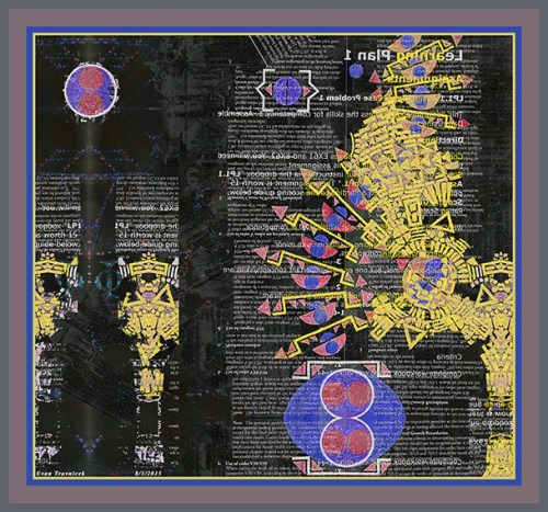
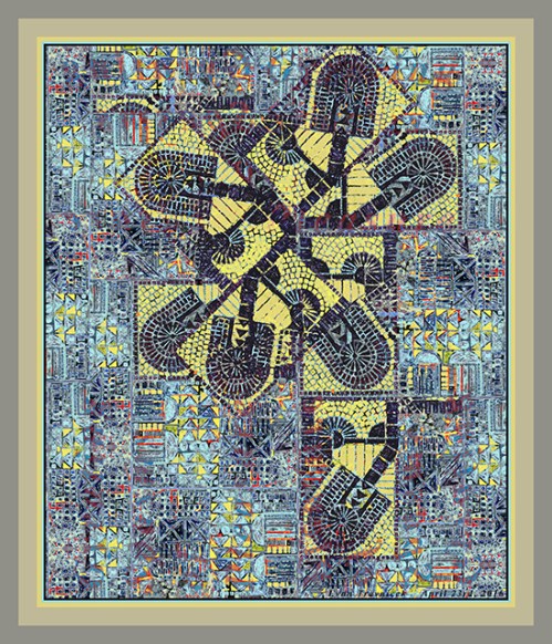
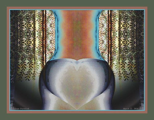
The idea here is a beautified, glorified, abstractified column. It became apparent to me as I was exploring other design configurations. This piece is derived from, believe it or not, Ataraxy (version 1). Of course I combined Ataraxy with a few layers of other material. Another example of that result is the piece I posted here back in August, 2015, called Galactic Template (version 2).

As far as common history is concerned, the architectural usage of columns dates back to ancient Egyptian times of around 3000 BCE. The ancient empire of Egypt is said to have originated in that time period. I only theorize that there could have been great civilizations, not alluded to in contemporary history books, that existed thousands, and perhaps tens of thousands, of years prior to ancient Egypt. Associate professor Robert M. Schoch has done considerable research revealing civilizations our current model of history ignores.

I chose to post this piece now because I had noticed my recent usage of the word “column” in my micro-blogging. My blogging is, of course, influenced heavily by what I notice going on in the world, and by other professional bloggers whose information and insights I value. I like to rely on my intuitive sense of informational flows; one way I do that is by noticing repeating patterns, including words, sounds, and images… even feelings. Perhaps especially feelings, as feelings are the place from which most people make decisions anyway.

A column can define a column in a newspaper, or it can define the architectural noun. To me, a column is a symbol of strength, civilization, calculation, order, governance, continuity, and stability. Perhaps this sense is intended to be communicated by journalists’ official use of columns.

At the bottom left and right of this picture are what appear to be stalks of grass, composed of black mosaic pieces. Or maybe they are skeletal impressions of hands beginning to cup and shroud the base of the column. Anyway, whether if the finger-tips of grass, or the phalanges of hands, they look like they are moving into a praying clasp. Hence, the title for this piece: Prayer of a Pillar.

The metaphorical, amorphic fingers merely suggest the form of hands as if each mosaic piece is obeying the non-physical commands of an unseen field moving them to pray. I’ve seen imaginary depictions of what it looked like in ancient Egyptian buildings and temples, and it appears that Egyptian artisans and their governing priesthoods liked to use bright, bold colors to fill in the shapes, forms, hieroglyphs, and figures engraved on their walls and pillars. So my idea of a column here has a more Eastern and ancient character to it, rather than a Western, colorless, marble quality.

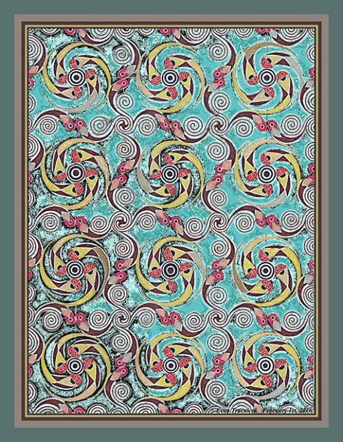
This piece has a lot of detail in it—a quality I wanted to achieve—with an appealing sense of balance and order. As many other pieces of mine, this work looks like it could be a still of a kaleidoscope. I also like to imagine that you are looking through a microscope at an exotic, alien world other than what you might normally see as cells and microscopic debris. After all, one of my original pieces in the Micro-Chimerisms series is titled Microscopic Works of Light.

I may add that the black mosaic phalanges coming up into a prayer formation at the bottom of this illustration can also be seen as the petals of a lotus flower. The lotus flower is an Eastern symbol of enlightenment, as they blossom on the surfaces of muddy bodies of water; from the depths of darkness, illusion, suffering, and mud is born enlightenment. So I’m really combining the Western prayer, the column of strength, and an Eastern symbol of enlightenment here.

These layers of materials, collages, drawings, and texts, along with multiple multi-layered symbols creates an idea I want to communicate to you: That we are multi-dimensional beings who perceive multiple meanings in the vast perceptions we receive and emit everyday.

Leave a comment

May 2, 2016 · 1:13 am

Planet Hunting (version 1)

PlanetHunting1ematted

This piece is derived from Ataraxy, an addition to my Micro-Chimerisms series, that I created last July (2015). I made several other variations from Ataraxy, but I felt this piece was the strongest. There are four other versions of it stored away for future viewings, projects, and shows.

I titled this structured melange Planet Hunting. I did so because the abstract mechanical object on the right of the picture plane looks like it could be a strange observatory that has several arrows pointing in a spread of degrees as if they were moving skyward. There’s a circular object in the upper left of the picture plane possibly suggesting a planetary body.

I like the notion that this image communicates the idea of aiming high, of shooting for the sky for one’s dreams. The dark background gives the mood that probabilities abound in the mystery, in the folds, in the countless unseen waves of space and time. There are what appear to be pillars on the lower left indicating an ancient civilization. Could it be Greek, Roman, or from the civilization on another planet?

Comparing ancient historical columns to textual columns was done half intentionally here. As I mentioned, this piece is derived from Ataraxy. I developed the columns, not from my original drawing, but by manipulating, copying, and combining new elements on to new picture files. It just happened to be that textual columns stood readily behind the digitally assembled yellow columns standing in front in this version.

There’s a large caldron or round iron oven in the low center that seems like it could be the dominant center of interest for the entire picture. But the fact that it’s dominant color is blue makes it a cool retreating hue. The yellow in the mechanical observatory off to the right and the columns on the left advance on the viewer as a louder warmer color balancing out the play of all the included shapes and objects illustrated.

Nevertheless, the round, blue, strange oven-like object still looks like it’s in the foreground, even though it’s primarily colored with blue, and secondarily, red. Perhaps it could be a steam engine, implying an abstract steam-punk setting. I like some steam-punk styles, but that’s not the core approach of my style, and the ideas I want to communicate to you. I like exploring imaginings of abstract alien technology, and obscure, archaic equations forgotten about in the vacuous, unfathomable echoes of our universe, and perhaps alternate universes.

I drew brackets, deltas (triangles), half-circles, and circles in different formations relaying my ongoing love of mosaic styles. As you may know, mosaics are how I see most everything when something is broken down—or seen—in its smaller elements. I like knowing what things are made of, and color coding helps me identify each part or element for the orders of greater and greater constituencies. For example, all the different organs of the human body are assembled into one unique organism or individual.

Of course we could explore the non-physical entity that animates and holds an organism together according to biological scientist Rupert Sheldrake’s theories of morphological resonance, but I recommend listening to any one of the talks or interviews of Sheldrake that you can find on Youtube.  He implies that organization is done by non-physical intelligent design.

Leave a comment

April 28, 2016 · 6:26 am

Toilet Scrubber (version 4)

ToiletScrubber4ematted

Toilet Scrubber (version 4)

35 X 30 inches

Print of drawing, cutout/collage material (paper and digital)

There are causes for which I named this piece thusly that I shall leave up to other parts of your mind to figure out. In the meanwhile, let’s explore for a few moments why I used the words I did here. The round headed object repeated at the center of interest looks like a toilet scrubber with its bristles and handle.

I thought of titling it Toil Rider, as one sort of rides toil when one cleans the bowl of one’s toilet. I wanted to give the image a sense of adventure and fun however, while mocking a chore that requires attention regularly. But then I just thought, “what the heck,” and I decided to just call it Toilet Scrubber. After all, that’s what it looks like. At least to me.

There are several toilet scrubbers in this piece. It looks like several repeated frames of a toilet scrubber in movement as it swishes around the bowl. Though, initially, you might be repelled by the whole idea, this piece would go well with your bathroom. It can serve as a diving board for inspiration as you ponder upon things while mentally belaboring one thing after another.

I combined an airplane view looking straight down at some industrial sites with a Micro-Chimerisms mosaic I’d drawn. The Micro-Chimerism I drew was drawn on the page of an old coffee table book exploring paranormal phenomena. I like doing ostensibly random things like this—layering seemingly unrelated subjects and items—in order to create new dynamic orders.

Leave a comment

April 24, 2016 · 6:51 am

Clocking the Mess (version 4)

ClockingTheMess4ematted

Creative destruction is the main theme of this hybridized collage. A few days ago, I cut out some images and text from a few old magazines I’d purchased at second hand stores. At the time, I fit them together into a spoked wagon wheel composition. I wasn’t exactly sure how I’d use them in a future design. Here is the result of that initial inspiration.

Earlier today (Sunday, April 17th, 2016), I was drawing some of my energetic abstractions I’ve developed over the years. After leaving the cafe I was sitting at, I started getting some ideas on how I’d use the cutout magazine material I already mentioned. I also knew I wanted to incorporate the drawings I’d just done. Upon returning home, I started scanning in the magazine cutouts and the drawings. Then I transferred them to my image editing program.

While at the cafe, I was listening to some classical music I feel explode with power and thrust. You see, when I first came to the cafe, I was listening to a classical station on the radio in my truck. They were playing Dvorak’s Slavonic Dances. I could feel the power chords resonating in that piece, but I hadn’t consciously formulated that assessment in my mind at that point.

So while I was in the cafe, I decided to listen to the Slavonic Dances on my iPhone. Then I decided to listen to the Overture of William Tell, by Rossini. I intuitively sought out more music I felt also had a powerful thrust to it. Then I thought of listening to the Ride of the Valkyries, by Richard Wagner. I topped off my desire for forceful, thrusting, power music with Tchaikovsky’s 1812 Overture. Tchaikovsky’s Overture was an excellent climax because of the cannon explosions that can be heard in it towards the end.

While listening to the last two pieces I mentioned, I started to write some of my thoughts down. As I mentioned, this piece is about creative destruction. It symbolizes the awesome creative / destructive power of natural phenomena, such as tornadoes, hurricanes, and vortices in water. The power of the classical music I listened to felt excellent for inspiring a person to clear out mental detritus, such as anxiety, hesitation, procrastination, cowardice and so forth.

I feel that destructive forces in nature are necessary forces that clean away old, rotting, obstructive, stagnating, lingering elements that have already served their purposes in the greater balances that constantly fluctuate throughout the universe. In this imagery, in which several parts coincide, I combine the power of thrusting, forceful classical music brimming with confidence, and an abstract depiction of a hurricane. It looks like the dark, swirling vortices have approached from the upper right from an ocean on to the bay of an old city, heading down across the land to the lower left of the picture.

The complex detail of the cityscapes, skies, and text would be near complete chaos if it weren’t for the wagon wheel composition around which they are all assimilated. I made sure there was also a straight line transversing across the entire picture plane. Another symbolic dimension I imagine that can be highlighted in this piece is a bow and arrow with the arrow aiming towards the upper right. I like to see multiple things in the abstract works of art I create. I am pleased when people see things in them that I’d never thought of.

I intuit that people generally gravitate towards art that isn’t too complex and chaotic. Identifiable objects, and simpler abstract shapes, are concepts people can grasp and feel senses of confidence and security with. An approach I’d been experimenting with for a while now is complexity. A philosophical idea I’d been pondering lately has to do with a polarity between absolutely void space, and completely filled solidity.

Art works that are amassed in complexity and chaos approach a paradox for me. I considered the notion that space is perhaps the ultimate filled solid, but its “matter” is so infinitely subtle that it appears to be a vacuous medium through which we can travel. Space, being one side of the polarity between itself and total solidity, is really just part of a polarized environment of creation. This ultimately makes matter and space one when looked at holistically; being and nonbeing are also dual parts of this greater existence. But the play of contrarieties must continue in order for the fluctuating spectrums of all existences to differentiate and experience something other than absolute unity.

In conclusion, I titled this piece Clocking the Mess because I used a magazine cutout of the face of a watch. Of course it represents time, and the main line transversing the picture represents the traditional Western linear concept of time. It also highlights the pathway for which the abstract hurricane is traveling across. The “mess” is all the intricate detail characterizing the image as a whole.

Leave a comment

April 18, 2016 · 7:27 am

Be To The How (version 9)

BeToTheHow9ematted

Meander across the page, does a weaving path of mosaic shapes in this illustration. I wanted to use one of the paper collages derived from various books, printouts, and lists I’d made over a year ago. The particular collages I used had been sitting around for a while because I didn’t feel bold enough to tackle the projects I knew I wanted to carry out on them. The collages came from a large eighteen by twenty-four inch piece of paper on which I glued various other paper media materials to. I cut up the collage into smaller pieces, thus providing myself future material for more works than one, though smaller.

Here is the result of what I drew on to one of the cut out collages. I didn’t feel bold enough to engage in these preparations because I was worried that I wouldn’t make anything that would satisfy the standards I’d set with previous successes. In an instant, I decided one day—a few days ago—that I would just start drawing on one of the collages with some magic markers that I have readily available in my little studio.

The result here is identical to the original drawing in composition, but not in color. The colors in this version are completely different. After tinkering, filtering, and manipulating other versions, I came to this version number nine, and felt a degree of success that satisfied me. I hope it visually satisfies you, too. Art is like food for the soul, and eyes are like the mouths that consume art’s cornucopia of visual taste and experience.

A friend had mentioned that my art looks “Kleeesque” to me one time, and I hadn’t thought about Klee’s art for some time now. I used to be very inspired by Klee’s work years ago. I remember checking out a huge book from the downtown library in Riverside, California on Klee’s work a long time ago. I would listen to Tchaikovsky’s Nut Cracker Ballet after I took the books home I checked out at the library, and turn the plates of images of Klee’s art in color with awe.

I used to be obsessed with Van Gogh’s art; I wanted to paint exactly like he did. I did a couple paintings and drawings that resembled Van Gogh’s style, but mostly I felt frustrated that I couldn’t do what Van Gogh did. At a certain point, I started asking myself if I wanted to be known as an imitator of Van Gogh’s art. I realized that I wanted to develop a style of my own. In my studies of other artists, I found the cubists, the surrealists, and Paul Klee to help me explore other avenues of expression. I resolved a sense in me that I would use Van Gogh and Paul Klee as a sort of polarized standard for which I could bounce back and forth the ideas of my own that I was developing.

This digital representation harkens me back to that stage of development in my artistic career. I titled it Be To The How as a poetic play on words. While there is no bee buzzing around in this organic portrait, it seems like there possibly could be. Nonetheless, “be,” as in “being,” is an existential notion, and I felt that the relationship between being and action (how to) was a pertinent observation. It looks like a being—perhaps a worm—is learning how to travel across a forest of grass and flowers as it stumbles across a bit of enlightenment for it’s culminating lesson for the day.

You can see some of the text and graphics from the collage showing through the colorful shapes I’d drawn on to them in this piece. In future projects, I’d like to let the graphics and text be less covered up by my drawing so as to give more play and emphasis to the collage work I accomplish.

This piece is 23 x 19 inches

Matted, glassed, and framed, this piece is: $400.00

Postage and handling is: $50.00

For a total of: $450.00

(I recommend you get the print glassed yourself, instead of me glassing. This is so you can avoid possible broken glass when you receive it).

Price for an unmatted print is: $90.00

Postage and handling is: $5.00

For a total of: $95.00


Buy Now Button

PayPal Acceptance Mark

Leave a comment

March 27, 2016 · 7:53 pm

Whispered Context (version 4)

WhisperedContext4ematted

Whispered Context is what I call this one. The female form visually whispers to the reader of the text as one reads it. It’s too obvious here to be a subliminal communication, but it implies this concept anyway. The last image I did like this I blogged and showed you, called New Morals, captured a new idea I happened upon in my lucid states of creativity.

I read Facebook’s rules concerning showing art with nudity in it, and it sounds like they are okay with it. After all, busts of the Greek statue David can be found pretty much anywhere, so I felt confident in sharing this image with you. This new series I’m developing reminds me of Greek statues, what with their marble statue resemblances behind the lithography of text.

As is a well-practiced art now, I used reversed and flipped text in this piece to bring attention to the shapes, patterns, and groups that letters, words, and sentences form. The designers of fonts put a lot of effort into designing letters so that they allow the eye to flow across them as they are read. Johannes Gutenberg, the inventor of the printing machine, back during the Renaissance, even did mathematical calculations for the characteristics of each letter, such as the middle part of o’s being wider than their tops and bottoms for example.

The foundation of this digital illustration is a collage. I pasted texts, words, and paragraphs from different sources together at different angles. They are all perpendicular to one another however so as to create a degree of stability. The piece as a whole is vertical, making it nice for near a doorway perhaps, or any other area of your house that can allow some vertical space.

As I mentioned previously, I’d like to use portraits of people who are interested, and incorporate them into future works. The face, I find, expresses so many things for people. People are just drawn to faces in art. I wanted to combine undefinable abstractions (such as reversed and flipped text) with the human face and form in order to create a synchronistic synergy. You may notice the text next to the left of the woman’s hair, creating an effect that looks like a breeze or wind is blowing her hair to the left (her right).

Another synchronicity I played on is how the woman’s eyes are right next to the bold text “EYES,” drawing attention to that area with your own eyes. Eye contact is another powerful connection people make with one another all the time. In art, I believe it’s a centering, and deliberating contemplation you can make as you wonder how this specter moves so well through all the black and white print as if she were made of a liquid lighter than water, combing with ease through all the denser materials collected together in this space.

This limited edition print (limited to 25) is: 30 x 20 inches

For: $90.00

If you want it framed with glass, it is: $400.00

If you are not satisfied with your purchase within 60 days of purchase, you can return it to me for a full refund.


Buy Now Button

PayPal Acceptance Mark

Leave a comment

March 25, 2016 · 5:10 am

Apex of a Heart (version 5)

ApexOfAHeart5ematted

What is this? It looks like the shape of a cartoon heart at the bottom center. I didn’t realize that I would get this shape when I was in the process of manipulating the photograph from which it came. I think I will let you figure out the source. I mean, it’s pretty obvious, isn’t it?

I wanted to turn the digital photo I was working with at a certain point into the shape of a vase. But the heart shape didn’t resemble the bottom of your typical vase. Therefore, I decided to title this piece Apex of a Heart. In anatomy and physiology, the apex of the human heart is at the bottom of the heart. I found this to be contradictory when I learned about that because when I normally think of the word apex, I think of the apex of a mountain, which is its peak.

Anyway, to overemphasize the “bottomness” of the heart’s apex, I made the point of the heart you see in this image touching the very bottom of the picture plane. The curtains behind the central form give you the sense that they entirely surround it, hiding it from everyone’s view (except yours) as a strange anomaly that oddly resembles something you can almost identify.

I filled in some holes and gaps to touch up the continuity of the form and the curtains. I made other variations of this image, which are more colorful. I decided however that I would like to use this fifth version to show you because the colors weren’t too jarring. Not that jarring colors are bad in general, it’s just that for this piece I felt I balanced this palette well enough after the second day of working on the visual document.

I would like to work with the human form to create more abstractions like this in the future. I would like to work with portraits of friends and acquaintances and incorporate them into my textual artworks. You saw an example of that in New Morals. If interested, send pictures of yourself with minimal background so I can select your image and put it into new works. This theme, and many other concepts, I’m developing currently. You’ve seen my other themes already, so I don’t need to explain them.

The diffuse glow, the soft feeling of cotton, and the exclusivity that this piece invites you to feel makes it an intimate experience. The nice thing about it is that you can return to it and remind yourself of it again and again. Just imagine having it as a limited edition print (25) in your collection of art from original artists. This print is 23 x 18 inches. Just the print itself is $70.00. Remember, there are only 25 that I will make, thus insuring their value for those who own them.

1 Comment

March 22, 2016 · 8:10 am

Bed Count (version 1)

BedCount1ematted

They look like wrinkles in the sheets of a bed. They look like nine square beds fit closely together for storage, creating a plane of mattresses and sheets; like fields of farms below an airplane as you travel overhead. Of course I hadn’t thought of this perception while I was drawing the original piece on collaged paper, which is derived from After the Crash J1 for which I posted previous to this one.

I selected this area of that drawing and repeated it eight more times, thus creating nine cells for which you see here. I turned each cell however so that each adjacent cell is not identically positioned, thus rendering a random—what looks to be—coded image.

It looks like the black cloudy spots in each cell could be nuclei for biological cells, and the surrounding speckles on the borders of each cell are the membranes. There are skin cells in the human body called cuboidal cells. I liken these abstractions to them.

Having made two comparisons already—cells and beds—I note to you that skin cells on the epidermis of your body are rubbed off each night on the sheets of your bed. The colorful impressions of your dreams are added to the folds of your soft sleepfulness as well. But you turn every once in a while to reposition your body in a more comfortable position while you sleep, like the Andy Warhol film called Sleep.

In my healthcare statistics class, I calculated simple formulas for hypothetical bed counts in hospitals. That’s part of the reason why I titled this piece bed count. When a hospital is a maximum capacity, all the beds are used leaving no more beds for new arrivals. That’s why an exact bed count is so important for healthcare workers to know working in a hospital. If there are less patients than there are beds, they can be calculated in ratios.

I don’t know if you can see the salt crystals mingled with the blue areas, but there is indeed salt that I used on the original drawing. I did this to create clouding and bleeding effects. I also used rubbing alcohol, which I splashed on the nervously applied random dots speckling the borders and the spots. You can see the bleeding effect in some of these areas creating an off purple color.

Leave a comment

March 21, 2016 · 7:20 pm

Tri-Iteration (version 1)

TriIteration1ematted

Is it time for some therapy for non-physical beings bound and whipped by the addictive pleasures of the flesh? Well, whatever. Apparently, art therapy is the thing critics and journalists like belittling and criticizing as of late. I sort of don’t blame them due to all the coloring books for adults that even Wal-Mart now sells. If I were more paranoid, I’d say that centralized PR firms caught on to my doodling after observing me from all the surveillance cameras around every corner for the last few years.

I would work on larger more extensive art projects, but, for whatever reason, I’ve been condemned to doodle on scraps of paper glued together into collages. I’m becoming cooler and cooler with that as the world’s years hammer away at my trembling heart. It’s cool; I needed to develop some courage. I hope I’ve gained a thread of it from a badge of courage awarded from heaven.

Anyway, I titled this piece Tri-Iteration because of the repeated lower-case i’s in the lower part of this abstract illustration. An iteration is a repeated utterance. This drawing is basically the foundation drawing for my Wrecked Tangles (After the Crash) J series. Besides the i’s, included in this picture is a t and an H. I suppose you political hacks could find a hidden connection there between the letters I incorporated herein, and current events.

Maybe my unconscious mind was trying to tell me and everyone else something. I wasn’t consciously trying to intend a message. In fact, this drawing was an attempt on my part to escape my over-thinking, analytical mind. Hence, “art therapy.” It allows me to rest my left brain, and enter the playful, experimental, careless regions of my right brain. Having been credentialed as a Registered Health Information Technician lately, I have been trained to think more scientifically, quantitatively, and rationally. I’m glad the artist self within me hasn’t been completely gutted by this world.

What I note to you about this drawing with pens, pastels, diluted acrylic, and collaged pieces of paper is that I used two new agents as transformative properties in it. I used salt and rubbing alcohol to help weather and distort the colors of dust and magic marker. In previous Wrecked Tangles drawings, I had struggled to make the wrecked parts of the angles and lines mimic nature’s and time’s characteristic features of entropy, weathering, stress, and crumbling.

I first made the frame around this piece solid colors with no interference, but then I decided it needed some pocks and perforations to give it a distressed look. So I copied a selection of the pocks, points, and perforations inside the image and stretched them over to the frame. I was satisfied with that result. It can be changed to solid if you want that format. I can also make the image as a print without any pseudo-matting so that you can get it framed yourself if you so desire.


Buy Now Button

2 Comments

March 17, 2016 · 6:13 am

Happy Zephyrs (version 4)

HappyZephyrs4ematted

This is the latest drawing I recently finished. It’s titled Happy Zephyrs. The image you see here is based on the original drawing. The original drawing was done on paper with felt-tip and gel pens. I used different metallic gold gel pens for the tails of the pisciforms you see repeating regularly throughout the picture plane. 

For some reason, I’ve been fascinated with metallic gold pens. I think it’s because in formal art, using things such as gel pens (perhaps even especially metallic gold pens) is considered low value, scrap-book, hobby, not serious type art. In this, I see a challenge. Therefore, I’m drawn (all fun intended). 

I decided that Happy Zephyrs, the original drawing as converted into digital imagery after scanning, was asking me to make a background for it. It was a subtle beckoning, but I heeded. I tweaked a few of the filters and adjustments in my editing program, and thus produced variations of what you see here. I feel particularly satiated with achieving an oxidized copper effect. This gives me the weathered, stressed, aged look that I often seek. 

I know many artists have experimented with and explored techniques of aging, weathering, stressing, ad hoc, and imperfect expressions already, so this really isn’t anything original on my part. I do feel, however, that this approach is something that has immeasurable depth and possibilities to it. In a sense, I feel like I let nature flow through me sometimes when I make art; like I’m letting the forces of nature with a few of its tools work the various terrains and mediums of earth. 

Electronic art is just another dimension to this process for me. The vortex, the force, the warp adjusting, the attenuation, the pattern recognition and hybridization are all within me. I am a doorway through which ideas come tumbling out and find security within the various mediums I record them in for present or future purposes. Even the ideas I supposedly complete in final works still have possibilities for future morphoses into new ideas. 

The word zephyr means a light wind or west wind. It comes from the Greek word Zephyrus, which was identified by the ancient Greeks as a god of the western wind. In my making of this drawing, I hadn’t delved too deeply in researching the myth behind Zephyrus. Perhaps it’s something you may embark upon if you feel so intrigued to do so. I just thought the pisciforms in this particular drawing looked like windsocks with happy faces, so I made the connection: Happy Zephyrs.

1 Comment

February 1, 2016 · 9:59 am