Category Archives: Art of eVan

Provincial Dumbshits (version 3)

provencialdumbshits3ematted

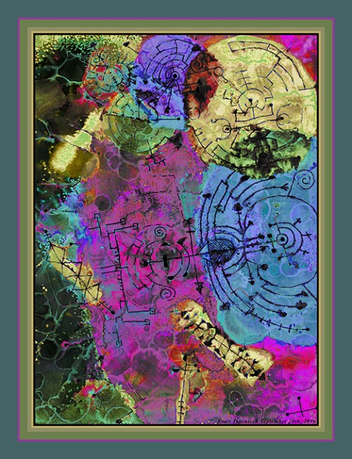
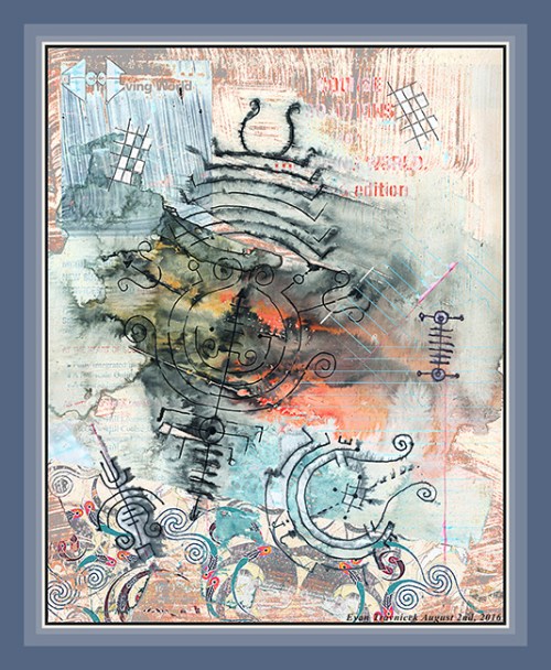
I was trying to figure out what to title this piece for a while. I knew what the idea was based on with the original drawing. In visual art, there are lines and colors that define things in the picture plane. In real life, objects, people, and animals are defined by their forms and boundaries. Humans have created the concept of owning property. Properties are legally defined by boundaries. In a more abstract sense, properties can also be allotted to things like chemical structures. So salt, for example, has salty properties that you can taste. Propriety is a word that characterizes a person’s sense of etiquette and social intelligence in social spheres. Propriety is a set of behaviors that one “owns” and exhibits to others to achieve unwritten and written credentials of acceptance.

I applied crudely aligned lines and colors in the original drawing for this series to highlight to you the questionability of boundaries. Most people are insecure about themselves and their properties, so worlds of “defense” and attack are maintained to manage the tensions peoples’ insecurities create. One approach to questioning the temporal, mortal, mutable boundaries people try to maintain is by showing, through science, the vast spaces that exist between planets; or, taking it down to atomic levels, showing people the boggling spaces that exist between subatomic particles, which is basically like scaling down interplanetary models; and finally showing how particles themselves are immaterial subatomic bundles of energy.

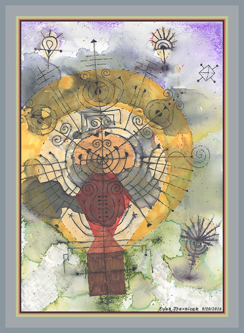
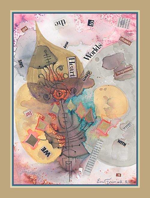
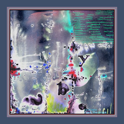
For the last couple of years or so, I have been exploring depictions of clutter. In contrast, historical Asian artists—especially Zen artists—have shown their mastery of using space for senses of fulfillment in their art. In my art, I feel like this is a state I am working towards, but in the meanwhile, I’m exploring various states of clutter. So, this piece here is a state along that journey. Yet, it has more space in it than other works I’ve done. The spaces also exhibit properties of variation in ambient color and etherial qualities.

A comment was recently made on my Art of eVan pan fage implying that some people think that “even a three year old kid could draw that.” It’s an amusing stereotypical remark abstract artists have encountered since abstract art proliferated in the early 20th century. I wouldn’t be surprised if the French Impressionists encountered comments like that from the provincial dumbshits of their time. And that’s what I titled this piece: Provincial Dumbshits. It’s a blunt comment right back to those who make it. Perhaps reactionary, but oh well, this is my art and my blog.

I used to live on a retired farm with my family in Eastern Nebraska for several years. I got to know the community there to a certain extent. Having moved there from Southern California in 2000, I thought I would take the Midwest by storm with my revolutionary art. I learned over time that this was not going to happen. Looking back, my art really isn’t that revolutionary in terms of mediums used. I suppose it could have been had I pursued digital animation more. I had a few ideas I was working on when I was attending school at Metropolitan Community College in Elkhorn, Nebraska, that could have been developed further.

Every once in a while, farmers would come and visit our family. We were renting out our land to other farmers in the community to farm, so they would store their equipment in my grandparents’ tractor sheds. Sometimes I’d show them my art—my big paintings—and I could tell it got reactions. My art is just so weird, abstract, and surreal to their weltanschauung that it sort of alienated me. Most farmers have nice, soft, pastel, kitschy landscape or still life scenes as “art” in their homes.

I talked to one of my dad’s cousins about the way of life in rural Midwest, and she explained to me that most people in the farmlands have a “provincial” outlook on life. They haven’t been to any big cities, other than Omaha or Lincoln. Their entire lives are spent in small town and farm community affairs. So they literally have no experience dealing with other places and peoples. I understood. But I gained a sense of love and respect for the Midwest over time. After all, I was born in Lincoln.

When I title this piece Provincial Dumbshits, I do it with love, but also a jab of edge. I suppose it’s an expression of frustration with the human tendency, in general, to cling to world views and belief systems, no matter how limited or wrong they may be. Not only do people in the country have this tendency, but people in the cities have this tendency as well. And so there is another contrast that creates an invisible boundary between country and city folk.

In summary, this piece, with its broken lines sparsely scattered about, symbolically questions all these temporary boundaries we all erect physically and psychologically to defend ourselves from others, the rest of the world, and the universe. Meanwhile, since we’re mortal, and earth itself is constantly changing, heeding not one wit to our borders and boundaries, none of these things we create to define ourselves and our universe will last forever. The spaces and ambience underlying the lines defy their crude claims, symbolizing the anxiety we all feel in our unconscious minds as we live day to day meeting our survival and reproductive needs.

Leave a comment

December 23, 2016 · 9:55 pm

Astonished Buoyancy (version 1)

astonishedbouyancy1ematted

I drew this piece this last Summer. At the end of Summer. The Balloon Fiesta here in Albuquerque lasts from October 1st to the 9th however. The shapes here in my image are balloon shaped, and the background looks like borderline psychedelic clouds.

I have been thinking of my art as non-political lately. I used to make paintings that were quite in depth with symbolism and personal symbolism. I’m sure many of those paintings could be interpreted in political ways. However, way back when I first started seriously painting, I had NO interest in politics.

They are balloons with bones, or structures, in them; like kites have sticks to give them stability and structure. I found some similarities of this drawing to Odilon Redon’s work. He drew and painted cyclops type balloons and characters. Some of his most famous artworks include these strange symbols. While drawing this image, I wasn’t thinking about eyeballs however. I was thinking about the bulbous shape that standard balloons take.

In other drawings I use this shape as petal formations encircling the floral disc. There’s a term I learned a couple of years ago called “splanchnic.” It’s a scientific term for guts. As it applies to the orange fruit, splanchnic are those little bulbous formations containing nectar and juice inside the slices. I think of these balloon like formations as splanchnic.

Taking journeys upward, being lighter than air, are what balloons are built for. I remember seeing some fictional depictions of what could possibly be lifeforms on Jupiter in Carl Sagan’s Cosmos. He called these lifeforms “floaters” because they were designed—or perhaps evolved—to float in the gaseous clouds of Jupiter. This idea always fascinated me. It opened my mind up to what alien lifeforms might look like.

Anyway, what I’m doing with my current drawings is making the viewer look at basic lines, dots, and shapes. I add subtle layers by washing the pieces with water or acetone to distort and bleed the shapes and lines. The continuous spaces that water creates with the colors allows for new dimensions to be penetrated. Instead of being totally two dimensional, the drawings end up flooding into new, unexpected, characterized world fulfillments.

The spaces between the lines are intended to capture mood, memory, association, and projection for the viewer. The spaces allow the mind to wander. The surrounding structures allow for stability.

2 Comments

December 15, 2016 · 9:26 am

Bower of Briar (version 1)

bowerofbriar1ematted

When finishing up a new work of art, my mind often draws nothing I would consider witty and poetic when I try to complete it with a title. Yesterday, I was streaming my consciousness, and jotted down a few thoughts and titles with respect to this piece. One of them was “Matchsticks for a Gas Stove.” While I have been micro-blogging my conflict with respect to climate change science lately, I just didn’t want to associate this piece with politics.

My art is an escape from politics. It’s a place of magic, wonder, exploration, experimentation, fun, mystery, intrigue, fantasy, poetry, and imagination. Politics has a tendency to destroy all that for me. So I compartmentalize my intellectual and creative pursuits. The title, Matchsticks for a Gas Stove, would have had too much suggestion of careless human CO2 production as narrated by Washington’s cadre of left-leaning politicians, lobbyists, lawyers, and journalists. Please understand that I’m not an anti-leftist. I just have been disappointed by the left’s tendency to favor big banks and illegal wars over the working classes in the last several years.

With my art, I really want to escape, or at least transcend, the confining roles of left vs right politics. I know that George Orwell wrote that “all art is propaganda” last century, but I still want to transcend that perception. I figure that left vs right politics, as a gestalt, or greater whole, holds itself in check, and rocks back and forth like a pendulum over time. This enables me to let go of insecure needs to insert left or right pieces of information for public consumption on social media.

In finally reaching the other side of this bridge over political waters, I found a satisfactory part of my life to write about and share with you associated with my new image. A few years ago, I was dating someone who really opened my heart up in a way that I’ve NEVER in my whole life experienced before. I had decided to break up with her because I already knew what the outcome between us would be. I had lost a job I had back then and I had to move back in with family. These factors significantly insecuritized me and I knew that I would be betrayed in some way, so I cut things off.

I haven’t dated anyone for the last few years. I have had experiences, but I just pretty much avoid relationships now. Compared to the average person, it is like ten times a challenge for me to open up, trust, and love another person. Most people, I find, to be mostly self-serving, and often in ways I find treacherous and untrustworthy. This includes the woman I started to fall in love with. I forgive her however. Nonetheless, I have not and will not pursue any kind of friendship with her, not out of spite, but in order to protect myself from being hurt.

What I want to describe in reference to this image I’m posting here is the sense that the woman I was with did something permanent for my heart. She opened up a new dimension of love for me that, as I already mentioned, I had never experienced before. It’s like she spiritually infused an added quality of love into the locked away parts of my heart since I was a child. Perhaps she added nothing, and my heart was ready to open up to a new dimension when I was with her to start with.

Anyway, this image looks, to me, like two different kinds of heat: Red inferno surrounding emissions of blue flames. The twigs with leaf-like formations on their ends can be perceived as matchsticks, thus giving the impression of using matches to help a gas stove light up. Blue flame is considered a more pure form of heat that won’t blacken pots and pans when its flame seers them. Symbolically, the blue center represents the places inside me that have been replaced with purer forms of love as they grow and expand further—tentatively at times—outward into the world of raging, lusty, careless, media / dust storms.

2 Comments

November 20, 2016 · 7:01 am

November Golden Leaf (version 1)

novembergoldenleaf1ematted

Just the other day, I got a couple new Schneider pens at the UNM bookstore. Schneider makes pens that are not totally water resistant, and that’s what I want for the mixed media drawings I’ve been making lately, and have made in the past. Pilot and Pentel are also brands that make water susceptible inks in some of their pens, so I use them as well. The particular Schneider pen I used for this drawing has slight colors of blue and yellow when it bleeds under the influence of water.

For the background colors of this drawing, I used alcohol based markers. Those colors can be seen in the bodies of the foliage for the tree, and also for the landscape for which the tree is rooted in. I splashed rubbing alcohol on these so as to wash, bleed, and blur it. The trunk and branches of the tree are made from the printed on pulp of paper media, such as magazines and books.

A guiding principle I consciously employed in the making of this image I learned from reading Robert Henri’s The Art Spirit manuscript. He emphasizes in his book that an artist should cover the plane with broad, basic shapes in order to furnish the soon to be picture with a structure upon which to add more detail. In reading Benedict Spinoza’s philosophical work on sharpening one’s wit, he suggests that a person’s reasoning abilities should start out with basic concepts and then progress into more complexity. This is much how civilization seems to develop, from the stone age up to now, the information age; at least Western civilization, that is.

I sometimes get bored and irritated with basic shapes in my art studies, but there’s no way around it. Everything in art starts out with the most basic, simplistic designs imaginable. These shapes then build upon one another as I imagine and act on developing a work of art further.

To skeletonize the tree, I drew black lines from my Schneider pen on the trunks and branches after the glue soaked cutout material dried on the surface. Using the pointillist technique, I dotted the sky with peach and lavender colors, and also the land below with grays. The middles of the leaves I carefully drew on the twigs of the tree are filled in with gold gel pen ink. I surrounded them then with a sky-blue ball point pen ink, and this is encapsulated by orange acrylic paint for which I painted with a brush.

The story is the colors and the season we are currently in—Autumn. I imagined a tree family called November Golden Leaf. This tree’s leaves literally turn gold in the Fall.

Leave a comment

November 18, 2016 · 6:32 am

Ghosts of Flower Bones (version 1)

ghostsofflowerbones1ematted

Here is an expression—a culmination—of what I really love in life. I’ve been working at a very condescending, obstructive, and incompetent environment for the last three months, and I was recently let go. Normally, I would have felt rejected, and sorry for myself, but this time I felt a sense of peace and freedom I haven’t felt for a long time. I had been working on this mixed media drawing in the last couple of weeks up to the point at which I was let go from this recent job. I finally finished it the day after I was let go.

This drawing is a culmination of so many ideas and artists who have inspired me: Paul Klee, Maria Elena Vieira Da Silva, Paul Cezanne, Van Gogh, and many others. Da Silva and Klee have such unique and individual ways of expressing the line in art that their obsession was passed on to me. I love the idea of objects being translucent in a spiritual sense and my senses being able to perceive and imbibe the multiple layers that they stack around me.

Cezanne was known as the progenitor of Cubism, though he did not invent cubism. It was Pablo Picasso and Georges Braque who officially developed scientific cubism. Nonetheless, when one looks at Cezanne’s still lifes, one can see the odd angles at which the different objects in the scenes are depicted. This is a distorted sense that I wanted to emulate here in this drawing and take it on a journey of my own efforts. Perhaps Van Gogh’s sense of color and swirls can be picked up here as well.

I used different papers and pages from old books pasted together as the preparation background on which I would draw this drawing. I made sure that the text, patterns, and pictures from the collage work did not show too boldly by washing it with diluted primer and acrylic paint. For the black lines—which I see as skeletal structures for the flowers, vases, and tea cup—I used an ink pen that bleeds under the influence of water.

For a lot of the spaces that I colored in, I used Sharpie markers. Then, to give the sharpie colors a washed-out watercolor effect, I used acetone as a wash flung over it, and brushed over the picture plane. I touched things up with more highlights and colors by using dry and oil pastels.

This picture really looks to me quite dimensional with depth. It is a quality I’ve noted in previous paintings I’ve done in the past. Depth and dimension seem to be things I don’t really have to struggle with creating. It comes naturally. Anyway, I hope you enjoy this piece. I haven’t posted any new artwork for a few months now. It’s because, again, I was working at a miserable job with very unhappy people. Now that my emotional energy is free of that toxic environment, I will be posting my art more often now.

1 Comment

November 7, 2016 · 3:55 am

Interlunar Cells (version 3)

interlunarcells3ematted

I set out on a journey to rediscover black ink writing pens that bleed. I had found a couple brands while I lived in Nebraska that did behave in such a manner; and I had produced a whole new metaphorical style with them in many drawings during a creative spell with pen and paper media while I lived there. Of course, since I moved to New Mexico, life has been rather uncertain as my losses and gains with various day jobs occurred over the years. But more to the point, I have been lacking a stable, long-term studio on which I can rely for my creative pursuits. So, in the meanwhile, I make drawings, instead of large scale mixed media paintings like I used to in the large basement of my family’s farmhouse.

An artist needs stability in order to proliferate. If life is constantly throwing an artist around, the artist will generally be discouraged and obstructed from being able to grow any kind of roots for creative sustenance. An artist exemplifies the archetypal inner child: rebellious, prankster, fun-loving, drama-creating, irresponsible, wildly imaginative, innovative, etc. Many artists don’t have a strong inner adult or parent to help guide them towards discipline, and, hopefully, prosperity. So, some get lost in addictions, and other frivolous, fruitless activities.

Artists are dependent on those who buy their work, and the contracts they sign with a variety of employers, collectors, gallery owners. In other words, if an artist was not born into wealth, then they will basically have to prostitute themselves and their talents around until they manage to get lucky enough to establish a more long-term flotilla of security.

This is not how the original drawing looks. I tweaked, and inverted the colors so that it looks psychedelic. I’m enjoying a random, almost spastic, dyskinesic, but liberating state I had been trying to develop in my creative immersions in Nebraska here in this illustration. I first drew the large elliptical and circular shapes on some sketch paper with some colored Bic markers. A couple of the markers I used were drying out due to age, so I went home and finished up the background with some newer markers.

I drew a preparatory structure with a hard pencil of what would later become the black bled lines you see in this image. Then I dribbled some acetone on the colors which successfully gave it more bleeding and distortion, sort of like tie-die. I added some water based pen colors as dots in the corners, nooks, and crannies here and there so that when I finally applied broad strokes of water across the paper plane, they bled well along with the black pen lines.

I consider this a member of my Goiddios series because it is not a digital / traditional hybrid amalgamation; the composition is true to the original drawing, save for the color manipulations. Remember, the Goiddios series is an effort in the direction of using traditional media. I may use some combining and hybridization, but the general spirit is traditional media. Specifically, pen, paper, glue, brush, chemicals, cutouts, and water based mediums. The idea is to steer closer to the physical plane, rather than the electronic plane of art.

Leave a comment

September 25, 2016 · 10:24 pm

Hydrozen Perogia (version 1)

HydrozenPerogia1ematted

I titled this one Hydrozen Perogia for word play. So here you have some image play and word play combined, literally. Not only did I produce some visual titillation, I also pasted some cutout text from magazines into this piece. I think some of the text comes from National Geographic magazines from the 1970s. Anyway, I have a bunch of text already cutout from various sources stored up from previous projects ready to be used for future projects.

Every once in a while, I’ll get some interesting titles for artworks and songs traveling through my head. More often than not, I’m engaged in some activity that requires my immediate attention—like driving—when I get these inspirations. So I have to attempt to use mental notations and flags to help me remember to write or draw them down when I get a chance.

My invented word “Hydrozen” is derived from hydrogen, the most basic type of atom on the elemental chart. It’s also an atom that composes part of the molecule for water: H2O, meaning, two hydrogen atoms, and one oxygen atom, which join together and share electrons in order to balance themselves out and produce what we know of as water. My second invented word is “Perogia” is derived from perigee, which is the point in the orbit of the moon or a satellite at which it is nearest to earth.

In medieval philosophy, water is considered an element, along with fire, earth, and air. Water is the dominant medium I used in the formation of this illustration. However, the large lobular shapes you see composing much of the space surrounding the line work were drawn with Sharpie type pens, which are not water based. The brand of markers I used for this beginning stage are called HobbyColour™. Like Sharpie, I believe the liquid compound ingredients are alcohol variants, such as propanol, butanol, diacetone mixed with different dye colorings. Don’t ask me what those are made of.

Chemistry is a subject that interests me lately. The subatomic particles, atoms, and molecules that compose everything we see are also determinant elements for artistic productions as well. They influence the outcomes of art works. While I appreciate digital art, digital art can’t imitate the natural influences of nanoscopic forces in the physical world. Water can’t really be controlled for example, so I just let it bleed.

Leave a comment

August 22, 2016 · 2:55 am

Deft Barrel (version 1)

DeftBarrel1ematted

Here I am back again. This time with a little more chaos. I’d been hinting that I like clutter, randomness, and crudeness as expressions of art in some of my social media posts lately. And I had been developing this current style as well. You’ll notice Paul Klee’s influence on my style. I’m not ashamed to admit that his work deeply impressed me long ago, and I wanted to continue taking the line that he started for a walk as if he passed a torch to me.

The previous work, Obnubilators, I posted to this one, is an initial representative of the free hand, basic contour designs I’ve been working on. This work, I titled Deft Barrel, is an inversion of the black line however. I basically inverted the black to white, thus producing a ghost-like effect, associable to Kirlian photography. And that’s what I feel I’m doing anyways—capturing the impressions of ghosts who let me capture facets of their energy in works of art.

I drew my designs on a a collage I had prepared months ago. The collage involved cut-out motor diagrams, and text from various sources. I got some ink pens that bleed when water is applied to the paper the ink is drawn on. Some pens don’t bleed with water. Even acetone doesn’t dissolve it or make it bleed, so I have to test the pens I think I need before I buy them. I also applied some other colorful water-based pens so as to add to the psychedelia.

Art, to me, is a balance between mastering elements of control, and letting processes and developments take paths and lives of their own. I must be the one to initiate action, but most of the time I don’t have a complete vision in my head of the outcome. That’s the exciting part to me; I enjoy surprising myself with unintended results in art. Everything that surrounds me has the potential to be used for artistic purposes. I just have to engage whatever it is that’s around me with an art spirit.

Leave a comment

August 14, 2016 · 5:39 am

Obnubilators (version 5)

Obnubilators5ematted

These are like charms to me. They’re derived from fancy iron fence vector designs. I just like the empty frame quality the black line structures provide for the eye. The thin black lines composing each design you see here in this picture are like the bones in a body; they are the iron structures interpenetrating the otherworldly cloud systems and paint strokes comprising the background.

I like to think of each design as a spell. When you write something, you spell it out. But you don’t think about writing as being spell-casting because school taught you that “spell,” in a writing context, is nothing more than blinking your eye. Yet, like sentences capture imagination and thought, these designs here also capture imagination and thought in a more abstract sense. They’re further down the diving board than the logic found in sentences.

I often find myself excessively bound by the rules of this world, which spurns my imagination so much that I end up criticizing every idea that comes to me. One of the main methods I use to counter mine and the world’s anti-imagination trend is to scribble freely on cheap paper. I got a pack of loose leaf college ruled paper at the store for $0.88 cents in order to make a physical portal for me to break free and express some simple ideas. The blue lines on college ruled paper bleeds when water is applied to it, giving the images produced interesting ambient backgrounds.

Yesterday, a friend of mine had an art show opening at the North Fourth Art Center here in town, and I attended. It was the first time I’d ever been to this art center; it was the first time I’d ever heard of this place. I was shocked. I thought I knew all of the art centers and galleries here in Albuquerque, but I was gratefully surprised to find that there is a lot more going on in the arts in my city than I knew. Catherine Lynch is currently showing her work there, and I encourage any of you in town to visit the center, and maybe even purchase one or some of her works on display.

After looking at Catherine’s works, I looked at the other works on display around the center. The gallery curator, Christopher MacQueen, took me and a couple other people on a tour around the center and explained to us that the center has art programs designed for people with disabilities. The main thing that stood out to me in looking at almost all of their art is that their strokes were confident, and the colors they used are bold. There was no hint of shame in any of the works I looked at. This truly inspired me, and reconnected me to my conviction that this world has gotten out of hand with rules, laws, regulations, and suppressed social conflict.

These designs here on this visual vignette I’m showing you are more delicate, but they still convey more of a sense of off the cuff, free hand exploration. Water can’t be controlled, so I use it frequently in pieces like this. Me and Catherine were talking about the unconscious forces that work through an artist yesterday while discussing the process of making art. We both agreed that, while it seems like these forces are beyond an artist’s control, they still happen because of the artist’s acts of creation.

1 Comment

August 6, 2016 · 5:49 pm

Running on Faith (version 4)

RunningOnFaith4ematted

Running on Faith is derived from Anna’s Amorphic Hour. I wanted to give this idea of legs, run by a steam-engine, a visual expression at a certain point in creating Anna’s Amorphic Hour. But I also knew that the steam stacks on old trains from the 1800s resemble vases, so I imagined Anna’s legs, coupled with the top of a vase, in this alternate reality. I already had the material for poppy flowers, which I used in The New Handheld Garden for You and Blue, so I plucked a selection of those flowers and plopped them digitally into the vase composing the upper torso.

To give you more of an idea of what materials I used, and the work involved, the background is composed of paper collage work I’d assembled prior to using it as digital material for my digital artwork. As you can see, it looks like I did more to my collage work than just pasting pieces of paper together. I also used sand-paper to give it a weathered look; I also used diluted primer to fade out the colors, and I also used a water diluted neutral dark hue to further add to its weathered look.

I just like what nature does to objects, tossed away pieces of paper, and even buildings, over time. From bleating relentless sunlight in the Summer, to layers of snow and rainstorms in the winter, things obtained their weathered qualities and characters. At a certain point in my development as an artist I found that the flow of creation often happened more effortlessly when I let the mediums I was working with do what they would naturally do upon my first initiations of producing a piece. This was most notable in using more liquid and liquid-like mediums, such as water, acrylic, and oil paints diluted with mineral spirits.

I was sort of inviting nature and chaos to do their things in my projects. I felt like I was letting other spirits express themselves through me. It almost seems like I was being a medium or channeler, but I was fully aware of everything I was doing while creating. I don’t have the studio I used to have, so I can’t fully explore all the wonderful, strange ideas I’d developed over the years. I work on much smaller scales now, as I produce drawings on paper with varieties of pens.

Running on Faith is a hybrid of digital imagery and traditional media. I don’t really mind  combining the digital world with the mediums of the traditional art world. I just personally would hate to see digital art completely consume traditional forms of art making so that the older processes become forgotten relics of the past. I have always found that ideas are ideally made material on traditional media, such as sketchpads. The idea can be played with and manipulated in successive sketches with water-colors, pens, pencils, etc.

There are just a lot more mind, perception, hand, and eye processes that go on in creating art traditionally that are left behind in digital art making. To me, comparing a traditional artist with a purely digital artist is like comparing a black belt in Karate with a master of some martial arts video game.

Running on Faith alludes to our current global financial melt-down, and how Western governments have come to the end of putting everything on credit. The fact that the vase and flowers composing the upper torso look like the stack of a steam-engine on a train suggests a return to early 20th century life-styles as peoples across the Western world wake up to realities that their governments won’t be there to take care of them as much anymore as was the case in the great 20th century.

Leave a comment

July 13, 2016 · 4:41 am