Category Archives: Art of eVan

Archimedes’ Light (version 1)

ArchimedesLight1ematted

My goal here was to capture the flame. This image is part of a larger drawing I titled Tree Fish. The blue arch on the left side of this picture is part of what I imagined to be fish wrapped around a fruit hanging from something. I became enamored with the right side of Tree Fish because of the balloon or parachute form whimsically described in the lower portion of this illustration.

I titled this sub-piece as Archimedes’ Light because of the ghost like flame that arises from the crown of the balloon. I was thinking of a buoyant lighthouse that’s traveling through some larger alien structures floating in the air. I chose Archimedes as part of the title because Archimedes discovered the principle of the displacement of objects. For example, when you put a metal bearing into a container of water, its volume and mass displace the water so that it occupies a space that the water would otherwise occupy. There’s an equation for this displacement principle. You can research it further from the last link I provided if you want to.

The small balloon at the bottom of this image displaces the air that surrounds it, and is supported by the air as it buoyantly floats through it. Imagine Archimedes is traveling on this balloon and he has a light that penetrates the density of the atmosphere as he devises a path to take between the larger bodies and structures near by. You can imagine yourself as Archimedes, or you can imagine that you’re traveling with him as you both do research into the fascinating, mysterious, and alien universe that surrounds you.

The minimal, whimsical approach I took in making this piece consisted of alcohol and water based markers applied to paper. I used acetone to cause some bleeding for the alcohol based markings, and I used water to make the water based markings to ripple smoothly across the ambient spaces. The dark blue is water based, and the light blue and reds are alcohol based markers.

1 Comment

May 1, 2017 · 5:43 am

Red Tea (version 2B)

RedTea2Bematted

I have been obsessed with professional alcohol based markers lately. Prismacolor makes a large variety of these types of markers. They’re double ended so that there’s a fine point end on one side, and a chisel or paintbrush point on the other. I recently lucked out in finding a deal for a set of 48 of these markers. At Michael’s, normally they’re priced at $299.99, but, one day, there was a 60% off coupon I was able to use, thus reducing the price of this set of markers down to $120.00. This effectively made each marker $2.50 each. Normally, each marker, bought singly, costs $6.99.

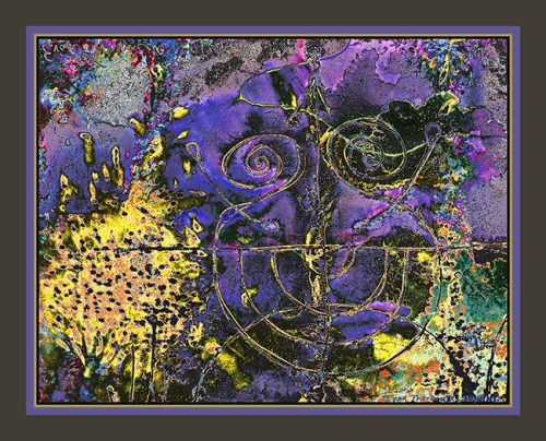
Previous to the above deal I just described, I was able to buy a set of 48 Artist’s Loft markers a few weeks ago for a similar deal. The Artist’s Loft markers are the markers I used to make the foundational drawing for this manipulated image. I mentioned the Prismacolor markers initially to describe to you the excitement I feel with regard to my current fascination with alcohol based markers.

What fascinates me about these alcohol based professional markers is the variety of colors that can be used. I had been wanting to collect a bunch of off color and neutral colored markers for my collection of art supplies because of a lack in the market I’d mistakenly and naively knew of prior to last year. Well, in my research over the last year, I discovered several brands of alcohol based marker makers that do indeed provide a wide range of colors: brilliant, pastel, dark, light, neutral, and everything in between!

I’ve also been interested in gel pens, ball-point pens, water-based pens, felt-tipped pens, fountain pens, reed pens, and other kinds of pens. Basically, as I mentioned at the introduction, I’ve been obsessed with pens. Since I have not been able to fulfill my dream as an artist with a large studio for the last several years, my compensation has been to downsize the sizes of my images, and to work with smaller tools, utensils, supplies, and equipment—the preponderance of the small if you will.

For internet production and consumption, this downsizing has worked out okay. Size is relative on the internet. Size is more determined by the screens by which viewers view art, whether if on handheld technology, laptops, or full sized computer screens. With my art, I include the dimensions, materials used, and other relevant information on my blog posts so that you are better informed as to what you’re investing in should you decide to share in the world of Art of eVan.

I like the sandy and stoney effect alcohol based markers give to the medium of paper after I manipulate my digitally converted drawings with filters in Photoshop. Rubbing alcohol does indeed have an unmistakable drying effect. Sand and stones are definitely mediums and symbols that lack water. That is, unless the relationship is that of a sandy beach that’s constantly being lapped by waves of ocean water. But even then, further away from the water is loads of beach sand that remains dry and scorched by a Summer’s sun. Anyway, you get the idea.

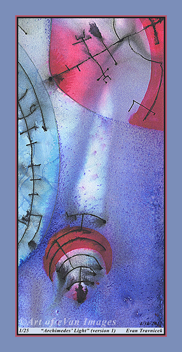
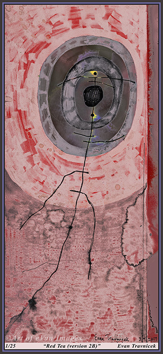
I titled this piece Read Tea (2B) because the markers I originally used for the foundation drawing are red. I used to use a color called Alizarin Crimson when I made oil paintings. It’s a standard dark red color that’s a staple for most professional oil painters. It’s a color that resembles blood. Therefore, it’s a natural, biological red. I used a couple markers from my collection that resemble alizarin crimson to surround an irregularly shaped target depiction.

As you may know, I have been fascinated with the bleeding effect that some water-based pens give after water is brushed over them on paper. I used that type of pen here, and achieved that bleeding effect that I wanted with the simple, hair-like scrawling you see transversing up to the middle of the target. It’s topped with a perpendicular line, thus giving it a capital letter T character. The letter T can be associated with the beverage of tea. Red tea tends to have a zinging sour taste to it intending for the drinker to perk up.

I sprayed and sprinkled some acetone over the alcohol based marker patterns, thus achieving some of the splatter marks you also see here. Acetone, like rubbing alcohol, after it dries, tends to parch materials of any moistness, giving mediums a stoney or sandy quality. So here I have chiseled out a simple abstract image with my chisel pointed alcohol based pens for you to feel in your viewing pleasure. I hope you enjoy it. I highlighted a couple tiny titillations of brilliant yellow and lavender around a couple of the dots near the center of the target to play with the notion of tiny intense points of color surrounded by vast areas of more neutralized color. I guess it’s playing with proportions, such as “the 80/20 rule” and so forth. In this case, it would be more like the 99/1 rule. Let’s make it the “98/2 rule” since that sounds less political.


Specifications:

Title: Red Tea (version 2B)

Source medium: Water-based, and alcohol-based ink, on paper

Source drawing completed: 3/4/2017

Print medium: Hewlett Packard printer ink from Hewlett Packard DesignJet Z2100 printer on Hewlett Packard print paper

Digital manipulation completed: 4/14/2017

Dimensions of print: 36 inches by 16 inches

Number of limited edition prints: 25

Investment of print not framed: $90.00

Investment of print framed: $435.00 (shipping included)

Contact me: artofevan@hotmail.com

Leave a comment

April 15, 2017 · 7:48 am

Textual Sur Viel (version 1)

TextualSurVeil1ematted

I’m enjoying the combinations of abstractions and amalgamations here from different sources. All the sources have been made by my efforts of course. The fine text you see distributed across this picture in orderly fashions and directions, for example, comes from a layer I selected, copied, and pasted from Ghosts of Flower Bones.

I titled this piece Textual Sur Veil I suppose as an allusion to the surveillance, particularly of text, across the internet. Sur comes from Old French, which means “on, upon, over.” The slightly shrouded pink circle with circuit-like lines drawn in it I imagined for a moment to be like a bug placed in a Christmas tree. Perhaps it’s an ornament with surveillance capabilities.

I imagined a Christmas tree because of the brush-like foliage in the upper and lower parts of the picture. It looks like a curving stream of smoke is arising from a twig in the background thus adding to the notion of a tree. Perhaps it’s a match that was used to stoke a fire in the fireplace.

Anyhow, we are in the Spring season now, so writing about impressions of Christmas really is just adding to our recent memories from this last Winter. So these impressions that remind us of Christmas are being transformed subtly by the forces of nature found in Spring. The yellow-green background gives this sense of Spring. I blend the seasons of Spring and Christmas together in this image much like nature does as it knows not the divisions we humans superimpose on to it.

I decided to add a strip of white on the bottom of my images now to give you an idea of what your print will look like signed by me. I learned that prints need to be signed specifically in pencil in order to make them less vulnerable to fraud. It also provides a space on which you can see the number of your print when you purchase it so as to insure that it is a limited edition, and that it will retain its value. I also decided to start providing you with the information of the materials I used to create this image, both the traditional materials, and the digital printing materials. I round my labor around a generalized amount because each image varies in the amount of time it takes to produce it, from physical start to digital finish. There is definite labor and expenses involved in framing each print as well.


Title: Textual Sur Veil (version 1)

Source medium: Water-based, and alcohol-based ink, on paper collage and paper adhered with diluted wood glue

Print medium: Hewlett Packard printer ink from Hewlett Packard DesignJet Z2100 printer on Hewlett Packard print paper

Dimensions of print: 23 inches by 23 inches

Number of limited edition prints: 25

Investment of print not framed: $80.00

Investment of print framed: $400.00 (shipping included)

Contact me: artofevan@hotmail.com

Leave a comment

April 9, 2017 · 6:41 am

Boolean Bellow Flipped (version 1)

BooleanBellowFlipped1ematted

At long last, I decided to post this version of a simple drawing I drew on a piece of college ruled paper under a month ago. You can see another manipulation of it in Aural Aurora, which I blogged about previous to this one. It’s basically derived from the same drawing. I just flipped the drawing on the horizontal plane for this piece. So I titled it Boolean Bellow Flipped.

Boolean is an abstract algebraic system that was developed by an English mathematician named George Boole. Boole is a surname of bull. The algebraic system he developed in 1851 denotes notations used to represent logical propositions, such as in computing and electronics. In computing, this translates as the binary variables of true and false. So here we have the notion of duality, but expressed in the title to a piece of art.

The large red and magenta bubble that looks like it’s in a slow motion process of popping reminded me of a bellow. Bellows used to be used to help fires grow in fireplaces. They may still be for all I know. So here I present to you this idea of a bubble popping, and a bellow blowing. Both of these ideas represent the expulsion of trapped or gathered air.

The air is directed towards the stick figure tree I drew crudely, but the tree, itself, looks rather unaffected. It looks like it has a protective bubble around itself, thus cushioning the adverse affects of some hot wind blowing its way. I drew the pink bubble originally with a water-based marker. I splashed water mixed with some old dusty ink in it to make the ink imbibe with the paper in random, fluid formations. I knew this would further help me create even more psychedelic patterns once I started digitally editing it with filters.

The straight lines of the college ruled paper are being obliterated by all the natural activity going on on top of them with the inks, and fluids. This is an expression of the balance between the linear thinking of Western culture, and the seemingly random—sometimes inexplicable—behavior of nature. We are all a part of nature. We are like conscious units that are able to reflect on nature however, making constructs to give ourselves senses of security, such as the stability of linear thinking.

Nothing physical lasts forever however. This picture helps to free up the notion that the rules of linear thought will last forever. It is my hope that Western culture starts understanding cycles, which permeate all existence, better. The poem I included in this piece reads:


In Wisteria,

Where the leaves wuther

In wonder

In wind swept eves,

Stars twinkle

In the ion pregnant sky,

Promising something unknown.


This is meant as a meditation that clears the way for something new, and letting go of the past. Empty spaces are often just promises for something new to be filled. Thus the space of emptiness is merely temporary. Hope is given in the line “in the ion pregnant sky.” I hope to inspire you with the random, free formations of brilliant color as expressed here so that you too may add your life to the spaces waiting to be filled in this world.

Leave a comment

March 24, 2017 · 7:08 am

Aural Aurora (version 1)

auralaurora1ematted

I titled this piece Aural Aurora to play with words. Aural pertains to hearing and and the sense of it with the ears. An aurora is a natural light phenomenon that happens at night in the Arctic and Antarctic regions of Earth. The word aura is found within the word aural, thus associating and suggesting the phenomena of auras as can be seen by some people around other peoples’ bodies. Auras are noted by these highly perceptive people to be fluctuating with a spectrum of colour.

This picture is an imagined combination of the above ideas described. It’s like you are at a polar region of the earth, and you’re witnessing Earth’s aura displaying a light show for you, but also including your aural sense. The vertical lines, evenly spaced, stretching across most of the picture plane in the background, can be seen as cosmic harp strings, playing along with the strokes and clouds of light.

I selected this image you see here as part of a larger drawing I drew a couple nights ago.  That other larger piece includes some poetic text I hand wrote on it. I plan on doing something with that too. But here, the irregular elliptical form in the clouds of the background nicely embrace the tree figure on the right, creating a sense of inclusion and unity with a night sky lit up by an auroral display.

This work accomplishes something I’d been considering as of late with regard to creativity, productivity, and ideals of perfection. Image making is the art of capturing something artistic within a fixed, two dimensional frame. All of physical reality is constantly changing. Even million year old rocks are changing on a molecular level, constantly. Sometimes image making seems like a neurotic activity to me because it’s an attempt to eternalize something that will never stay the same.

My way of coping with this unconscious futile attempt to fix and preserve something I may find beautiful is by letting the random, spontaneous forces of nature work through me as I relinquish many attempts to control outcomes with regard to what I produce. Watercolor is a good example of this. One can let the watercolor just bleed across a piece of paper and let it go where it may. The concept here is liquid. Anything liquid takes a path of its own, though artisans of all ages try to master it and control it.

Making art gives an artist a sense of control and mastery over his or her world. I like to question that sense of control and mastery by attempting to be random, and spontaneous. Artists train themselves to hone in on templates, such as the human body for example, and they attempt to master it by drawing it “better” than their peers. Better is of course relative, but I’ll just say that artists are really competitive. Denial of this is just face-saving in my opinion.

After civilizations die out on worlds, their ruins and remains are left behind. The Western world of culture I grew up in was and is filled with what is termed pop art. From Doritos bags, to Pepsi cans, to boxes of clothing detergent—all of these commodities are founded in pop art. My art is imagining what it will be like when nature recaptures the discarded items of pop art and starts returning their elements back to natural properties.

2 Comments

February 26, 2017 · 7:59 am

Wendy’s Sandy Waves (version 8)

wendyssandywaves8ematted

So you wanted to see some pop art in Art of eVan. Well, here is a piece with elements of it in it. I actually made this piece, and its variations, back in October 2015. It’s derived from a picture of a woman on a beach. The series is titled Wendy’s Sandy Waves. I thought of the figure as a mermaid bathing on a beach.

I thought of all the chaotic patterns as representative of uncontrollable emotions. Water is often depicted as a symbol for emotions because of their mercurial, ever changing qualities. The mermaid is taking a break from swimming around in them. She seems to be caught by you noticing her as she peers back.

The mermaid’s hair is what gave me the impression of pop art with this piece. It looks like some of Andy Warhol’s style of drawing over the hair of people in pictures he used for his silk-screen works. I rather think of this piece as more interesting than some of Andy Warhol’s portraits because the level of detail in the background is multiplied. The foreground, too, has much detail that satisfies me.

1 Comment

February 21, 2017 · 7:25 am

Developing to Save (version 1)

developingtosave1ematted

I needed to create another work of art to share with you. I hadn’t especially planned for this piece for any length of time. In fact, I produced it just tonight in one sitting. I already had the material to make it. I already have scanned in a lot of the drawings and collages I’ve been creating for the last few months, so I’m not lacking new material to work with digitally. I just haven’t posted much of my art lately to my profiles online.

I find the blogs I’ve posted previously with artworks intimidating because of the amount I’ve written for them. I’ve been at a loss for ideas in literal form lately because I’ve been developing a lot of visual ideas in my sketchbooks. So there’s been less writing on my part going on here.

One way I’ve found to help mobilize my writing talents is to record my dreams and write them down. Writing is an action. It’s more of an action than thinking, to be sure, but less of an action than carrying out the actions prescribed in the words. Actions, such as scribbling or writing, can stoke the imagination into finding new inspirations. But if one doesn’t do anything about the ideas that occur, then the ideas are as good as lost.

Some people have thought of art as not creative, but more like just rearranging matter and energy that already exists. My take on it is that, if time is removed from the equation, then an artist really is creating something. In timelessness, an artist is at the moment of conception in the universe, thus he or she is co-creating with the beginnings of what we might imagine to be our universe. Measurements of time may be relative, but timelessness is everywhere because it has no measurement.

I titled this piece Developing to Save, first of all, because of the text in the background collage work; second of all, for the activities I’ve been engaged with in my art lately. I mentioned that I’m developing a lot of ideas in my sketchbooks to use for further future developments. I have this habit however of not going back to previous ideas when I want to have an idea to work on. I have a strong urge to always be developing new ideas. It’s like I can never have enough new ideas to work with. I feel like an innovator. I can’t get stuck in a rut of one idiosyncratic dimension for the rest of my life.

A role model who has helped me understand this urge is David Bowie. I’ve micro-blogged before how he was constantly reinventing himself for the new trends that would arise around himself in the music industry, in culture, society, and art. I think he often juxtaposed himself with respect to whatever current trend there was and produced a lyrical and musical commentary on it. Art is about relationships, really, and Bowie was constantly readjusting himself with new identities in the continuum of change.

This piece, Developing to Save, is an attempt to deal with a contradiction. Developing implies a state of change, and save implies a state of fixation. The traditional visual arts—not counting motion picture or animation—are about the fixation of ideas into visual forms. The images produced in the visual arts are snapshots in time, space, energy, and the artist’s peculiar perceptions of his/herself and her/his world.

This image depicts the curved horizon of a landscape in my mind with odd shaped trees evenly spaced on the horizon. The green I imagine to be grass below the horizon. Yet, it’s like paint, or wallpaper, that was once applied to a wall, and it’s rubbing off now due to time, wear, and tear. The background is a selection of paper collage I assembled and glued together last year. I’ve used some of it in other works of art I posted to my Art of eVan blog.

Leave a comment

February 10, 2017 · 7:18 am

Mindy’s Blending Machine (version 2)

MindysBlendingMachines2ematted

In further explorations and experimentations with the female form, I combined this lady, whom I named Mindy, with a mosaic collage I’d drawn called Intraluminal Autoclaves. As you can see, the background collage is composed of textual material from old books and printouts of engine diagrams. I’m currently rather annoyed by the current rage of collage art. It’s a current trend with American arts and craft, scrapbooking hobby pursuits. I used to find it interesting, but because it has become mainstream and mundane, I’ve become bored of it.

Too many hobby artists today think they are being original with their collage scrap-booking art. They don’t even know who inspired them to begin with. They think they’ve come up with their ideas all on their own—like they just woke up one day, and started making collage art. I know that collage art, as I’ve learned from art history, comes from 20th century European art. Artists, such as Max Ernst and Kurt Schwitters, come to mind as a couple of original representatives of collage art.

Early collage art, dadaist, surrealist artists inspire me. They broke the mold of what art was supposed to be in their times and introduced a whole new way of making art. At this point in the 21st century, since collage art seems to have run its course of possibilities, I feel the commonness in this type of art now, though, paradoxically, I’m habituated with using it as a style in the development of my own art.

There are times when I am inspired by collage type art, but it has to be unusual, novel, and hybridized. Some artists pull it off really well. They have a great sense of streamlining unrelated biological and mechanical parts by putting them together to create new entities of expression.

I’m working out conflicts in my own creativity with respect to traditional art-making vs. the internet age and digital art; in regards to arts and crafts type art vs. unusual novel art; and of relating to my past freedom in making oversized mixed media oil paintings vs. the little detailed pen drawings I’m limited to creating now. I realize that Gary Bolyer, an online art marketing teacher, advises artists to not talk about themselves too much in their art blogging, but my developments are what I find most interesting in discussing. I suppose tensions such as these will always be there for me as an artist, and it’s probably good that they are. Dissatisfaction can be a good core driving motive for creating more artwork.

I titled this piece Mindy’s Blending Machine because it looks like a woman is walking in front of and through an industrial factory building. You can see cords, fans, and machinery behind her as she walks from the right of the image to the left. I altered the colors of her skin to dark and light pinks. This helps to blend her with the pink mosaic pieces behind her. An oversized shadow is also cast upon the wall below and behind her as if light were shining on her from her upper left anterior side.

The pink makes Mindy blend in with the background as if she where a chameleon. This is another idea of mine of a woman merging herself with her surroundings in order to extend her spirit out and create greater degrees of harmony. Maybe the pink beads coming from her mouth are utterances, like prayers, to the heavens beyond the machinery of materialism to fill her with love in order to share with the rest of the world.

The title, Mindy’s Blending Machines, has allusions to blenders that make smoothies. After drinking a strawberry smoothie, she feels the sweet satisfaction coating her inner sensations. I used the name Mindy because it has rhyming characteristics with the word blending. In art, it’s an advised practice to help blend and unify a picture by putting a certain color in foreground, as well as background, objects. This practice helps a picture harmonize better, even if the intent is to emphasize contrasting colors and boldness.

Leave a comment

January 18, 2017 · 4:08 am

The Enfeoffment of Hasenpfeffer (version 4)

theenfeoffmentofhasenpfeffer4

I like this idea of creating weathervanes, or mobiles out of wire. An artist I haven’t mentioned as an inspiration of mine—Alexander Calder—created mobiles out of metal and wire. He colored the vanes and panels at the ends of wires and rods bold colors. He was influenced by Joan Miro’s work, who, in turn, also filled in his broad, basic, abstract shapes with bold colors. And, yes, Miro is also an inspiration of mine.

In my imaginings of creating wire construct sculptures, I love the possibility of using the shadows they would cast on the ground as parts of the artwork. Like a disco ball for a dance floor, or a psychedelic animated projection playing behind a 60s rock band, I am fascinated by the employment of multi-media in art. But alas, my discouraged soul must plug away with jotting down these ideas in notebooks for now.

Here in this image, I am satisfied with the obtuse composition. What appears to be a burning bush off to the extreme left of the picture is a bold yellow form. Most of the rest of the picture is filled with purples and magentas. There is also a yellowish abstract manifestation showing up on the extreme lower right of the picture. The yellow from the bush and the yellow from the foliage off to the right are separated.

Bold colors, when separated like this on the picture plane, cause problems compositionally because they both vie for the viewer’s attention simultaneously and create a break in the flow of the eye’s path across the picture. The lines from the abstract wire construct create structured, organized pathways however, so that the eye can find a bridge with which to connect the overt disconnection. Moreover, I made the sure that the burning bush on the left was bigger and more dominant than the gallimaufry off to the lower right. This gives it a closer feel dimensionally to the viewer.

Some people have told me that this wire construct, reaching across and organizing the image’s visual properties, looks like a face, and perhaps there’s a hidden message in its symbology. I really was not intending any kind of covert message. I just have become fixated on drawing these basic wire construct designs. And, again, I’d like to, some day, make mobiles out of them.

Enfeoffment means the official deed by which a person was given land by a king under the feudal system of Europe of the Middle Ages in exchange for services. Hasenpfeffer is a dish made of rabbit meat. I learned of the word hasenpfeffer from watching a Bugs Bunny episode on the Loony Tunes cartoons. In that episode, Yosemite Sam is the cook for a king, and Bugs Bunny somehow becomes the target for Yosemite to make hasenpfeffer for the king. I suppose the face you may see in this image could associate with Bugs Bunny, or a rabbit, anyhow.

Really, the title of this piece could be re-worded as The Deed of a Rabbit. What would the deed of a rabbit be you may ask? We could ask Richard Adams, who wrote Watership Down, but he recently passed away. Watership Down is an adventure story about a group of rabbits forced to move off of their land, effectively becoming anthropomorphized animal refugees by land terraforming men. I highly recommend reading this book, as I found it to be extremely engaging when I was in middle school.

Rabbits are thought to be timid, easily scared creatures, but their powerful hind legs enable them to escape danger. But like Peter Rabbit, who liked to nibble on vegetables in farmers’ gardens, rabbits also have courage. They just are not ferocious beasts who scare other predators away. So I have an appreciation for rabbits as a symbol after reading Watership Down, and having the challenging experiences I had during my school years.

Leave a comment

January 1, 2017 · 6:45 am

Compressed Ontology (version 1)

compressedontology1ematted

A simple definition of ontology is “the branch of metaphysics dealing with the nature of being.” Since I learned of the word, I’ve always thought of it as the study of relationships of everything. Philosophically, it is confined to metaphysics however, which deals with the non-physical aspects of nature. Many twentieth century scientists, philosophers, and thinkers have relegated ontology to piles of superstition, folk lore, and hocus pocus however. This is because they believe physical matter is the final frontier in human exploration.

I use the word ontology in my title here as an artistic resource. To me, art has always been about relationships, and how anything relates to anything else. Complementary colors can be set side by side to one another in realistic or abstract depictions, such as red and green for example. These two colors create tension in the eye because of their contrasting relationship.

The main thing(s) that stands out to me that emphasizes the idea of relationships in this picture is/are the crude line drawings and the cubic object. I am drawn to the un-shaded cube. I intentionally drew the cube with Bic markers without shading. I like the effect that it has because, even though there is no shading, it still looks three dimensional. With the irregular teal colored pool next to, and in front of the cube, it makes it look like the cube is a melting chunk of ice. Hence, another ontological relationship.

I can get away with calling the relationships in this picture plane ontological because they really are not physical. In fact, this is a digital image you are viewing. If you invest in it as a limited edition (25) print from me, then perhaps you could call it physical. But even then, the objects in this image are not physical. They are mere representations of symbols I made up, and which I put no effort in defining. I just like to create simple wire constructs as drawings because of the structures and spaces they excite for me.

Art allows me to express myself in ways that words would be forbidden. Art is my Freudian slip. Art and music have always been vehicles in various cultures, societies, and civilizations as valves that allow for the release of whatever is suppressed in those worlds. I learned that ancient Egyptians, for example, had layers of meaning hidden in their hieroglyphic language. Painters of kings and queens in Medieval and Renaissance Europe frequently subtly betrayed their masters by infusing barely noticeable symbols or expressions indicating questionability of the tyrant’s power.

In my own art, I have full freedom to play with the tensions between objects, subjects, and colors without offending anyone. Abstract art allows for the full expression of one’s soul because it’s not recognizable in standardized ways. Or, the shapes are so universal—squares or circles for example—that their symbolism can mean too many things to be sure they mean one thing only.

I thought Compressed Ontology would be a good title because of what it means to me. Decades ago, I read a trilogy by Robert Monroe concerning his out-of-body experiences. He discovered in his nightly journeys that he possessed a “second body,” an immaterial body, that he was able to detach from his physical form and then explore the universe, physical and non-physical. In one of his journeys, he described physical life for humans as an artificial “compressed learning” environment.

I thought about what compression means in this regard since reading those books. Compression would mean a rather forced, limited environment in which resources are scarce and physical beings must deal with one another, for better or for worse. I suppose the learning part of this compressed environment we all live in comes about in time as we “successfully” deal with situations minute by minute, hour by hour, day by day, person by person, etc., etc.

Most people I would venture to say have been born into less than optimal environments in which stereotypical “success” is out-of-reach, thus securing a situation for the soul in which certain people and circumstances are compressed, and “forced” upon the soul seeking spiritual growth in one way or another.

The floating, abstract, crude, wiry objects floating above the ground have a sense of heat about them, indicating “hot to handle.” They sort of remind me of the wire loops surgeons use for loop electrosurgical excision procedures (LEEP). They also remind me of the iron brands farmers use to mark their cattle’s skin for recognition. Fiducial markers are other objects used for landmarks or locators associated with this idea. So we have hot and cold sensations coming from this picture: The colorful, melting ice cube, and the hot wire constructs.


5 Comments

December 26, 2016 · 6:22 am