
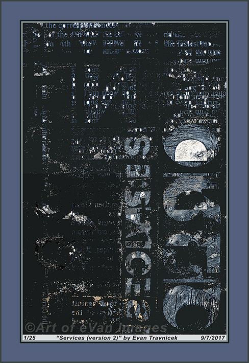
Note the pinpoints of organized light, like they are coming from the windows of a skyscraper working at night. Like there’s a story of workaholics to be told here. They were formed by a flooding technique I used that’s provided for users to use in Photoshop. Overlapping text can be determined—however inchoately—as composing the vertical and horizontal structures. It can’t be determined, however, whether if the larger text arising from the bottom to the middle of the picture is implying “services” or “devices.” In a larger, holistic context, devices perform services, so there is indeed some meaningful overlap there.
Usually I make and show images with a lot of color in them. This piece doesn’t meet that standard, so it is sort of an odd one for me. It still expresses a style I’d imagined and been inspired by. It achieves an apparently complicated and random background—sort of like white noise—but makes gestures towards order and implications towards meaning. It’s like a subconscious stew or alphabet soup. Perhaps I may develop some ideas playing with the shapes of letters and transforming them into aberrations of traditional letters as found in the English alphabet.
After reviewing this piece and preparing it for my online galleries, I am reminded of Maria Elena Vieira Da Silva’s art, and how it inspires me. I find this piece to be very similar to some of the paintings she produced. I’m not ashamed of that either. Usually I strive to be as original and independent as I can from other artists, but, with this piece, I feel it’s a model that only resembles Da Silva’s; and it acts as a stepping stone for me for inspirations of newer and even more original work.
I find this illustration to be rather top heavy due to the concentration of white points collected at the very top of the image. This vaguely annoyed me, and I wanted to add some space above that concentration. After looking at it for a few more moments, I decided to leave the canvas shape and size as it is. I find it to be an asymmetrical balance that creates tension, but not enough to be obnoxious. Moreover, I selected a rectangular shape in the lower left side of the picture plane, and darkened it slightly so that it differentiates to a slight darker shade from the rest of the dark grey background. It could be the silhouette or shadow of a building in the foreground in one’s imagination.
