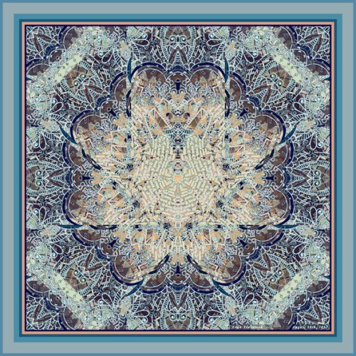
It looks like you could almost place both of your hands on the pattern forming the center of this image. I almost used the word “prayer” as part of the title for this piece, but I decided on the name Yoga of an Inter-Dimensional Carnation because it looks the petals of the flower have arms along side them that are reaching upwards in eight different phases, as if to complete a yoga pose.
I suppose prayer and yoga can be compared as similar, but I would have to say that they are not exactly the same. Prayer, to me, is an intense focusing of one’s desire addressed to a higher source, such as God, and yoga to me is about a lifestyle accompanied by regular breathing and muscle exercises. Yoga is a purifying of one’s self so that one’s prayers can be more readily and immediately answered, quickening the process of oneness with the universe, and relinquishing emotional and spiritual debris.
A friend of mine on Twitter gave me some valuable insight about who my audiences are, and who my art would appeal to. She gave me all kinds of ideas about what the patterns I create could be put on, such as satchels, rugs, shower curtains, bags, purses, shoes, and even jewelry. She said that many of my designs would appeal to kids, as in putting them on lunch boxes, and for games, and so forth. It became overwhelmingly apparent that my art appeals particularly to women’s and children’s tastes.
These audiences weren’t necessarily my target audiences, as my mind had been more set to appealing to art collectors. I hadn’t intended my art for household items, utilitarian objects, and women’s fashion, but I totally can see how all that would work. I’d even be excited to work with some manufacturer or another and to contract my work with some of their projects and fashion designs for the mentioned areas.
This image worked well because of how the paisley designs show up so well, giving the space surrounding the lotus-like flower at the center a sense that this could be an intricate and ornate table cloth for a very nice dining room. You can’t see the text very well from the printout material I used for this amalgamation, nor can you see the engine diagram material very well as well. Because the detail is so rich, an owner of this piece as a print would continue to be pleasantly surprised to encounter new things in it all the time.
Though this image was completed before I completed Galactic Template, I posted it after Galactic Template because I felt more impressed by it. It has a shimmering quality of light, delicacy, and subtlety that the previous piece doesn’t seem to encompass as well. I was able to pull out the center with orange and yellow hues so as to offset the cool glow of the picture with a warm central glow, all finished in pastel highlights.
This piece shows you the unresolved struggle I had in trying to make the central mosaic patterns complete a circular design. As I mentioned, the center looks like a pair of hands next to each other with the thumbs overlapping. I couldn’t figure out how to get rid of the finger-like extensions breaching the circle. I felt good about this design, so I took a tangent off with it and created four different versions of it. To see how the completed circle at the center looks like, see Galactic Template previous to this post.

